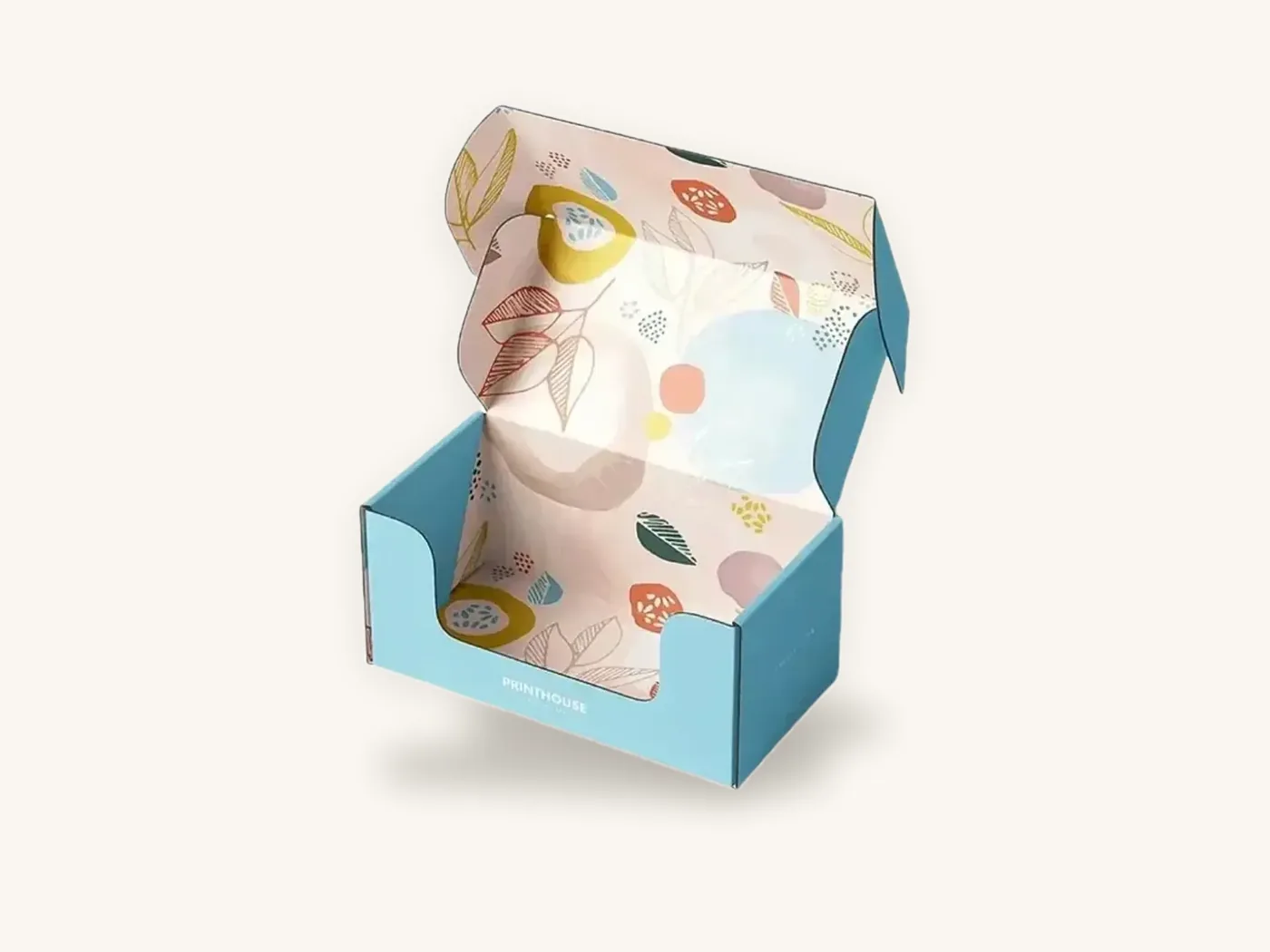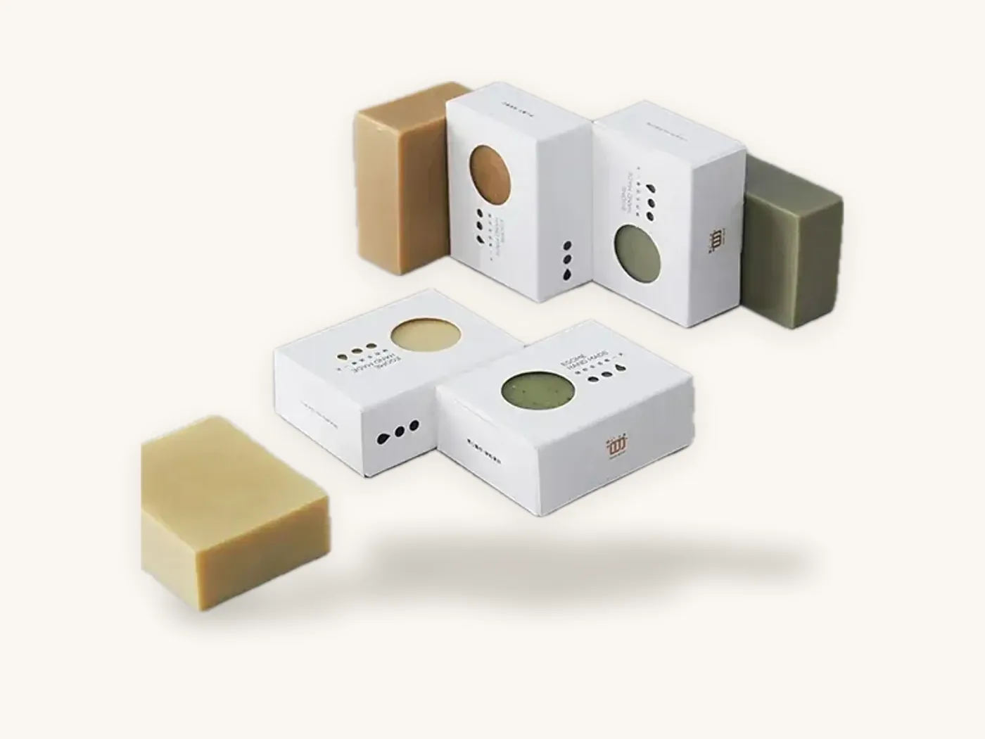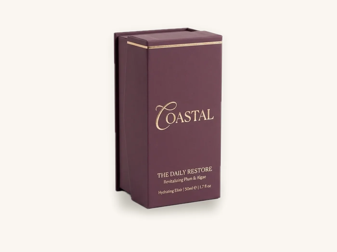
Packaging color psychology is the practice of choosing box colors based on what shoppers tend to associate with them, but those associations are learned, not wired in. Red does not make everyone hungry and blue does not make everyone trust a brand. What color does reliably is signal a category, separate one variant from another, and make a box findable on a shelf or in a feed.
So the useful question is not "what does green mean?" It is "what does green mean in my category, to my customers, printed on my board, next to my competitors?" This guide gives you common associations as a starting point, then shows how category, culture, contrast and print production change the answer, and how to test your choice before you order a full run.
Key takeaways
- Color associations are common tendencies shaped by culture, category and personal experience. Treat any chart of "color meanings" as a hypothesis, not a rule.
- In most categories, the colors shoppers expect were set by the leading brands. Following those codes helps recognition; breaking them helps you stand out but can confuse.
- Contrast between colors matters more for legibility than the hues themselves. Check your design in grayscale and for common forms of color vision deficiency.
- The same artwork looks different on kraft, white SBS and metallic board, and under matte, gloss or soft-touch finishes. Choose colors for the substrate you will print on.
- Use PMS spot colors for brand colors that must match run to run, and approve a printed sample when color is critical.
- The best colors for packaging are the ones that make your product identifiable fastest to the people who buy it. Test with real boxes and real buyers.
What color psychology can and cannot tell you
Popular articles often attach precise emotional effects to each color and back them with percentages. Be skeptical. Much of that material is marketing content, and research on color and emotion generally finds that responses vary widely by culture, context, product type and the specific shade.
What holds up in practice
A few things are reliable enough to design around. Color is processed quickly, so it is often the first cue a shopper uses to find a brand or a variant they already buy. Colors pick up meaning from repeated exposure, which is why certain categories develop shared palettes. And high-contrast combinations are easier to read than low-contrast ones, for everyone.
What does not
A color does not carry one fixed meaning across every product. Black can read as luxurious on a perfume box and as heavy or aggressive on a baby product. Pink can read as playful on candy and as clinical-soft on skincare. The context around the color changes the message more than the color itself.
Watch out: if a supplier, agency or article tells you a specific color will raise sales by a set percentage, ask for the source. Claims like that rarely transfer from one product and market to another. Your own test results are worth more.
Common color associations on US packaging
The table below lists associations that are widely used in US consumer packaging design. They are starting points drawn from how colors are commonly used in retail, not measured effects. Each row includes a caution because every one of these associations has exceptions.
| Color | Common associations | Where it often appears | Caution |
|---|---|---|---|
| Red | Energy, urgency, appetite, celebration | Snacks, candy, sale items, holiday | Can read as warning or discount; hard to own because so many brands use it |
| Orange | Warmth, fun, value, citrus | Snacks, kids, sports nutrition | Can look inexpensive in large flat areas |
| Yellow | Optimism, attention, sunshine | Snacks, cleaning, kids | Poor contrast with white; light yellow text is hard to read |
| Green | Nature, freshness, health, plant-based | Organic food, supplements, CBD, personal care | Heavily used for "natural," so it differentiates poorly in those aisles |
| Blue | Calm, cleanliness, reliability, cold | Water, dairy, pharma, tech, personal care | Can feel clinical; less common in food outside dairy and water |
| Purple | Indulgence, creativity, premium | Chocolate, beauty, some wellness | Specific shades print inconsistently in CMYK; often needs a spot color |
| Pink | Playful, soft, romantic, sweet | Beauty, confectionery, baby, gifting | Associations vary strongly by shade and audience |
| Black | Luxury, sophistication, strength | Fragrance, spirits, premium tech, men's grooming | Shows scuffs and fingerprints; heavy for baby or food basics |
| White | Clean, simple, clinical, pure | Skincare, pharma, tech, minimal brands | Can look generic without strong type or a single accent |
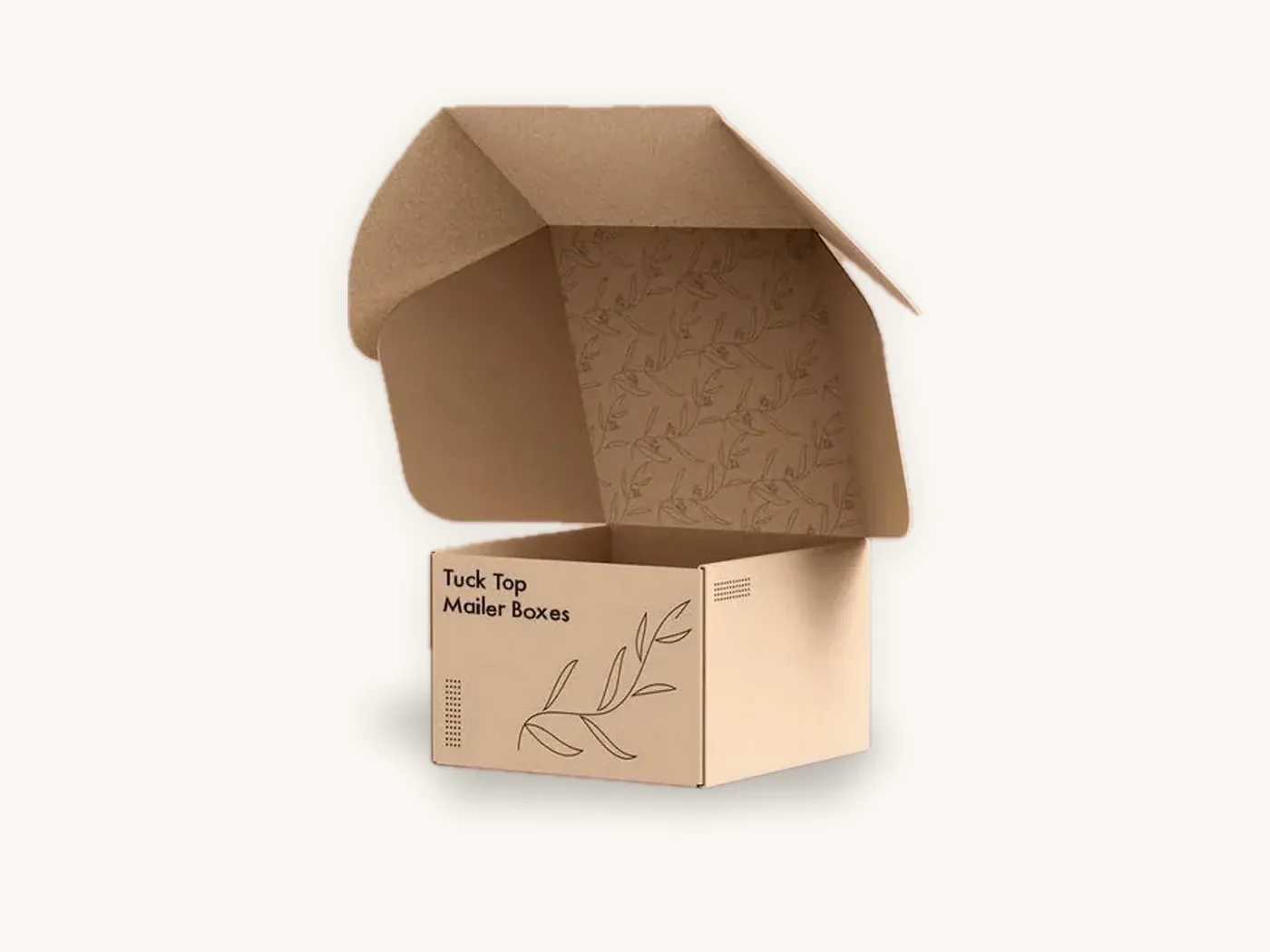
| Brown / kraft | Natural, handmade, earthy, honest | Coffee, soap, candles, bakery | Muted color reproduction on kraft board |
| Gold / metallic | Premium, celebration, gifting | Spirits, chocolate, holiday, beauty | Overuse reads as cheap; best as an accent |
Use this as a vocabulary for discussing options with your designer, not as a decision tool. The decision comes from the category and testing steps below.
Category color codes: when to follow them and when to break them
Walk down any aisle and you will see that categories develop their own color languages. These codes often matter more than general color psychology, because shoppers learn them through repeated purchases.
How category codes form
When a successful brand uses a color consistently for years, shoppers begin to link that color with the product type or a variant. Competitors then adopt similar colors so their products look like they belong. Over time a category ends up with a shared palette that functions like a set of signposts.
Common patterns you will notice
- Flavor and variant coding: in snacks, candy and beverages, colors often signal flavors (for example, green for mint or lime). Deviating can cause shoppers to pick the wrong variant.
- Strength or intensity: in coffee, spirits and some supplements, darker palettes are often used for stronger or richer versions.
- Clean and clinical: skincare, pharma and medical products lean on white, blue and pale neutrals.
- Natural positioning: green, earth tones and kraft dominate organic and plant-based ranges.
- Premium gifting: black, deep jewel tones and metallic accents are common in fragrance, chocolate gift boxes and spirits.
A decision matrix for following or breaking codes
| Your situation | Recommended approach | Why |
|---|---|---|
| New brand entering a crowded, color-coded aisle | Follow the category color for variants; differentiate with one ownable accent, typography or structure | Shoppers need to know instantly what the product is |
| Established brand with loyal repeat buyers | Keep your core color; change it only with a transition plan | Regular customers search for your color first |
| Challenger positioning against category norms | Break the dominant color deliberately and keep the product name very clear | Contrast with the shelf is the point, but clarity must compensate |
| Premium line extension | Shift to a darker, quieter or metallic version of your palette | Signals a step up without losing recognition |
| E-commerce only, sold mainly on your own site | More freedom; prioritize recognizability in thumbnails and photos | No physical shelf neighbors to fit or contrast with |
For a deeper look at how color works with your logo, type and voice over time, see our packaging branding guide.
Culture and market differences: US, UK and UAE
If you sell in more than one market, the same color can land differently. The safest approach is to treat associations as local and check them with people who live in and buy in that market.
General differences worth checking
White is associated with cleanliness and weddings in much of the West, while in some East Asian cultures it has associations with mourning. Green has strong positive and religious associations in many Muslim-majority countries, which is relevant for the UAE. Red is associated with good fortune and celebration in Chinese culture, which is why it features heavily in Lunar New Year packaging. Purple and gold carry royal or premium connotations in many places.
These are broad tendencies, and modern consumers in major cities are exposed to global brands, which softens many of them. Still, a quick review with local customers or distributors before a launch costs little.
Practical advice for multi-market brands
- Keep your core brand color consistent across markets so the brand remains recognizable.
- Adjust secondary colors, seasonal editions and gifting packaging for local occasions and associations.
- Check that imagery and color combinations do not unintentionally reference national flags, political movements or religious symbols in a way you did not intend.
Contrast, legibility and color vision deficiency
A beautiful palette fails if people cannot read the product name, the variant or the required information on the box. Contrast is where color choice becomes a functional decision.
Value contrast matters more than hue
Two colors can look very different in hue but have similar lightness, which makes text hard to read. Red text on a green background, or light blue on white, are classic examples. A simple check is to convert your artwork to grayscale. If text and background merge in grayscale, they will be hard to read for many shoppers, especially in dim store lighting.
Plan for color vision deficiency
A meaningful share of people, more commonly men, have some form of color vision deficiency, most often difficulty distinguishing red from green. If your variants differ only by a red versus green band, some customers will not be able to tell them apart. Add a text label, an icon or a pattern difference, not just a color change.
Legibility on required panels
Colors behind regulated information need special care. Nutrition, supplement facts and ingredient panels need clear, high-contrast text. Our packaging typography guide covers type sizes and contrast on those panels. If you add a QR code, keep a dark code on a light background with a clear margin; the QR codes on packaging guide explains why inverted or low-contrast codes often fail to scan.
Tip: test your color choices at the size a shopper will actually see them. Print a front panel at full size and look at it from about two meters, then shrink the image to a marketplace thumbnail. Both views should make the product and variant obvious.
How board and finish change your packaging colors
The same color file can look quite different depending on what it is printed on and how it is finished. This is a frequent source of disappointment after approving a proof on screen.
| Substrate or finish | Effect on color | Best practice |
|---|---|---|
| White SBS paperboard | Brightest, closest to screen proofs | Use for color-critical cosmetics, candy and product cartons |
| Natural kraft board | Colors darken and mute; pale colors largely disappear | Use bold or dark colors, or print opaque white ink beneath light colors |
| Corrugated white liner | Good color, slightly less crisp than SBS | Avoid very fine color detail; large dark floods may show flute lines |
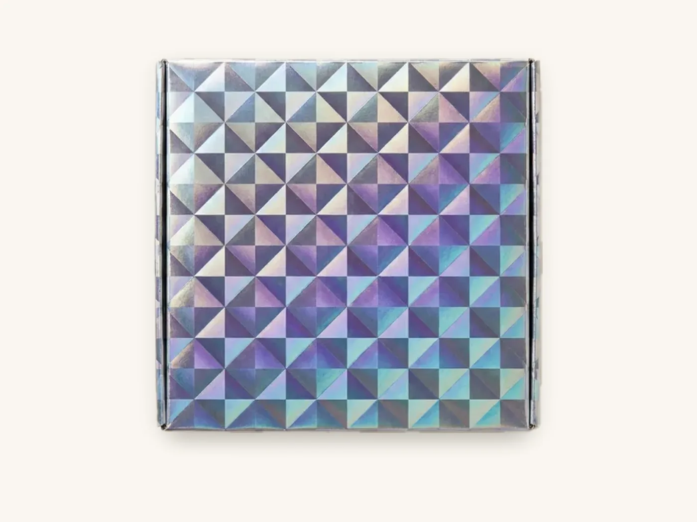
| Metallic or holographic board | Colors take on shine; transparent inks tint the metal | Use white ink underneath areas that should look non-metallic |
| Matte lamination | Slightly softer, less saturated look; reduces glare | Good for photography-heavy or muted palettes |
| Gloss lamination | Deeper, more saturated colors; more glare | Good for vivid snack, candy and toy palettes |
| Soft-touch lamination | Mutes and darkens colors noticeably | Request a printed sample; adjust colors slightly brighter if needed |
| Aqueous coating | Minimal change; slight protection | A sensible default for most boxes |
See our SBS paperboard and kraft paperboard pages for how each board takes ink, and the printing and finishes page for the finish options.
CMYK versus PMS spot colors
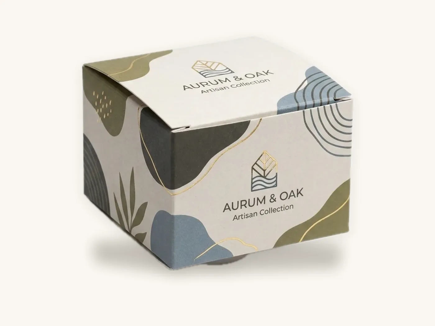
Most packaging prints in CMYK, which builds colors from four inks. Some brand colors, especially bright oranges, vivid greens, purples and certain blues, are difficult to reproduce accurately in CMYK. A PMS spot color uses a premixed ink for an exact match and keeps that color consistent between runs. The CMYK vs Pantone guide explains the tradeoffs.
Screens display color in RGB, which can show colors that print cannot reproduce. A proof on your monitor is a layout check, not a color guarantee.
A process for choosing the best colors for packaging
Use this sequence to go from a blank palette to printed boxes. It works for a new brand or a new product line within an existing brand.
- Define the job of color. Decide whether color must identify the brand, signal a variant, communicate a benefit (such as "natural" or "premium"), or all three. Rank those jobs.
- Collect the shelf. Photograph or screenshot at least ten competitor packages in the same category and price range. Group them by dominant color.
- Find the gap and the code. Note which colors signal the category and which colors are unused. Decide where you need to fit in and where you can stand out.
- Choose a primary color, one or two supporting colors, and a neutral. Keep the system simple enough that variants can be added without losing recognition.
- Assign colors to variants. If you have flavors, strengths or shades, give each a clear color and a text or icon label.
- Check contrast. Convert to grayscale and review the product name, variant name and all required text.
- Match colors to the board and finish. Adjust your palette for kraft, SBS, corrugated or metallic board, and for your lamination or coating.
- Specify brand colors precisely. Name PMS references for colors that must match, and set up files according to our artwork preparation guide.
- Review a 3D proof and a printed sample. Check how colors wrap around edges and panels, then judge color on physical boxes under several lighting conditions.
How to test packaging colors before a full run
Because color associations vary so much, the most reliable information comes from testing with your own buyers. Testing does not need to be expensive.
Shelf and screen tests
Place printed samples or high-quality mockups next to competitor products on a real shelf or table, and in a screenshot of a marketplace search page. Ask people unfamiliar with your brand to find your product and to identify which variant is which. Note how long it takes and where they hesitate.
Short run comparisons
With digital printing, you can order two color variations of the same box in small quantities. Use them in your own store, at a market, in a subscription shipment or as retailer samples. Look at which version buyers pick up, comment on or photograph. Keep the rest of the design identical so color is the only difference.
Feedback from retailers and distributors
Buyers for retail chains and distributors see many packages. Ask them whether your colors fit the aisle, stand out appropriately and communicate the right price level.
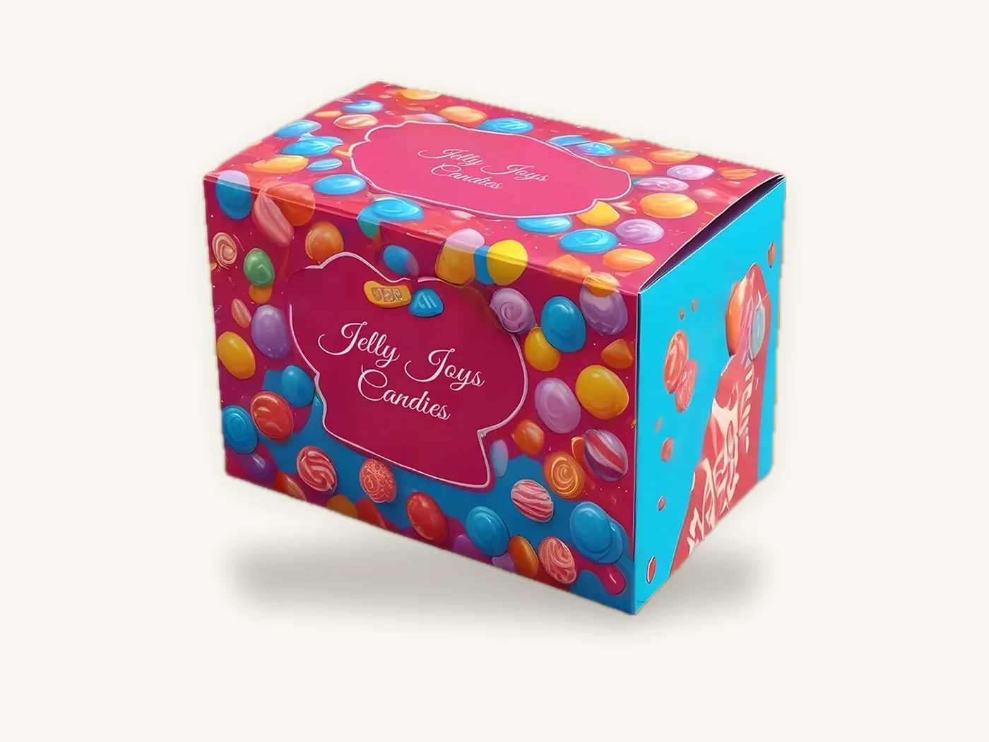
For candy boxes and other variant-heavy ranges, run tests with the full set of colors side by side, because a color that works alone may clash or blur next to its siblings. The chocolate and candy page shows common structures for multi-variant ranges.
Ordering color-critical packaging from Box Sense
When color matters, a little extra information at the start saves a revision round later.
What to send
- The box style and internal dimensions, such as cosmetic boxes or custom product boxes
- Board choice: white SBS, kraft, corrugated or metallic
- Finish: aqueous, matte, gloss or soft-touch lamination, plus any foil or spot UV
- PMS references for brand colors, and whether they must be spot colors or can be converted to CMYK
- Artwork files on our dieline, or a brief for our design services team
- Quantities to price, for example 50, 250 and 1,000
What happens next
We confirm a quote within 24 hours. Free design support includes the dieline, artwork setup, a 3D digital proof and two revision rounds. Unprinted structural samples are free, and a printed sample of your approved artwork is free on orders of 100 or more; that printed sample is the best way to judge color on your actual board and finish. See samples for how that works.
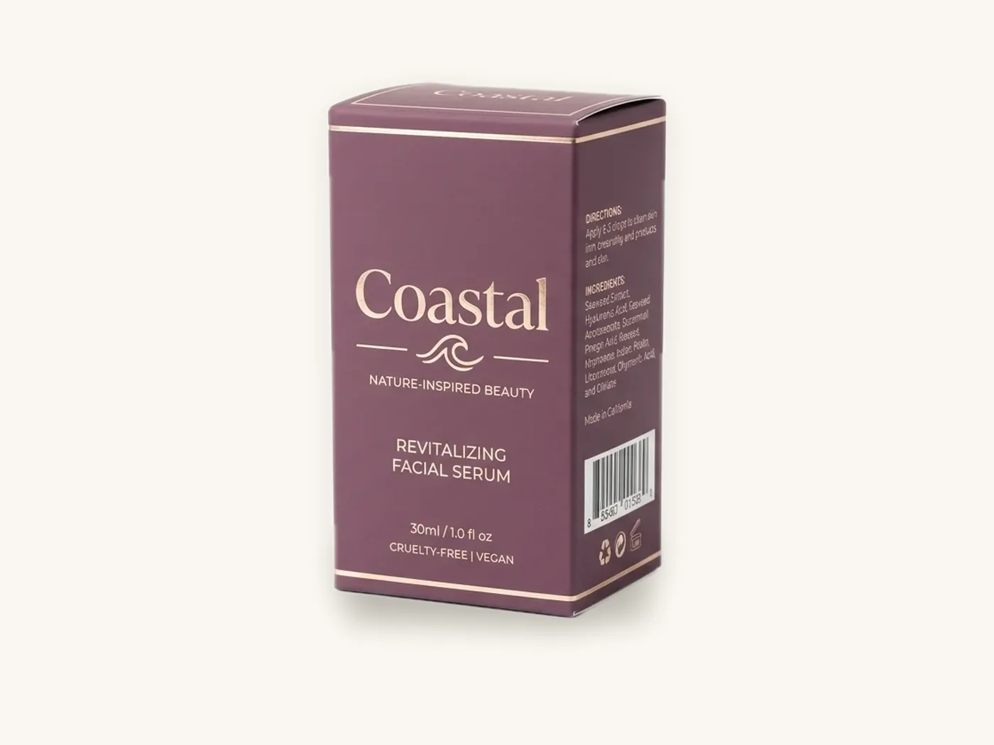
The minimum order is 10 boxes. Short runs print digitally, roughly 10 to 500 units, and larger runs print offset. Standard production is 8–12 business days after proof approval, with rush production in 5 business days available on most paperboard and corrugated styles. Shipping is free on every US order. As a price reference, a 2.5x2.5x6 in cosmetic carton in 18 pt SBS with full color, soft-touch and foil is about $1.93 each at 100 units and about $0.86 at 1,000; the estimator prices your own spec.
Frequently asked questions
What are the best colors for packaging?
There is no universally best color. The best colors for packaging are those that fit your category's expectations, make your product and variants easy to identify, contrast well enough to read, and reproduce accurately on your chosen board and finish. Start by studying competitors in your category, then test a small number of options with real buyers using short printed runs.
Does color really affect whether people buy a product?
Color strongly affects whether a shopper notices a product and how quickly they recognize a brand or variant, which influences buying. However, the specific emotional meaning of a color varies by culture, category and context. Rather than relying on general claims, test how your own customers respond to printed samples in real shopping situations.
What color packaging looks most premium?
In many US categories, black, deep jewel tones, muted neutrals and restrained metallic accents are commonly used for premium products. Finish matters as much as color: soft-touch or matte lamination with a single foil detail often reads as more premium than a bright gloss box. Premium cues still need to fit your category and price point.
Is green packaging a good idea for natural products?
Green is widely associated with nature and health, which helps shoppers identify natural products quickly. Because so many natural brands use green, it can make differentiation harder. Consider pairing a category-appropriate green with a distinctive accent color, typography or structure, and avoid relying on color alone to imply environmental benefits you cannot substantiate.
Why do my packaging colors look different from my screen?
Screens display RGB light, while printed boxes use CMYK or spot inks on a physical board. Some RGB colors cannot be printed, and substrates and finishes change appearance: kraft darkens colors, soft-touch mutes them and gloss saturates them. Use PMS references for critical colors and approve a printed sample on your actual board and finish.
Should I use Pantone colors on my boxes?
Use PMS spot colors when a brand color must match exactly and stay consistent across print runs, or when a color is difficult to achieve in CMYK, such as vivid oranges or certain purples. For photography and multicolor illustrations, CMYK is standard. Many brands combine both, printing CMYK artwork with one spot color reserved for the logo or main brand color.
How many colors should a packaging design use?
Most effective packaging uses a limited palette: one dominant color, one or two supporting colors and a neutral for text. Additional colors can signal variants within a range. Too many competing colors make it harder for shoppers to find the product name and key information, especially on small boxes or in online thumbnails.
Next steps
Shortlist two or three palettes that fit your category, check them in grayscale and on your chosen board, then price the spec in the instant estimator. When you are ready to see your colors printed, request a quote and we will prepare a dieline, a 3D proof and a path to a printed sample on your real finish.
Boxes in this guide
Order the packaging we covered
Written by the Box Sense Packaging Team
Our structural designers, prepress technicians and production staff print and convert custom boxes every day for brands in the United States, United Kingdom and UAE. Questions about this guide? Talk to us.