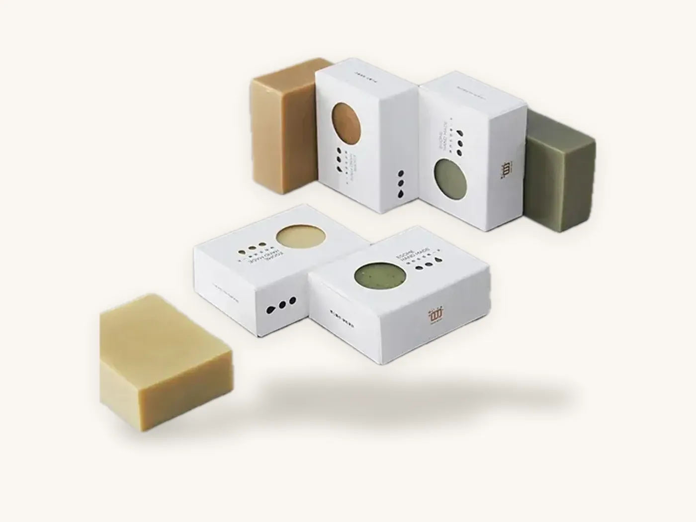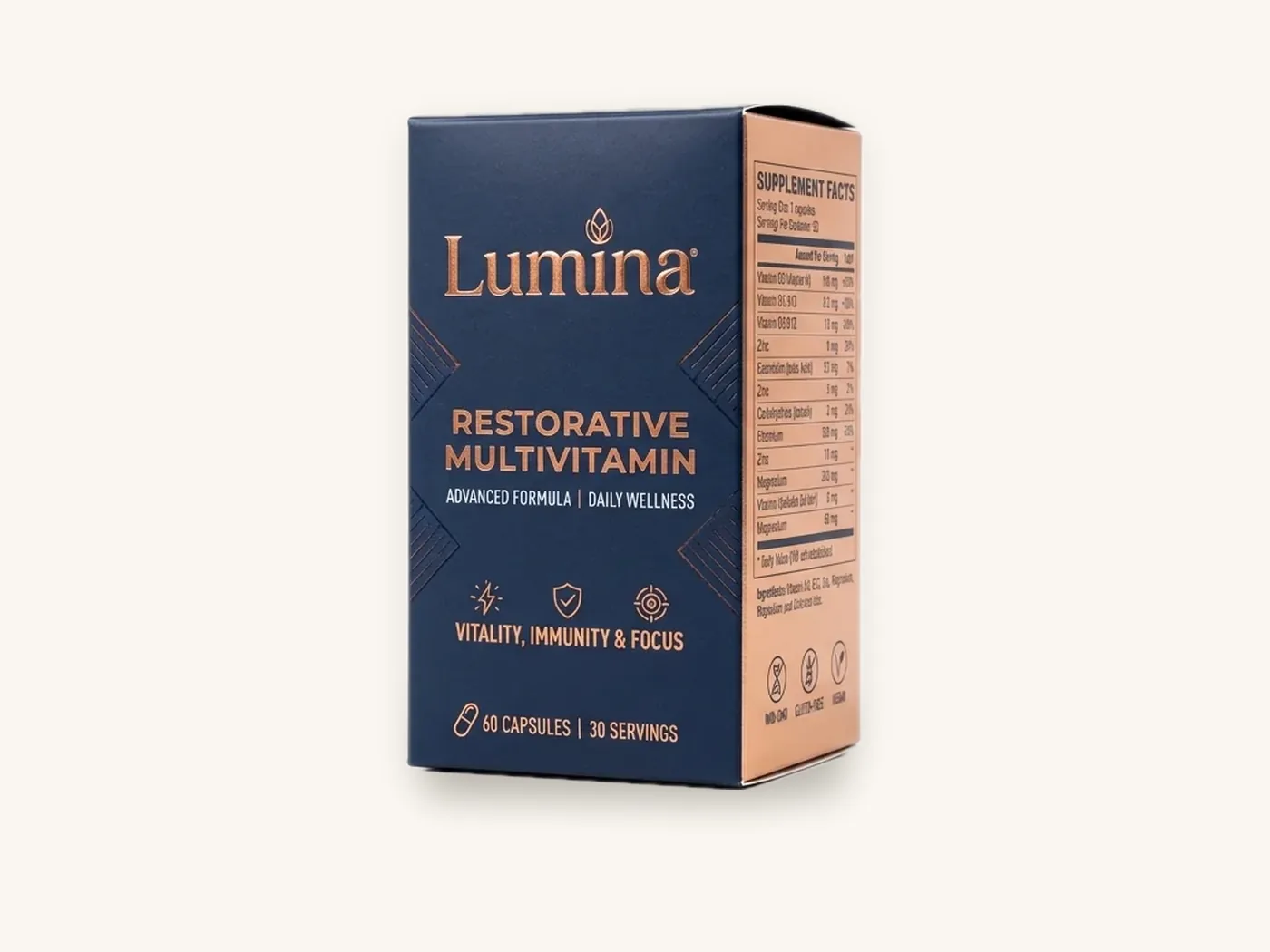
Good packaging typography does three jobs in order: it tells a shopper what the product is from a distance, it helps them compare and choose up close, and it delivers required information clearly enough to satisfy regulators. Most type problems on boxes come from designing on a large monitor and forgetting that the real box is small, folded, printed on board and read in bad light.
This guide covers how to choose fonts for packaging, how to build a hierarchy across the panels of a box, practical minimum sizes for different print methods and finishes, and where regulated products such as food, supplements and cosmetics have their own type-size rules. It ends with a pre-approval type check you can run on any proof.
Key takeaways
- Design type for the physical box at actual size. Print the front panel at 100% and read it from arm's length and from about two meters away.
- Use a clear three-level hierarchy on the front panel: brand or product name, variant or benefit, and supporting detail. If everything is bold, nothing is.
- Most brands need no more than two type families on a box. Choose fonts with open letterforms and a generous x-height for small text.
- Fine type is limited by the print process: reversed (knocked-out) text, kraft board, foil and embossing all need larger, heavier type than positive text on white SBS.
- Food, dietary supplements, cosmetics and OTC drugs have federal label rules, including minimum type heights for some statements. Confirm current requirements with FDA or counsel.
- Review type on a 3D proof, where folds, glue flaps and curved edges reveal problems a flat file hides.
Why type on a box behaves differently from type on a screen
A web page can be zoomed. A box cannot. Several physical factors change how readable your type is once it leaves the design file.
Viewing distance changes by moment
A shopper first sees a carton from a shelf or a thumbnail, then holds it at reading distance to check details. The product name has to work at the first distance and the directions, ingredients and warnings at the second. Designing only for the second distance is a frequent reason packaging looks cluttered from a few steps away.
Panels fold, curve and wrap
Text placed close to a crease can end up on the wrong panel or split across an edge. On tubes and round boxes, long lines curve out of view. Tuck flaps and dust flaps hide type completely when the box is closed. Our guide to what a dieline is explains the safe zones that keep type on the panel you intended.
Board and ink change letterforms
Ink spreads slightly as it soaks into board, a behavior printers call dot gain. Very thin strokes and tight counters (the enclosed spaces in letters like e and a) can fill in, especially on uncoated or kraft stocks. Textured papers break up fine serifs. What looks crisp at 6 pt on a monitor may be soft on a printed carton.
Lighting is rarely ideal
Store lighting creates glare on gloss laminations, and bathroom or kitchen lighting is often dim. High contrast and sturdy letterforms survive these conditions far better than light weights and pale colors.

Building a type hierarchy across the panels of a box
A folding carton has several panels, and each has a different job. Assign type roles by panel before you choose sizes, so the most important words land where people look first.
| Panel | Main job | Typical content | Type approach |
|---|---|---|---|
| Front (principal display panel) | Identify and attract | Brand, product name, variant, key benefit, net quantity | Largest sizes; strongest contrast; three levels at most |
| Side panels | Compare and reassure | Features, how to use, variants in the range, certifications you can substantiate | Medium sizes; short lines; clear subheads |
| Back panel | Inform and comply | Facts panels, ingredients, directions, warnings, company name and address | Smaller sizes, but within legal minimums; generous line spacing |
| Top or end panels | Find on shelf or in a drawer | Product name, variant, sometimes shade or flavor | Short, bold, readable when the carton is stacked or lying flat |
| Inside surfaces | Surprise or instruct | Thank-you message, usage steps, QR code | Relaxed; brand voice can come through |
The three-level front panel
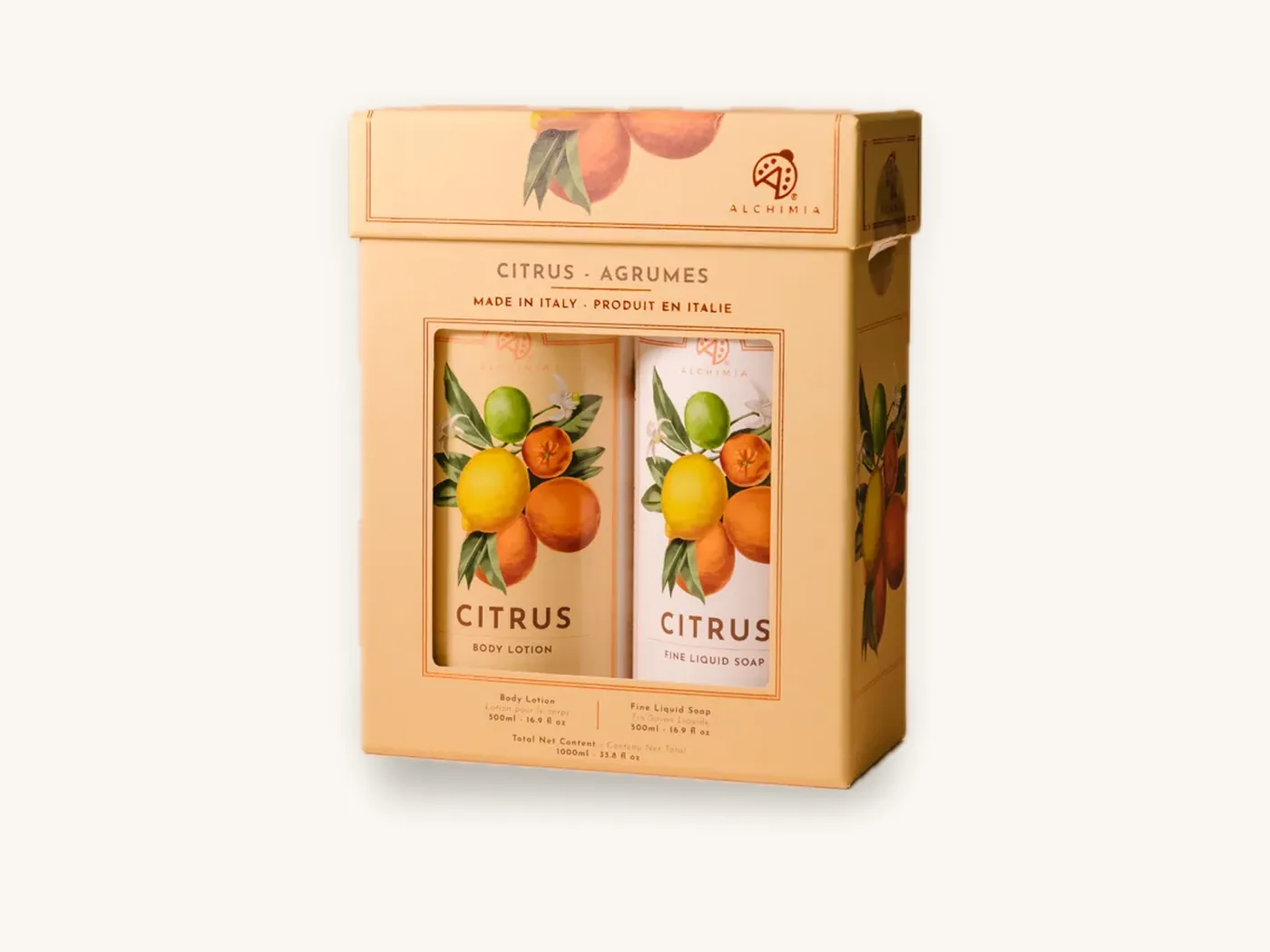
On the front panel, aim for a clear sequence. Level one is usually the product name or the brand, whichever customers search for. Level two is the variant, flavor, shade or strength. Level three carries a short benefit or descriptor and the net quantity. If a fourth level appears, move it to a side panel.
A useful check is the squint test: blur your eyes or apply a heavy blur to the artwork. You should still see the first level immediately and the second level as a distinct block.
Keep brand and product names distinct
When the brand and the product name compete at the same size, shoppers are unsure which is which. Decide which one leads for each product. A single-product brand often leads with the brand. A brand with a large range often leads with the product or variant, with the brand as a consistent signature.
Choosing fonts for packaging
Font choice sets tone, but on packaging it must also survive small sizes, printing and folding. Most brands work best with a display face for names and a highly legible text face for everything else.
Font categories and where they work
| Font category | Tone it tends to carry | Works well for | Watch for |
|---|---|---|---|
| Humanist or geometric sans serif | Clean, modern, approachable | Supplements, skincare, tech, most back panels | Very light weights disappear at small sizes |
| Transitional or old-style serif | Established, crafted, editorial | Spirits, coffee, gourmet food, heritage brands | Thin serifs can break up on kraft or textured board |
| High-contrast didone serif | Luxury, fashion, fragrance | Brand names on premium cosmetics and perfume | Hairline strokes fill in or vanish below display sizes |
| Slab serif | Sturdy, honest, workwear | Food, pet, outdoor, tools | Can feel heavy in long passages |
| Script and handwritten | Personal, handmade, celebratory | Short names on bakery, candles, gifts | Poor legibility in all caps or at small sizes; never for required text |
| Condensed sans | Efficient, bold, sporty | Sports nutrition, snacks, long names on narrow panels | Tight counters fill in when printed small |
Practical font selection tips
- Favor a generous x-height for small text. Letters with taller lowercase characters stay readable at smaller sizes.
- Choose families with several weights so you can build hierarchy with weight rather than adding more typefaces.
- Check tabular figures if you set facts panels, so numbers align in columns.
- Confirm the license covers packaging. Many desktop font licenses restrict use on products for sale or require a separate license. Check the foundry's terms before artwork is final.
- Outline or embed fonts in the final files. Our artwork preparation guide covers file setup.
How many typefaces to use
Two families cover nearly every box: one display face and one text face. A third may appear as a small accent, for example a script signature. Each additional face makes the package look less organized, particularly on a small carton.
Minimum type sizes for print, finishes and board
These are practical rules of thumb for legible, reliable reproduction on packaging. They are not legal minimums, which are covered in the next section. Treat them as a starting point, then confirm on a proof and a printed sample for your exact board and finish.
| Situation | Practical minimum | Why |
|---|---|---|
| Positive (dark) text on white SBS, offset or digital | About 6 pt, regular weight | Fine board and ink hold small text well |
| Reversed (white) text knocked out of a dark color | About 7–8 pt, medium or bold | Surrounding ink spreads into thin white strokes |
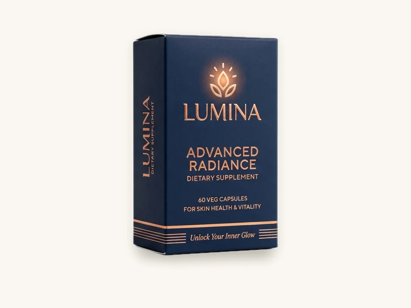
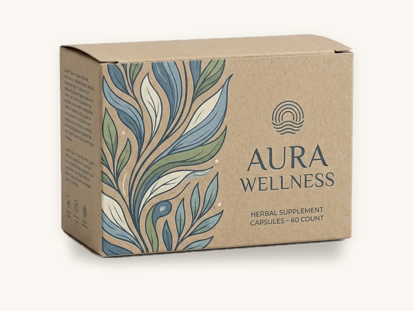
| Text on natural kraft board, one color | About 7–8 pt, avoid light weights | Absorbent, textured surface softens edges |
| White ink on kraft | About 8 pt, bold weights preferred | Opaque white needs heavier strokes to stay solid |
| Text printed on corrugated E-flute | About 7–8 pt; larger for flexo-style one-color work | Flute texture and softer surface reduce sharpness |
| Foil stamping | About 8–10 pt, avoid hairline serifs | Foil can bridge across small gaps between letters |
| Embossing or debossing | Roughly 12 pt and up, simple letterforms | The board must physically form each stroke |
| Spot UV on text | About 10 pt and up, bold weights | Registration between the print and the UV layer has slight tolerance |
| Fine rules and strokes | Keep lines at least about 0.25 pt | Thinner lines can break up or disappear |
For more on how much variation to expect in registration and color, see our packaging print tolerances guide. The printing and finishes page shows foil, embossing and spot UV samples.
Tip: avoid building small black text from all four CMYK inks ("rich black"). Tiny misregistration between plates makes the edges look fuzzy. Set small text in 100% black only, and save rich black for large areas.
Contrast, color and finishes that affect legibility
Legibility depends on contrast as much as size. A 9 pt bold word in pale gray on white is harder to read than a 7 pt regular word in black.
Contrast rules that hold up on boxes
- Dark text on light backgrounds is the most legible option for long passages such as ingredients and directions.
- Avoid text over busy photography or patterns. Place a solid panel behind required text.
- Check contrast in grayscale. If text and background look similar in grayscale, readers with color vision deficiency and shoppers in dim light will struggle. The packaging color psychology guide covers palette contrast in more detail.
How finishes change readability
Gloss lamination can create glare that hides text under store lighting, especially on dark backgrounds. Matte and soft-touch finishes reduce glare but slightly soften and darken colors, which can reduce contrast for mid-tone text. Metallic board makes light-colored text hard to read unless a white ink underlayer is used.
Line length, spacing and alignment
Keep line lengths short on narrow panels. Add slightly more line spacing to small text than you would on screen, because board and ink spread make lines feel tighter. Left-aligned text is easier to scan than centered blocks for anything longer than a few lines.
Regulated panels: food, supplements, cosmetics and drugs
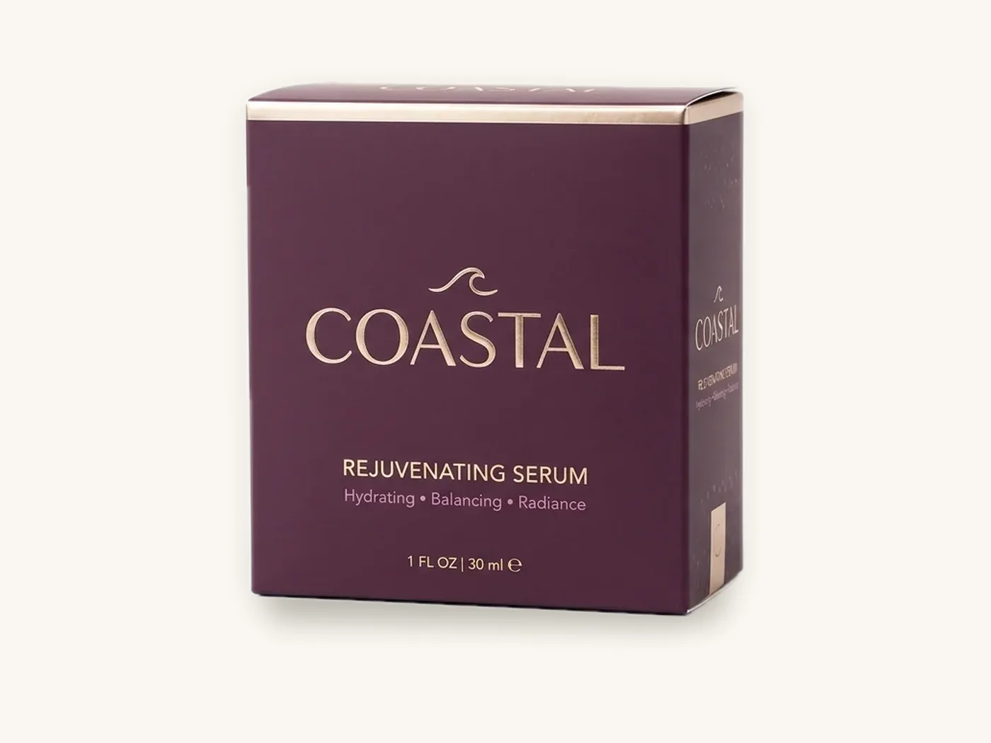
Some label information has federal rules for placement, format and, in several cases, minimum type height. The summaries below are general and are not legal advice. Regulations change and have exceptions, so confirm current requirements with the relevant agency or your regulatory counsel before approving artwork.
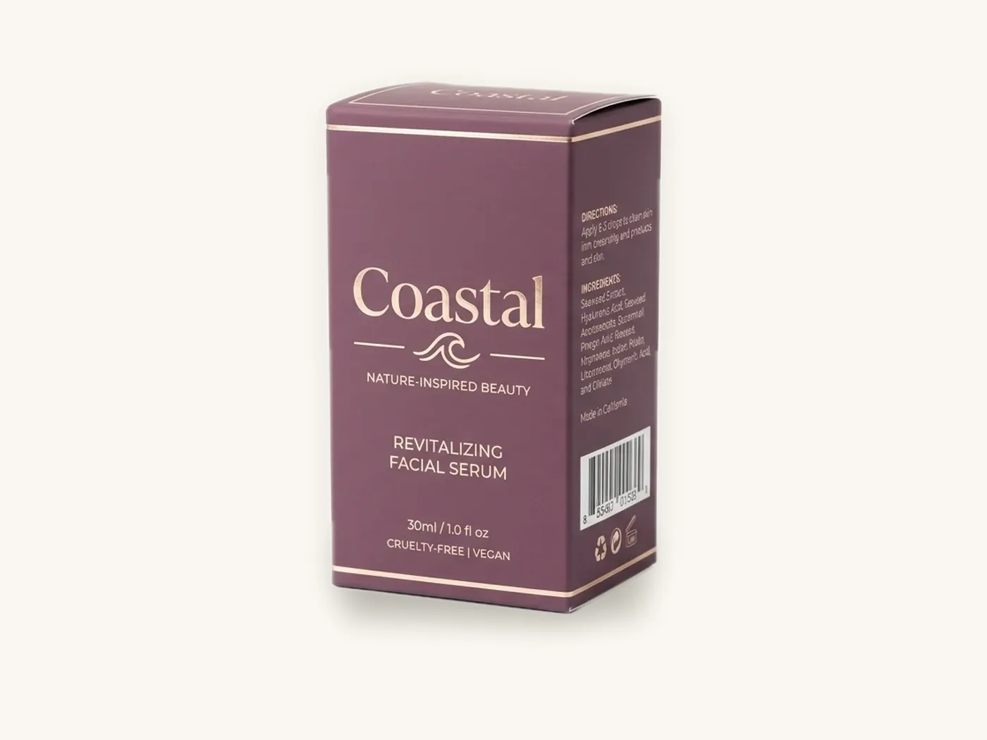
Net quantity statements on food and cosmetics
For packaged food and cosmetics, FDA rules generally require the net quantity statement to appear within the lower portion of the principal display panel, generally parallel to the base, in a minimum type height that scales with the size of that panel. The height is generally measured on the lowercase letter "o" or its equivalent. The widely referenced size bands from FDA's food labeling regulation (21 CFR 101.105) are shown below.
| Area of principal display panel | Minimum type height for net quantity |
|---|---|
| 5 sq in or less | 1/16 in |
| More than 5 up to 25 sq in | 1/8 in |
| More than 25 up to 100 sq in | 3/16 in |
| More than 100 up to 400 sq in | 1/4 in |
| More than 400 sq in | 1/2 in |
Cosmetics follow a similar framework under FDA's cosmetic labeling rules. You can read the food rule directly in the Electronic Code of Federal Regulations, and verify the current text before relying on it.
Nutrition Facts and Supplement Facts panels
FDA specifies the format of Nutrition Facts panels for food and Supplement Facts panels for dietary supplements, including the order of information, bolding, rules and minimum type sizes, with modified formats allowed for small packages. Do not redesign these panels for style. Use the specified format and fit your brand design around it. Our FDA food labeling guide and supplement label requirements guide explain what each panel must contain.
Cosmetic ingredient declarations
Cosmetics sold at retail generally need an ingredient declaration in descending order of predominance, with a minimum letter height and a smaller allowance for very small packages. Where a carton cannot hold the declaration, FDA rules provide limited alternatives. The cosmetic labeling requirements guide covers the details and recent changes.
OTC drugs, cannabis and other categories
Over-the-counter drugs use a standardized Drug Facts format with its own type rules. Cannabis and CBD products are regulated at the state level, and many states set specific warning text, symbols and sizes. Toys, pet food and other categories carry their own required statements. When in doubt, ask the regulator for the current requirement or consult counsel.
Watch out: a rebrand or a new limited edition is when regulated type most often goes wrong. A designer shrinks the back panel to fit new graphics and the net quantity or facts panel drops below the required size. Lock regulated panels as fixed zones in your template.
Barcodes, QR codes and small technical marks
Codes and small marks are part of your typography system because they compete for the same space.
UPC barcodes
Barcodes need a quiet zone (clear space) around them, dark bars on a light background and a size that meets retailer scanning requirements. Avoid placing them across a fold or on a curved edge. Our UPC barcodes on packaging guide covers sizing and placement.
QR codes
Give a QR code clear space, keep it dark on light, and print a short line of text telling people what they will get when they scan. The QR codes on packaging guide explains size and contrast checks.
Recycling marks and certification logos
Use only marks you are entitled to use and can substantiate, at a size where any required text within them remains readable. If you use FSC-certified board and want to show the FSC label, the label use is governed by FSC's own rules for logo use.
A pre-approval checklist for type on packaging
Run through this list on every proof before you approve it. It takes a few minutes and catches most of the problems that lead to reprints.
- Print the dieline artwork at 100% and fold it into a paper model if you do not yet have a sample.
- Read the front panel from about two meters. The product name and variant should be clear.
- Read every panel at arm's length in normal room lighting, not under a desk lamp.
- Check the smallest text against the practical minimums for your board and finish.
- Confirm regulated statements (net quantity, facts panels, ingredients, warnings) against current rules for your category.
- Look for type near creases, glue flaps and tuck flaps. Keep text at least 1/8 in inside every cut and fold line.
- Check small text is set in a single ink, not rich black or tints.
- Verify spelling, units and numbers in every language and version, especially if artwork has been duplicated for variants.
- Scan every barcode and QR code on the printed proof or a test print.
- Review the 3D proof to confirm type reads the right way up on every panel, including inside lids and top panels.
For launches, pair this with the planning steps in our packaging for product launch guide, so type review has time in the schedule.
Ordering type-heavy packaging from Box Sense
Supplements, cosmetics and food cartons carry a lot of text, so the proofing stage matters. Here is how to make it efficient.
What to send
- Box style and internal dimensions, such as supplement boxes, cosmetic boxes or custom product boxes
- Board and finish, since kraft, soft-touch and foil all affect minimum sizes
- Final approved label copy, including regulated text reviewed by whoever is responsible for compliance
- Artwork on our dieline with fonts outlined, or a brief for our design services team
- Quantities to price
What happens next
We confirm a quote within 24 hours. Free design support includes the dieline, artwork setup, a 3D digital proof and two revision rounds. We check artwork for print issues such as text too close to cuts, reversed type that is too fine and missing bleed; your team remains responsible for regulatory content. Unprinted structural samples are free, and a printed sample of approved artwork is free on orders of 100 or more, which is the best way to judge small type on your real board.
The minimum order is 10 boxes. Standard production is 8–12 business days after proof approval, with rush production in 5 business days on most paperboard and corrugated styles, and shipping is free on every US order. As a reference, a 3x2x5 in straight tuck end carton in 18 pt SBS with full color outside and aqueous coating is about $1.15 each at 100 units and about $0.51 at 1,000. Brands in the health and wellness space often start here; use the estimator for your size.
Frequently asked questions
What is the best font for packaging?
There is no single best font. For names, choose a display face that fits your brand's tone and stays clear at the size shoppers see from a distance. For ingredients, directions and facts panels, choose a legible sans serif or sturdy serif with a generous x-height and several weights. Confirm the font license allows use on commercial packaging.
What is the minimum font size for a product label?
It depends on what the text is and how it is printed. Legally, some statements such as net quantity on food and cosmetics have minimum type heights that scale with panel size, and facts panels have specified formats. Practically, about 6 pt positive text on white board is a common lower limit, with larger sizes needed for reversed text, kraft, foil or embossing.
How big should the net quantity be on a food box?
Under FDA food labeling rules, the minimum type height for the net quantity statement generally depends on the area of the principal display panel, ranging from 1/16 in for panels of 5 sq in or less up to 1/2 in for panels over 400 sq in. Placement rules also apply. Confirm the current regulation before approving artwork.
How many fonts should I use on a box?
Two type families are enough for most packaging: one display face for the brand or product name, and one text face for everything else. Build hierarchy with size and weight within those families. A third font can work as a small accent, but more than that usually makes a small box look disorganized and harder to read.
Can I use a script font on packaging?
Yes, for short, large words such as a brand or product name, especially in bakery, candle and gift categories. Avoid scripts for required information, long text, all-caps settings and small sizes, where they become hard to read. Also avoid thin script strokes with foil or embossing, which need sturdier letterforms to reproduce cleanly.
Why does small text look blurry on my printed box?
Common causes are text built from multiple CMYK inks, very light font weights, reversed white text on dark backgrounds, and absorbent or textured boards like kraft. Ink spread fills in thin strokes. Set small text in a single ink, use regular or medium weights, increase size for reversed text and check a printed sample on your actual board.
Do dietary supplement boxes have type size requirements?
Yes. FDA specifies the Supplement Facts panel format, including type sizes and layout, with modified formats for small packages, and other statements such as net quantity also have placement and size rules. Requirements are detailed and change over time, so confirm them with FDA guidance or regulatory counsel before approving supplement packaging artwork.
Next steps
Print your current artwork at actual size, run the checklist above and note any type that falls below the practical or regulatory minimums. Then check what your carton costs in the instant price estimator and request a quote to get a dieline and 3D proof you can review panel by panel.
Boxes in this guide
Order the packaging we covered
Written by the Box Sense Packaging Team
Our structural designers, prepress technicians and production staff print and convert custom boxes every day for brands in the United States, United Kingdom and UAE. Questions about this guide? Talk to us.