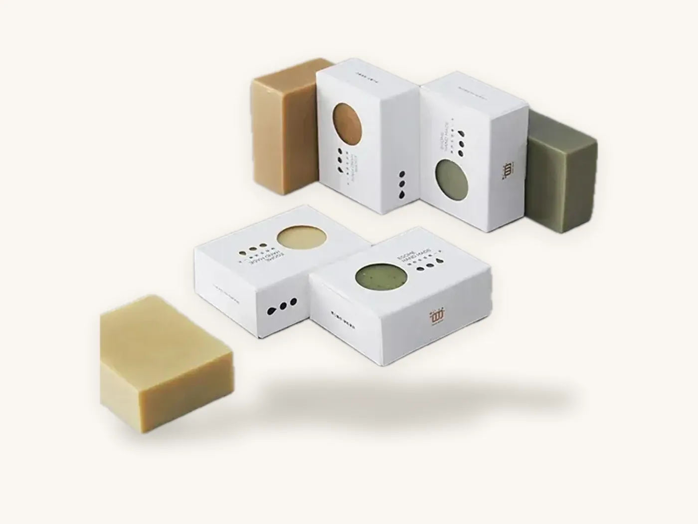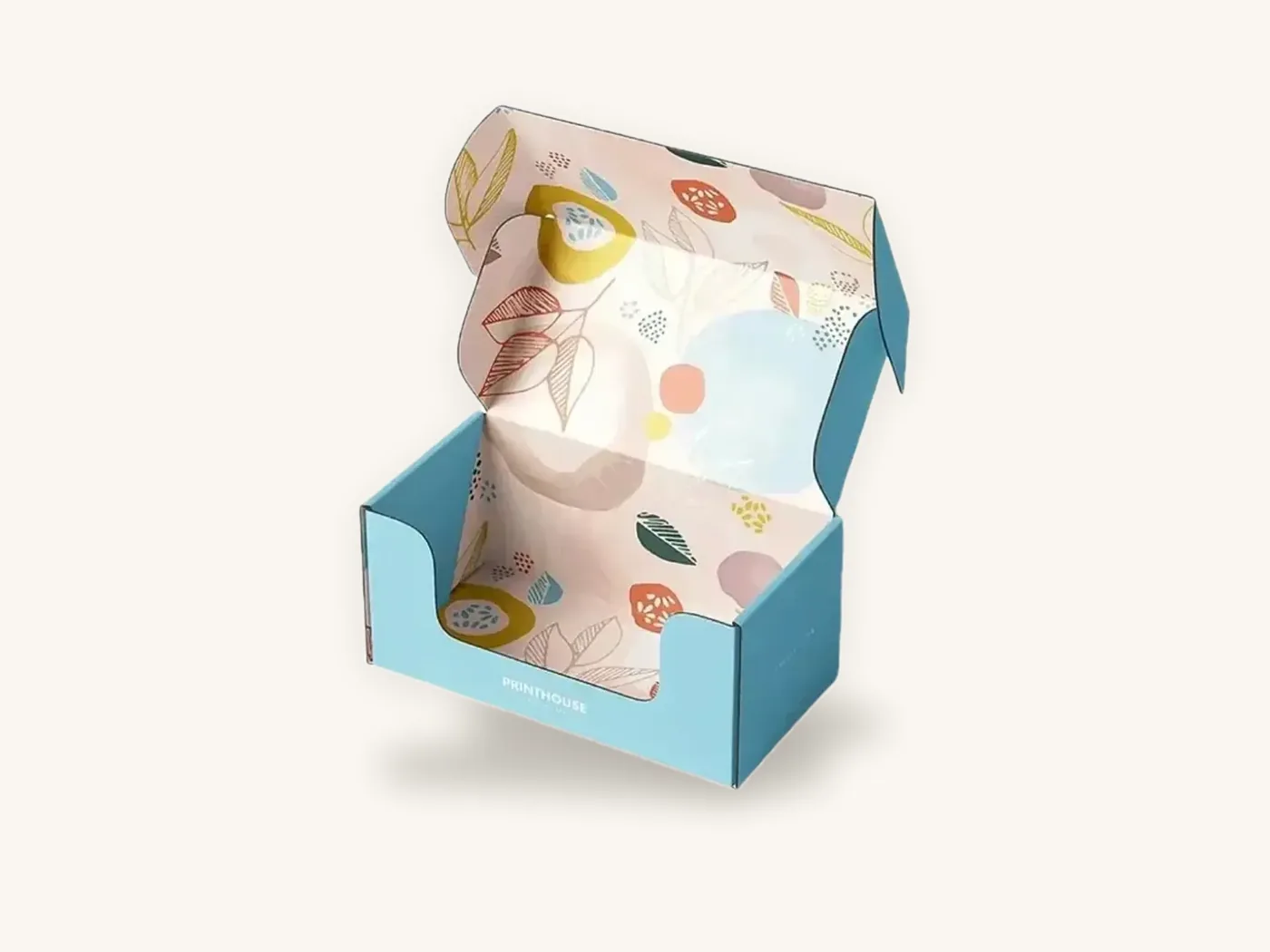
Packaging branding works when every box, carton, label and insert a customer touches looks like it came from the same company, even though each piece is printed on a different material, at a different size and often in a different month. The logo matters less than the rules behind it: which assets appear where, which colors are allowed on which board, and who approves a change.
This guide treats packaging as a system rather than a single design. It shows how to rank your brand assets, organize your packaging into tiers, keep color consistent across kraft, white and rigid stock, and write the one-page spec sheet that stops your brand from drifting every time you reorder.
Key takeaways
- A consistent packaging brand identity comes from a small set of fixed assets applied by rule, not from making every box elaborate.
- Rank assets into primary (always present), secondary (used when space allows) and supporting (used on premium pieces only).
- Organize packaging into tiers: shipper, primary retail or presentation box, and small-format pieces like labels and sleeves. Each tier gets its own rules.
- The same CMYK file prints differently on kraft, white SBS and wrapped rigid board. PMS references and substrate-specific artwork keep color believable.
- A written packaging spec sheet (board, print, finish, dieline version, color references) is the single most effective tool for consistency across reorders.
- Box Sense prints from 10 boxes with free dieline and artwork setup, which makes it practical to build the whole system in small runs before scaling.
What packaging branding actually means
Brand packaging design is often reduced to "put the logo on the box." That produces boxes that are branded but not recognizable. Recognition comes from repetition of a distinctive combination: a color, a type treatment, a graphic device, a layout habit and a physical feel.
Think of a customer who has bought from you twice. The first order arrived in a mailer; the second was a retail carton picked up in a store. If they can identify you from across the room in both cases, before reading a word, your packaging is doing its brand job. If they need to find the logo, it is not.
Identity versus decoration
Decoration is anything that changes from box to box: seasonal illustrations, product photography, flavor colors. Identity is what stays fixed. Strong systems keep identity elements few and rigid, and give decoration a defined space to change in. Weak systems do the opposite, redesigning the layout for every product while the logo is the only constant.
Why a system beats a single hero box
Most brands start with one box and then add products. Without rules, the second and third boxes are designed from scratch, usually by different people, and they drift. A system decides in advance how a new product slots in, so a launch becomes an artwork update on an existing template rather than a new design project. It also makes supplier handoffs, reorders and later refreshes far cheaper.
Build your brand asset hierarchy first
Before choosing a box style, list every visual element your brand owns and rank it. This ranking decides what appears on a 1.5 in tincture carton versus a 12 in subscription mailer.
| Asset level | Typical elements | Where it must appear | Rule of thumb |
|---|---|---|---|
| Primary | Wordmark or logo, one core brand color | Every piece, including labels and tape | Never altered, only scaled |
| Secondary | Brand pattern, secondary palette, headline typeface | Any surface larger than a business card | Can be cropped or recolored within palette |
| Supporting | Illustration style, photography, taglines, icons | Retail faces, inside lids, premium boxes | Changes by product line or season |
| Tactile | Finish (matte, soft-touch), foil color, emboss | Presentation and gift tiers | Chosen once per tier, not per SKU |
| Structural | Opening style, insert color, closure | Presentation and shipper tiers | Keep consistent within a tier |
Choosing one ownable color
A single primary color used consistently does more for recognition than a rich palette used loosely. Pick one that you can reproduce on your hardest substrate, which for most brands is kraft. A pale lilac that looks elegant on white board may turn muddy on brown. If your hero color cannot survive kraft, either commit to white board everywhere or choose a color that can. Our guide to packaging color psychology covers what different hues tend to signal.
Type as an identity asset
A consistent headline typeface, set with the same weight, case and letter spacing, is one of the cheapest recognition tools you have. Limit packaging to two type families at most, and define minimum sizes for each tier so fine body copy stays legible on small cartons. The packaging typography guide goes deeper on sizing and legibility.
Organize packaging into tiers
A box system is easier to manage when every piece belongs to a tier with its own purpose and budget. Most direct-to-consumer and retail brands end up with three to four.
Tier 1: the shipper
The outer box that travels through the carrier network. Its job is protection and quick identification. It gets scuffed, labeled and handled, so detailed artwork is wasted on the outside. A one- or two-color logo on custom shipping boxes, or a bold full-color exterior on a custom mailer box that doubles as presentation, both work. Decide which role the shipper plays and design for that.
Tier 2: the primary product box
The carton or rigid box the product lives in. On a shelf it must communicate category, product name and your brand in about the time it takes someone to walk past. For e-commerce it carries the unboxing moment. Custom product boxes in SBS paperboard are the workhorse here, with tuck end and auto-lock bottom styles covering most sizes. The folding cartons page shows the common structures.
Tier 3: presentation and gift
Rigid boxes, magnetic closures, sleeves and drawer boxes for gift sets, bundles and VIP orders. This is where tactile assets like soft-touch lamination and foil belong. Use this tier sparingly; if every order arrives in a premium box, it stops feeling premium.
Tier 4: small-format brand carriers
Custom labels and stickers, hang tags, tissue, tape and insert cards. These are the pieces that let a plain stock box carry your identity, and they are the fastest way to bring a new product into the system before its custom carton is ready.
| Tier | Main job | Typical format | Brand assets used | Budget focus |
|---|---|---|---|---|
| Shipper | Protection, identification | Mailer or RSC, E- or B-flute | Primary only, or primary + pattern | Board and size |
| Product box | Shelf read, product info | Folding carton, 14–24 pt SBS or kraft | Primary + secondary + supporting | Print quality |
| Presentation | Gifting, perceived value | Rigid, magnetic, sleeve | All, plus tactile | Finish and structure |
| Small format | Extend brand onto stock items | Labels, tags, tissue, tape | Primary + pattern | Quantity and coverage |
Tip: design the smallest piece in the system first. If your logo lockup, color and pattern read clearly on a 2 in round sticker, they will scale up to any box. Designing a mailer first and shrinking it down usually breaks.
Keep color consistent across different boards
This is where most packaging brand identity systems fail in practice. A brand approves a color on a white carton proof, then orders kraft mailers with the same CMYK file and wonders why the result looks dull and brownish.
Why the same file prints differently
Ink is translucent. On white SBS, the white board reflects light back through the ink, so colors look bright. On kraft, the brown fibers sit under the ink and darken every color. Corrugated board has a slightly less smooth surface than paperboard, which can soften fine detail. Rigid boxes use a printed wrap paper glued over greyboard, and the lamination on top shifts how saturated the color appears.
| Substrate | How color behaves | What to specify |
|---|---|---|
| White SBS paperboard | Brightest, closest to screen proof | CMYK or PMS; aqueous or lamination |
| Kraft paperboard or kraft corrugated | Darker, warmer, lower contrast | White ink underlay for light colors, or dark one-color designs |
| White-lined corrugated (E-flute) | Bright but slightly softer detail | Avoid hairline type; keep small text above about 6 pt |
| Wrapped rigid board | Depends on wrap paper and lamination | Match wrap paper to carton proof; confirm finish before color approval |
| Label stock (paper or film) | Varies by face stock and varnish | Request a printed sample next to a carton |
Practical color controls
- Name PMS references for primary colors. CMYK builds shift between presses and print methods; a named spot reference gives the printer a target. See CMYK vs Pantone for packaging for when a spot color is worth it.
- Create a kraft version of your artwork. Decide which elements get opaque white ink underneath and which print directly on brown.
- Approve color on the real board. A screen proof confirms layout; only a printed sample confirms color.
- Keep a physical reference set. Store one approved sample of each tier. When a reorder arrives, compare against the sample, not against memory.
- Accept a tolerance. Different substrates will never match exactly. Aim for "clearly the same brand," not identical readings.
Material choice itself sends a brand signal, so compare SBS paperboard and kraft paperboard side by side before committing a whole system to one.
Design templates that scale to new products
A packaging system earns its keep when you add SKU number twelve. The goal is a template where a new product needs only new copy and perhaps a flavor or variant color.
Fixed zones and flexible zones
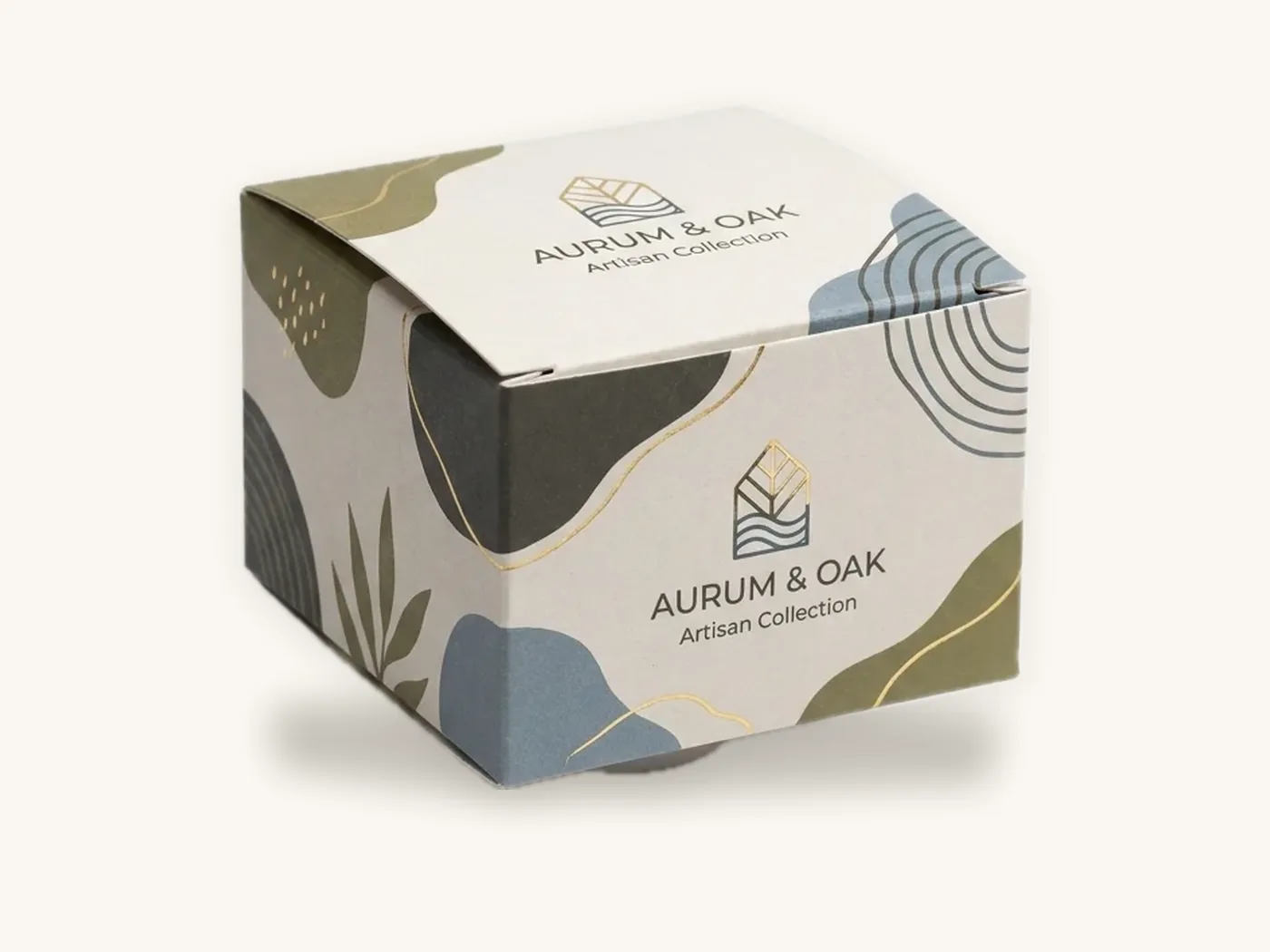
Divide each carton face into zones. Fixed zones hold the logo, the brand bar or pattern, and the legal information block, always in the same position. Flexible zones hold product name, variant color, imagery and claims. Document the zones with measurements from the panel edges so a designer six months from now reproduces them exactly.
Variant color coding
If you sell multiple scents, flavors or strengths, a variant color system helps shoppers and warehouse staff alike. Keep variant colors in a defined band of the panel and never let them replace your primary brand color. A shopper should read "your brand" first and "lavender" second.
One dieline family
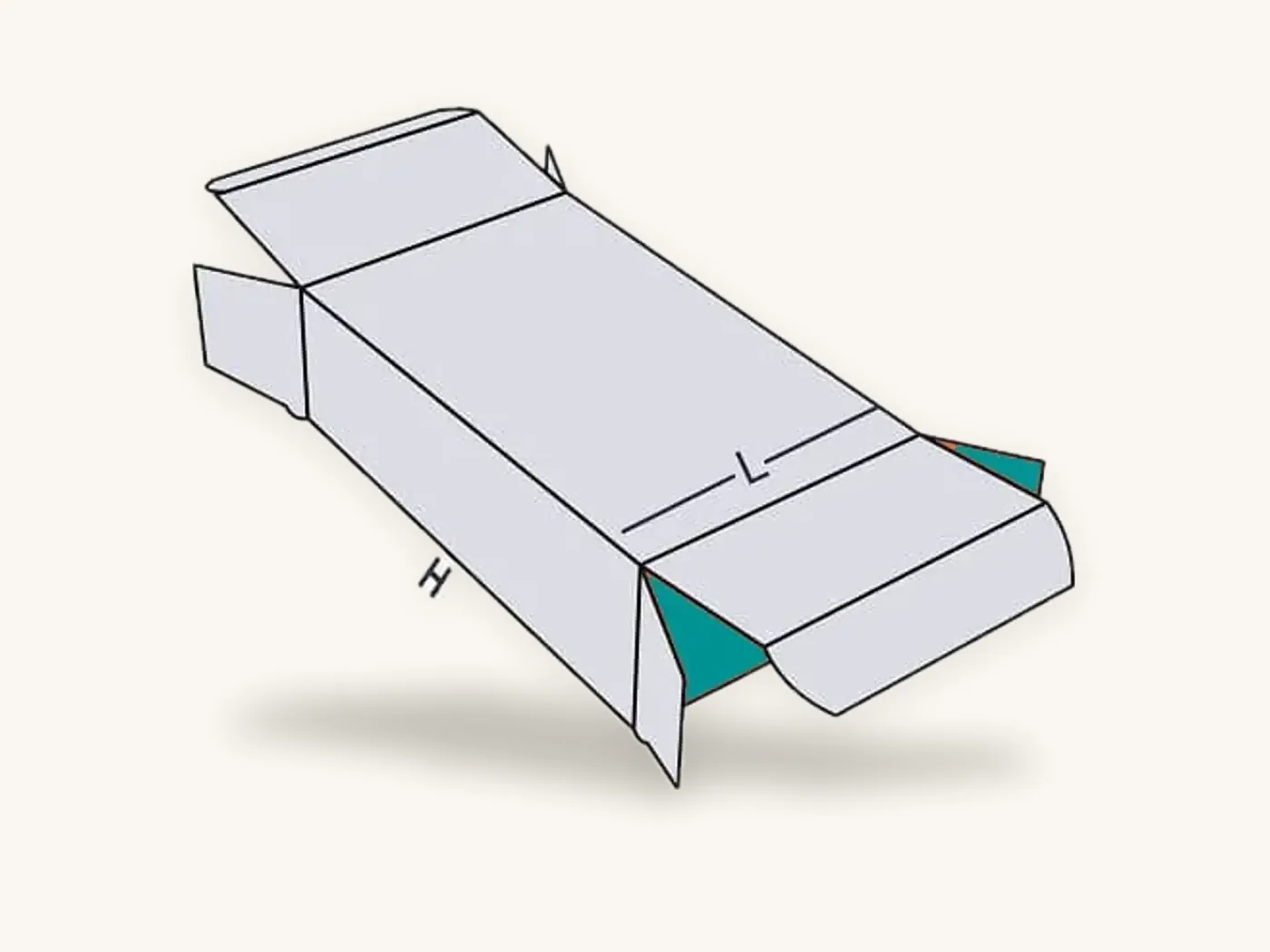
Where possible, use a small number of structures in a few sizes. Three carton sizes built on the same tuck style give a neater shelf, simpler storage and artwork templates that transfer between sizes. If you are unsure how structures are drawn, what is a dieline explains panels, glue flaps and bleed.
Brand the inside, the details and the small pieces
A consistent identity is not only about exterior faces. The places customers notice after opening often do more for memory than the outside.
Inside lids and insert cards
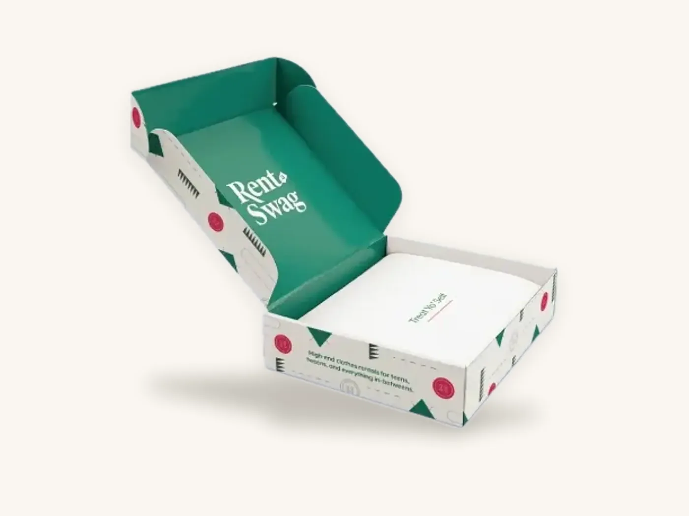
An inside lid printed with your pattern, or a single line of copy in your headline typeface, carries the brand into the unboxing. Insert cards repeat the same type and color, so the paperwork looks like part of the product instead of an afterthought.
Labels as system glue
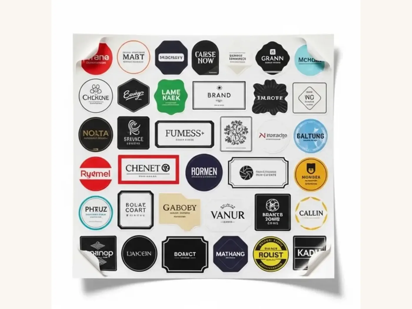
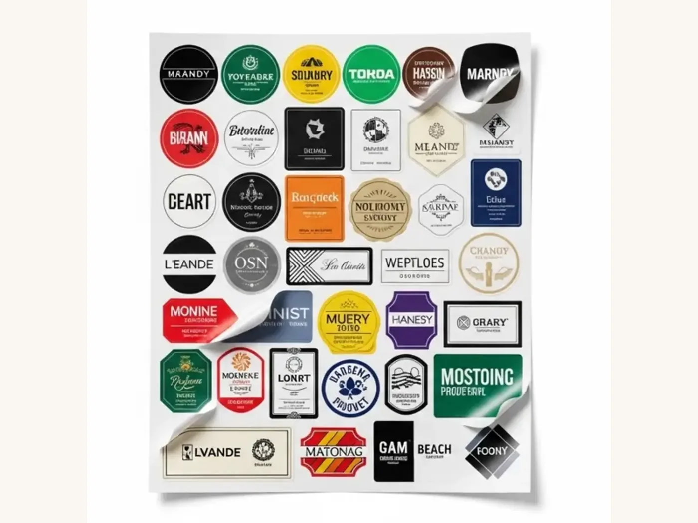
Labels let you bring stock boxes, pouches, jars and bags into the same identity. A branded seal on tissue, a variant sticker on a plain carton, or a closure label on a mailer all apply your primary assets at very low cost. They also carry batch codes and dates, which is useful when a product changes faster than you can reprint cartons.
Tape, tissue and void fill
Printed tape or a tear strip on a shipper, and printed tissue paper inside, turn an ordinary box into a branded one. Keep these to your primary color and pattern; they do not need product-level detail.
Write a packaging brand spec sheet
The spec sheet is the document that turns design intent into repeatable production. Without it, each reorder relies on email threads and whoever remembers the last run. Keep it to one page per packaging item.
What the spec sheet should include
- Item name and internal code (for example, "Carton, Small, Tuck End v2")
- Structure and style, with the dieline file name and version
- Internal dimensions (length x width x depth)
- Board type and caliper, for example 18 pt SBS or E-flute white-lined corrugated
- Print method, number of colors, inside or outside printing
- Named PMS references and which elements use them
- Coating or lamination, plus any foil, emboss or spot UV areas
- Insert type and material, if any
- Approved sample date and where the physical reference is stored
- Owner who approves any change
Version control
Every artwork file should carry a version number in the file name and a tiny version code in a non-visible area of the dieline, such as a glue flap. When a customer or retailer reports a problem, you can then tell exactly which run it came from.
Watch out: "small" changes such as a new ingredient line or a moved barcode are where drift starts. Treat any change to a fixed zone as a controlled revision, update the spec sheet and approve a new proof.
Budgeting a consistent system
Consistency does not require premium finishes on every tier. It requires spending deliberately where each tier's job is done.
A reasonable starting system for a small brand might be a kraft or white mailer as the shipper, an SBS carton as the product box, and a label or sticker to brand anything else. As a reference point, a straight tuck end carton in 18 pt SBS at 3x2x5 in, full color outside with aqueous coating, runs about $1.15 each at 100 units and about $0.51 at 1,000. A kraft tuck carton in 18 pt kraft at 4x3x2 in with one-color print is roughly $0.81 at 100 units. An 8x6x3 in E-flute mailer with full color outside is about $2.64 at 100 units. All include free US shipping, and the instant price estimator will show your exact sizes.
Where to spend and where to save
- Spend on print quality and color control for the product box, because it carries the most information and sits closest to the customer.
- Spend on finish for the presentation tier, where tactile assets carry the brand.
- Save on shipper print coverage when the product box does the presentation work.
- Save by using one foil color and one emboss design across the system; each finish carries one-time tooling, so reusing the same foil or emboss design is the efficient route.
How to build your box system with Box Sense
Building a system is easier in stages: prove the templates in short runs, then scale the pieces that are working.
What to send us
- A list of the packaging items you need, grouped by tier
- Product dimensions and weights for each item
- Your logo files (vector), brand color references (PMS where you have them) and typefaces
- Any existing packaging you want the new system to match or replace
- Target quantities for each item and a target in-hand date
- Artwork, or a request for help from our design services team
How the process runs
- Quote within 24 hours for each item and quantity.
- Dielines and artwork setup are free, with a 3D digital proof and two revision rounds for each design.
- Samples. Unprinted structural samples are free, which lets you check the whole family of sizes together. A printed sample of approved artwork is free on orders of 100 or more.
- Production takes 8–12 business days after proof approval, with rush in 5 business days on most paperboard and corrugated styles.
- Delivery is free on every US order; international shipping is quoted at cost.
The minimum order is 10 boxes, so you can print a small run of every tier, test the system on real customers, and reorder at scale once the look is settled. Digital printing covers short runs and offset takes over for larger ones; if you are matching colors across both, keep the approved sample from the first run as your reference.
If you sell under a retailer's or distributor's brand as well as your own, private label packaging explains how to run two identities from one set of structures. And when the time comes to change the system, the packaging redesign guide covers how to do it without confusing loyal customers.
Frequently asked questions
What is packaging branding?
Packaging branding is the practice of applying a brand's visual and tactile identity consistently across all of its packaging, including shipping boxes, product cartons, labels and inserts. It relies on fixed assets such as a logo, primary color, typeface and pattern, used by clear rules, so customers recognize the brand on any piece before reading the name.
How do I make my packaging look consistent across different products?
Use a shared template with fixed zones for the logo, brand color and legal information, and flexible zones for product names and variant colors. Keep structures to a small family of sizes and styles, document every item on a spec sheet, and approve color on real printed samples rather than on screen.
Why does my brand color look different on kraft boxes?
Printing inks are translucent, so the brown kraft fibers underneath darken and warm every color. Light and pastel colors are affected most. Use opaque white ink beneath light colors, choose a darker brand color that survives kraft, or keep kraft for one-color designs and use white board where full color matters.
How many packaging pieces does a small brand need?
Many small brands start with three: a shipper or mailer, a product box and a label or sticker that brands everything else. Add a presentation tier, such as a rigid or magnetic box, only for gift sets or high-value bundles. Labels and tissue let stock packaging join the system cheaply while custom cartons are still being developed.
Should my shipping box be plain or printed?
It depends on the shipper's role. If the product has its own branded carton inside, a one-color logo on the outer box is usually enough, since the exterior gets scuffed and labeled. If the mailer is the presentation box, print it fully and consider inside printing, because it carries the whole unboxing.
What is a packaging spec sheet?
A packaging spec sheet is a one-page record for each packaging item listing structure, dieline version, dimensions, board and caliper, print method, PMS references, coatings, finishes, inserts and the approved sample date. It lets any supplier or new team member reproduce the item exactly, which prevents gradual drift across reorders.
Can I build a branded packaging system with small quantities?
Yes. Box Sense produces custom boxes from 10 units using digital printing for short runs, with no die or plate charges. That makes it practical to print a small batch of every piece in your system, test how they look together and with customers, then reorder larger quantities of the items that work.
Next steps
List every packaging item you use today, sort them into tiers and note which brand assets each one carries. That exercise alone usually shows where the drift is. Then check costs for each tier in the packaging price estimator, and request a quote for your box system so we can supply dielines and proofs for the whole family at once. For file setup, the artwork preparation guide covers bleed, safe zones and color modes.
Boxes in this guide
Order the packaging we covered
Written by the Box Sense Packaging Team
Our structural designers, prepress technicians and production staff print and convert custom boxes every day for brands in the United States, United Kingdom and UAE. Questions about this guide? Talk to us.