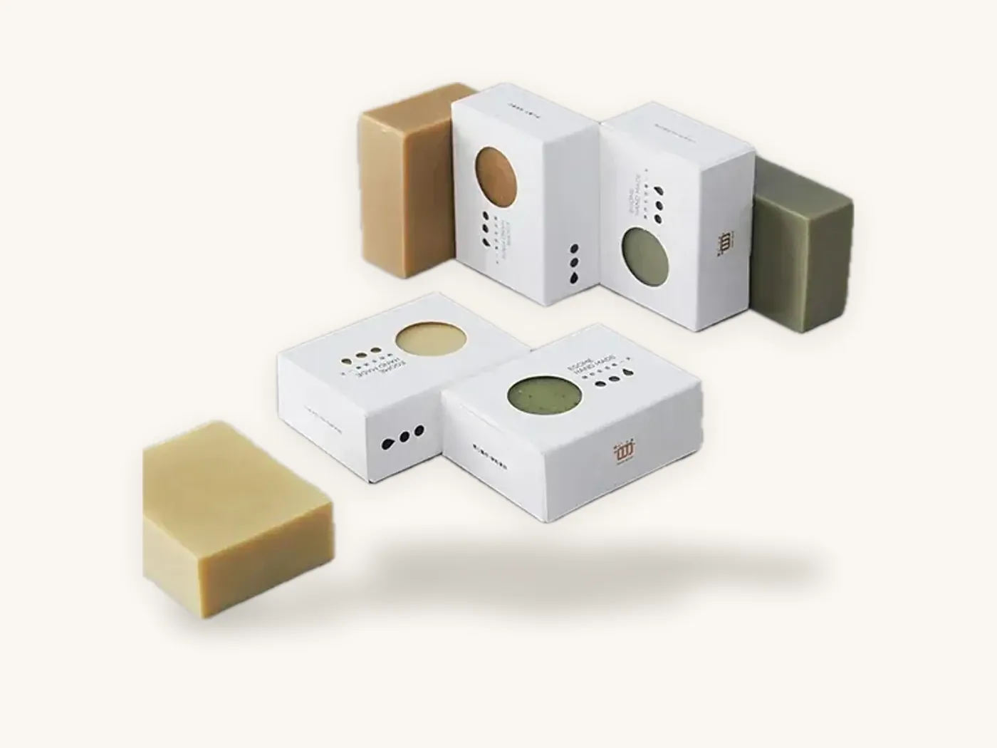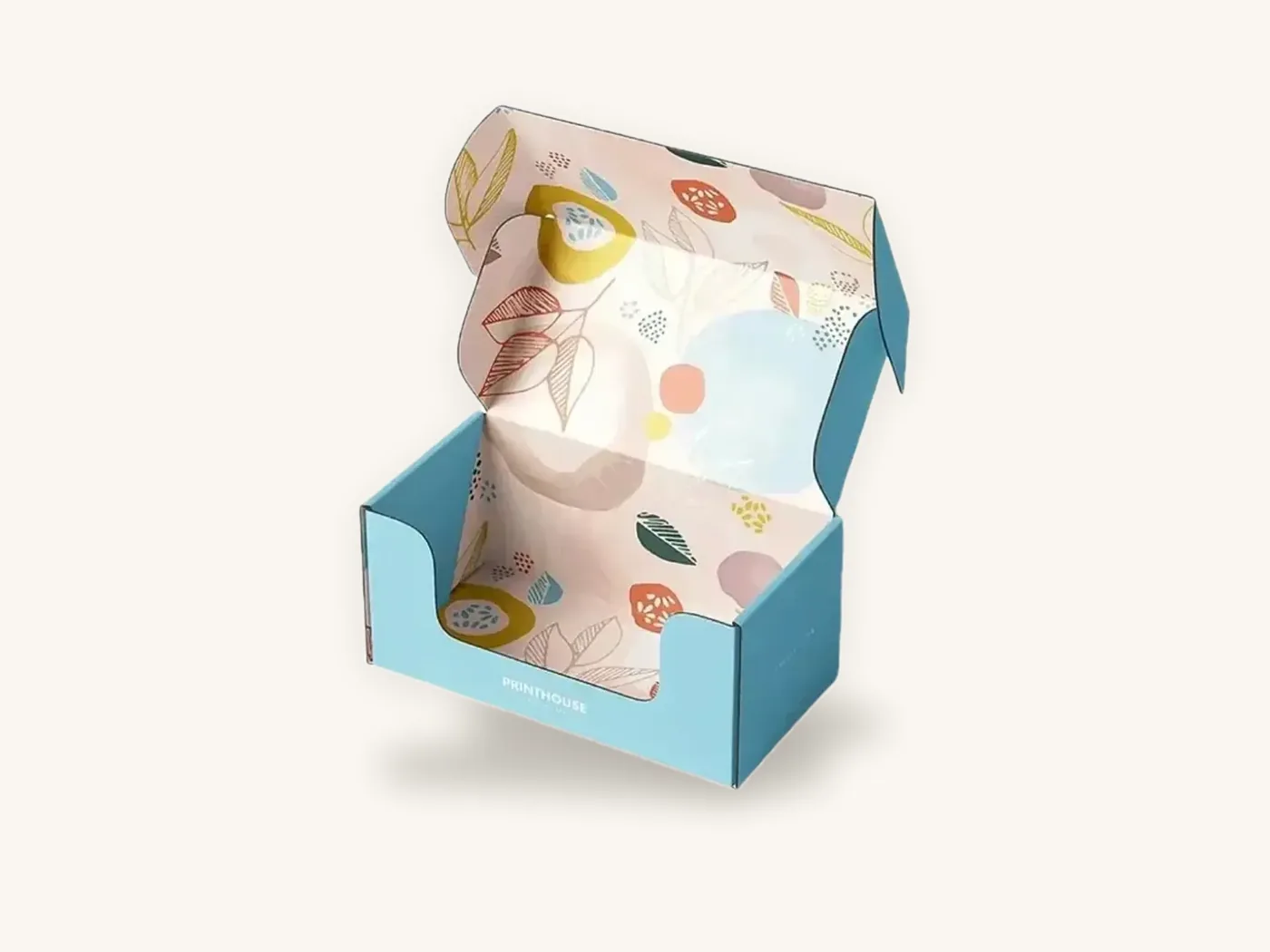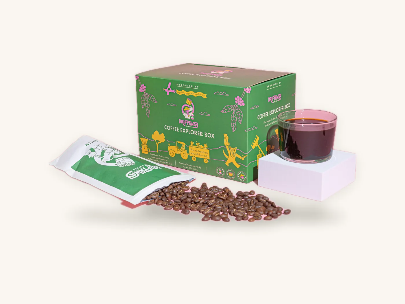
A packaging redesign is worth doing when your current boxes are causing a real problem, such as shoppers misreading what the product is, a range that has become inconsistent, a new retail channel, or a cost or material change. It is risky when the only reason is that the team is tired of looking at the old design. The customers who already buy from you find you by shape, color and layout, and a redesign that removes those cues can make them walk straight past you.
The safest approach is to decide first what must stay, then change only as much as the problem requires. This guide walks through the triggers that justify a packaging refresh, a scale for how far to go, an audit of the cues loyal buyers rely on, low-cost ways to test before committing, and a rollout plan that handles old inventory, retailers and regulatory copy.
Key takeaways
- Redesign to solve a named problem, not because the design feels old internally. Write the problem down before briefing a designer.
- Most brands need an evolution, not a revolution. Keep your most recognizable cues and fix what is not working.
- Run a distinctive asset audit of color, shape, logo placement, type and imagery. Protect whatever customers actually use to find you.
- Test with real printed samples and real shoppers or customers before a full run. Short digital runs from 10 boxes make this cheap.
- Plan the changeover: run down old stock, update retailer and marketplace images, and consider "new look" messaging on the first run.
- Re-check every piece of regulatory copy during a rebranding packaging project; a redesign is the moment old errors get copied forward or new ones slip in.
Signs it is time for a packaging refresh
Some reasons for a redesign are strong, some are weak, and a few are warning signs that the problem is not the packaging at all.
Strong reasons
- Shoppers misunderstand the product. Customer service questions, reviews or retailer feedback show people cannot tell what the product is, who it is for or which variant to buy.
- The range has grown messy. Each new product was designed separately, and the shelf or product page no longer looks like one brand.
- A new channel has different needs. Moving from online-only to retail shelves demands a readable front face, a barcode and often a different structure.
- A material or structure change. Switching to kraft, FSC-certified board or plastic-free windows changes how the existing artwork prints.
- The brand itself has changed. A new name, a merger, a repositioning from budget to premium, or a new core audience.
- Damage or practical failures. The box crushes, the lid pops open or the product rattles.
Weak reasons
- The team has seen the box every day for years and is bored of it. Customers have seen it far less.
- A competitor redesigned.
- A trend looks appealing. Trends date quickly, and the packaging design trends guide is best read as options, not instructions.
Warning signs the problem is elsewhere
If sales fell because of price, availability, product quality or distribution, new packaging will not fix it and may confuse remaining buyers. Check those first.
How much to change: the redesign scale
"Redesign" covers everything from updating a typeface to replacing the whole identity. Placing your project on a scale up front keeps the design brief honest and sets expectations for cost and risk.
| Level | What changes | What stays | Risk to recognition | Typical trigger |
|---|---|---|---|---|
| 1. Tidy-up | Copy hierarchy, legibility, small layout fixes | Colors, logo, structure, imagery style | Very low | Confusing information, new regulatory copy |
| 2. Refresh | Type, pattern, photography, finish | Core color, logo, overall layout | Low | Dated look, messy range |
| 3. Evolution | Layout system, secondary palette, structure update | Core color and logo, key shape cues | Moderate | New channel, premium repositioning |
| 4. Rebrand | Logo, name or color, possibly structure | Maybe one or two cues | High | Merger, new name, new audience |
| 5. Category reset | Everything, including format | Nothing visible | Very high | Entering a new category or market |
Most packaging problems are solved at levels 1 to 3. Level 4 and 5 projects need a deliberate plan to bring existing customers along, because you are asking them to relearn how to find you.
Match the level to the problem
A useful habit is to write one sentence: "We are changing the packaging because ___, and we will know it worked if ___." If the problem is "shoppers cannot tell our two strengths apart," a level 1 or 2 fix with clearer variant coding is enough. If the problem is "retail buyers see us as a budget brand," you may need a level 3 evolution with new board, finish and structure.
Audit your distinctive brand assets before designing
A distinctive asset is anything a customer uses to recognize your brand without reading the name: a specific color, a box shape, a logo position, a pattern, a typeface, a character or illustration style. Before the designer starts, list them and judge how recognizable each one is.
How to run the audit
- Collect every current packaging item and lay them out together, plus screenshots of your product pages.
- List each recurring visual cue: color, shape, logo placement, type, pattern, imagery, finish, window, structure.
- Ask real customers what they remember about your packaging without showing it. Even a handful of short conversations or a simple email question is revealing.
- Show cropped or unbranded versions of your box to a few customers and see whether they identify it.
- Rate each cue: strongly recognized, somewhat recognized, not noticed.
- Decide: keep strongly recognized cues, consider improving somewhat recognized ones, and feel free to change unnoticed ones.
A hypothetical example
Say a small snack brand sells granola in a kraft carton with a mustard-yellow band across the top and a hand-drawn illustration. Customer conversations suggest people remember "the brown box with the yellow stripe" but nobody mentions the illustration or the typeface. A sensible redesign keeps the kraft board and yellow band, cleans up the type for legibility, and replaces the illustration with clearer flavor imagery. The shelf cue survives, and the problem of hard-to-read flavors gets fixed.
Watch out: the element designers most often want to change is the brand color, and it is usually the one customers rely on most. Change a core color only when there is a strong reason, and if you do, consider a transition period where old and new colors both appear.
Brand cues by product category
What customers rely on differs by category, which affects how bold a packaging refresh can be.
| Category | Cues customers commonly rely on | Safer to change | Handle carefully |
|---|---|---|---|
| Cosmetics and skincare | Color family, carton shape, logo position, finish | Photography, secondary type, pattern | Shade or variant color coding |
| Food and snacks | Band or block color, window, flavor colors, format | Illustration style, copy hierarchy | Front-of-pack format, allergen and nutrition layout |
| Supplements | Color by product line, bottle or carton format | Graphic style, benefit icons | Strength or dosage coding, required label text |
| Candles and home | Finish, box style, typography, label shape | Imagery, inside printing | Scent naming and color system |
| Apparel and accessories | Mailer or box color, logo, tissue, closure | Pattern, inside messages | Core box color and shape |
Cosmetics and beauty
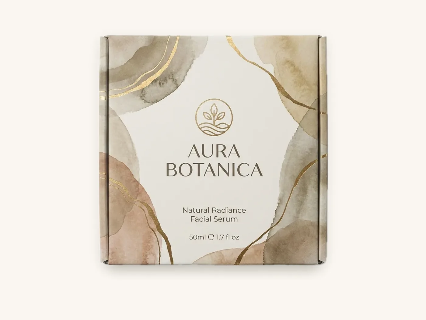
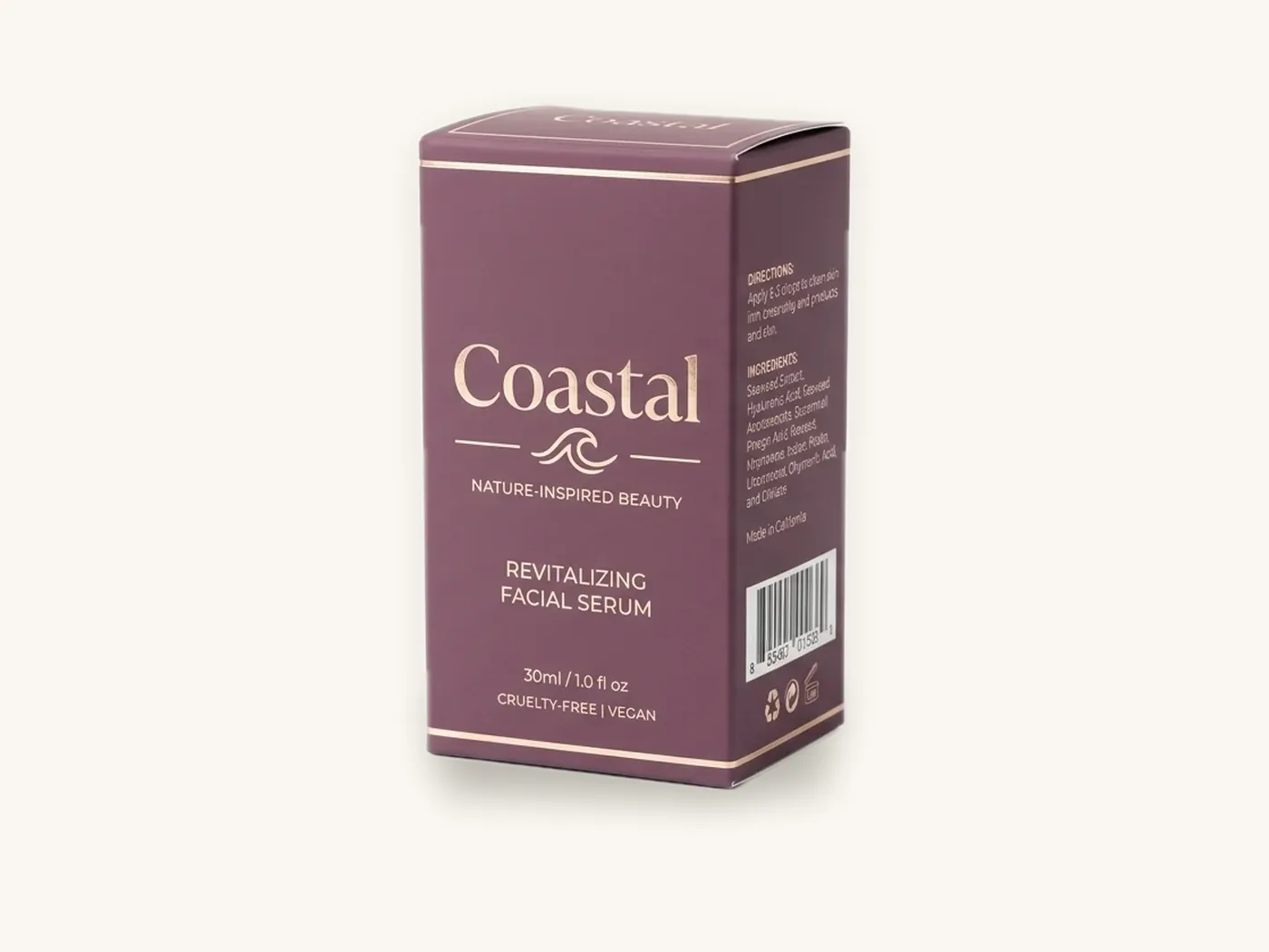
Cosmetic boxes often rely on color and finish, such as a soft-touch carton with foil. A refresh can modernize type and imagery while keeping those. The cosmetics and beauty packaging page shows common carton styles, and cosmetic labeling requirements outlines the copy that must survive the redesign.
Food packaging
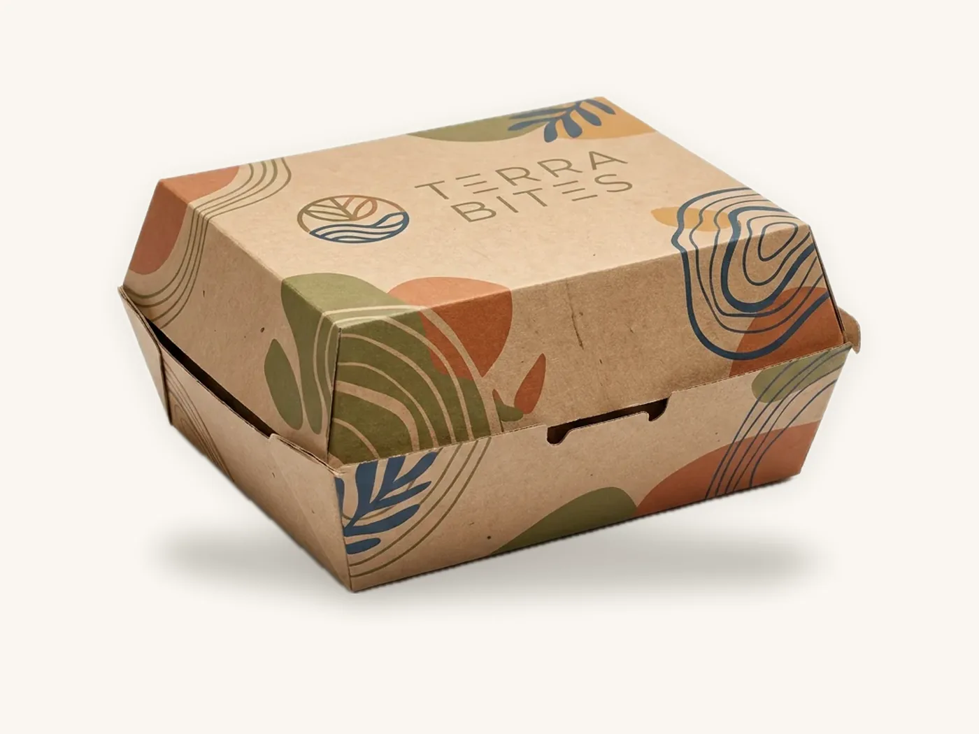
Custom food boxes are often shopped quickly, so front-of-pack format and flavor coding matter. Any redesign must keep required label elements correct and placed where regulations expect. Review the FDA food labeling guide and confirm current requirements with the FDA or your regulatory advisor. The food and beverage packaging page covers structures from cartons to window boxes.
Test before you commit to a full run
A rebranding packaging decision should not rest only on screen mockups. Screens hide what matters most on packaging: printed color on real board, finish in real light and how the box looks among others.
Low-cost testing methods
- Printed prototypes. Print a short run of the new design on the real board and finish. With a 10-box minimum and digital printing, you can test two or three directions side by side.
- Shelf simulation. Place prototypes among competitor boxes, or among your own range, and photograph from a shopper's distance. Ask someone unfamiliar to find your product.
- Squint and distance test. View both old and new from several feet away. Which reads as your brand faster?
- Customer conversations. Show existing customers old and new together and ask which they would pick up, what each communicates, and whether the new one still looks like you.
- Online image test. Product thumbnails are tiny. Check the new box at thumbnail size on a phone.
- Unboxing test. For e-commerce brands, send prototypes to a handful of friendly customers and ask for honest reactions.
What to listen for
Pay most attention to confusion: "Is this the same product?", "Did the formula change?", "I did not recognize it." Those responses point to a lost cue. Pay less attention to simple preference between two designs, which is often driven by novelty.
Tip: keep the old box in every test. Comparing two new directions against each other tells you which is prettier; comparing each against the current box tells you which keeps your customers.
Planning the rollout without losing customers
The design is only half the job. How you switch over decides whether loyal buyers notice a better box or think you disappeared.
Rollout sequence
- Freeze the design system. Approve templates, color references and a spec sheet for every item. Our guide to packaging as branding shows how to structure these.
- Order structural samples for any changed sizes or styles, and test fit.
- Update and proof artwork for every SKU, including regulatory copy review.
- Plan inventory run-down. Calculate how many weeks of old packaging you have and schedule the new run to arrive as old stock runs low. Avoid scrapping large quantities, and avoid long stretches with both designs on the same shelf.
- Notify retailers and marketplaces ahead of the change with new images, a switch date and any new barcodes if product identity changes.
- Update your own channels: product photos, ads, email templates and customer service scripts.
- Launch with messaging where it helps: a "new look, same formula" flag or insert card on the first run.
- Monitor customer questions, returns and reviews for confusion in the first weeks.
- Remove transitional messaging on the next reorder once the new look is established.
Handling old inventory
If you have large stocks of old cartons, options include using them for a specific channel such as wholesale, adding a transitional sticker that previews the new look, or timing the switch to a natural break like a seasonal range. Reprinting everything at once is rarely necessary. A phased rollout by product line spreads cost and gives you a chance to adjust.
Retail and marketplace considerations
Retailers may need notice before packaging changes, especially if dimensions, case packs or barcodes change. Marketplace listings need updated images so customers do not receive something that looks different from the photo. When the product itself has not changed, say so clearly in the listing and on the pack.
Structure, material and sustainability changes
Some redesigns are driven by structure or material rather than graphics, and these change how artwork behaves.
Switching board
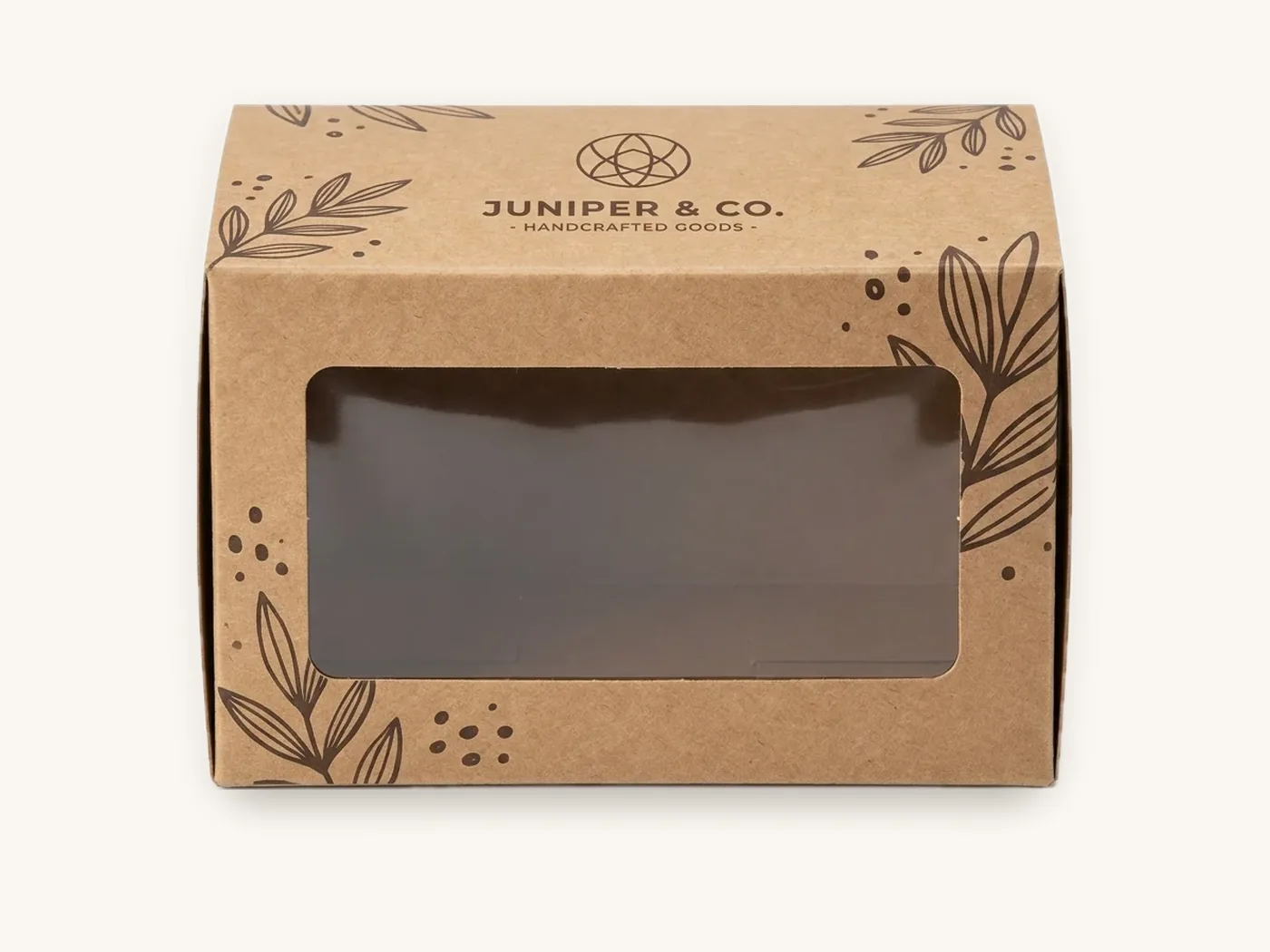
Moving from white SBS to kraft, or adding recycled content, darkens colors and reduces contrast. Existing artwork usually needs adjustment, often with opaque white ink under light colors. Always approve on a printed sample. The eco-friendly materials page and sustainability page cover FSC-certified boards, soy and water-based inks, aqueous coatings and PLA windows.
Adding environmental claims
If the redesign adds recyclability, compostability or "eco" language, the claims must be accurate and substantiated. The FTC's Green Guides describe how environmental marketing claims should be qualified in the US. Our green claims on packaging guide summarizes the principles; confirm current guidance with the FTC or counsel.
Changing structure
A new structure, such as moving from a tuck end carton to a window box, or from a plain RSC to a printed mailer, means a new dieline and a new fit test. If you are unsure how panels and flaps map to artwork, what is a dieline explains it.
What a packaging redesign costs
The design fee is only one line. The full cost includes artwork adaptation across every SKU, prototypes, tooling for any new finishes, and any old stock you write off.
| Cost driver | What affects it | How to control it |
|---|---|---|
| Design and artwork adaptation | Number of SKUs and panel sizes | Build one template, then adapt; use free dieline and artwork setup |
| Prototypes and testing | Number of directions tested | Test two or three directions in short digital runs |
| New finishes | Foil, embossing, spot UV, inserts | Reuse one foil and emboss design across the range |
| Structure changes | New sizes or styles | Change structure only where it solves a problem |
| Old inventory | Weeks of old stock on hand | Time the switch to run-down; use old stock in one channel |
| Channel updates | Photography, listings, retailer materials | Shoot new packaging from the first short run |
Reference unit prices
Unit price depends mainly on size, board, print, finish and quantity. As references, a cosmetic carton in 18 pt SBS at 2.5x2.5x6 in, full color with soft-touch and foil, is about $2.91 each at 10 units, about $1.93 at 100 and about $0.86 at 1,000. A straight tuck end carton in 18 pt SBS at 3x2x5 in, full color with aqueous coating, runs roughly $1.73 at 10 units and about $0.51 at 1,000. A window box in 18 pt SBS at 4x4x4 in is about $1.66 at 100. All include free US shipping, and one-time tooling is about $60 for foil, $60 for embossing and $40 for spot UV when chosen.
Those figures make the testing stage inexpensive relative to the full program. For broader budgeting, see the custom packaging cost guide and how much custom boxes cost, or model your exact spec with the instant price estimator.
Redesigning your packaging with Box Sense
We can support a redesign from the first prototype through the full rollout, including matching the new look across different board types.
What to send
- Your current packaging, or photos and specs of it
- The problem the redesign should solve and the level of change you expect
- New artwork or design direction, or a request for help from our design services team
- Any structure, size or material changes
- SKUs and quantities for prototypes and the first production run
- Your target switch date and how much old stock remains
How it runs
- Quote within 24 hours, including prototype and production quantities.
- Free dielines and artwork setup with a 3D digital proof and two revision rounds per design.
- Prototypes. Unprinted structural samples are free for fit testing new sizes. Short printed runs start at 10 boxes, and a printed sample of approved artwork is free on orders of 100 or more. See samples.
- Production in 8–12 business days after proof approval, with rush in 5 business days on most paperboard and corrugated styles.
- Free shipping on every US order; international shipping quoted at cost.
There are no die or plate charges, so testing several directions does not carry setup fees beyond any finish tooling. If custom product boxes are the core of your range, start there, then roll the system out to shippers and small-format pieces.
Frequently asked questions
When should a brand redesign its packaging?
Redesign when packaging is causing a specific problem: shoppers misunderstand the product, the range looks inconsistent, you are entering a new channel such as retail, materials or structures are changing, or the brand itself has changed. Boredom inside the company or a competitor's new look are weak reasons on their own.
How do I redesign packaging without losing customers?
Identify the cues customers use to recognize you, such as color, shape and logo placement, and keep them. Change only what solves the problem. Test printed prototypes with existing customers alongside the old box, update retailer and online images, consider "new look" messaging on the first run and monitor for confusion afterward.
What is the difference between a packaging refresh and a rebrand?
A packaging refresh updates elements like typography, photography, patterns or finish while keeping core recognition cues such as the brand color, logo and layout. A rebrand changes the identity itself, often the logo, name or core color. Rebrands carry much higher risk of confusing existing customers and need a deliberate transition plan.
How long does a packaging redesign take?
It depends on the number of SKUs and the level of change. A tidy-up on a few cartons can move from brief to production within a couple of months, while a full rebrand across a large range takes longer. Once artwork is approved, Box Sense production takes 8–12 business days, with rush in 5 business days on most paperboard and corrugated styles.
Should I tell customers about new packaging?
Usually yes, especially when the product inside has not changed. A short "new look, same product" flag on the pack, an insert card or a note on product pages reduces worry that the formula or quality changed. Remove the message on a later reorder once customers are familiar with the new design.
What should I do with old packaging inventory after a redesign?
Time the new run to arrive as old stock runs low, rather than scrapping boxes. Other options include using old cartons for one channel such as wholesale, applying a transitional sticker, or switching at a natural break like a seasonal range. A phased rollout by product line spreads both cost and risk.
How much does it cost to redesign packaging?
Costs include design and artwork adaptation, prototypes, tooling for any new finishes, structural changes and written-off old stock. Box Sense includes dieline and artwork setup free with no die or plate charges. As a reference, a 3x2x5 in straight tuck end carton in full color is about $1.73 each at 10 units, which keeps prototype testing affordable.
Next steps
Write your one-sentence redesign goal, run the distinctive asset audit, and decide your level on the redesign scale before briefing anyone. When you are ready to prototype, price your cartons in the packaging price estimator and request a redesign quote for a short printed test run. For file setup on the new artwork, follow the artwork preparation guide.
Boxes in this guide
Order the packaging we covered
Written by the Box Sense Packaging Team
Our structural designers, prepress technicians and production staff print and convert custom boxes every day for brands in the United States, United Kingdom and UAE. Questions about this guide? Talk to us.