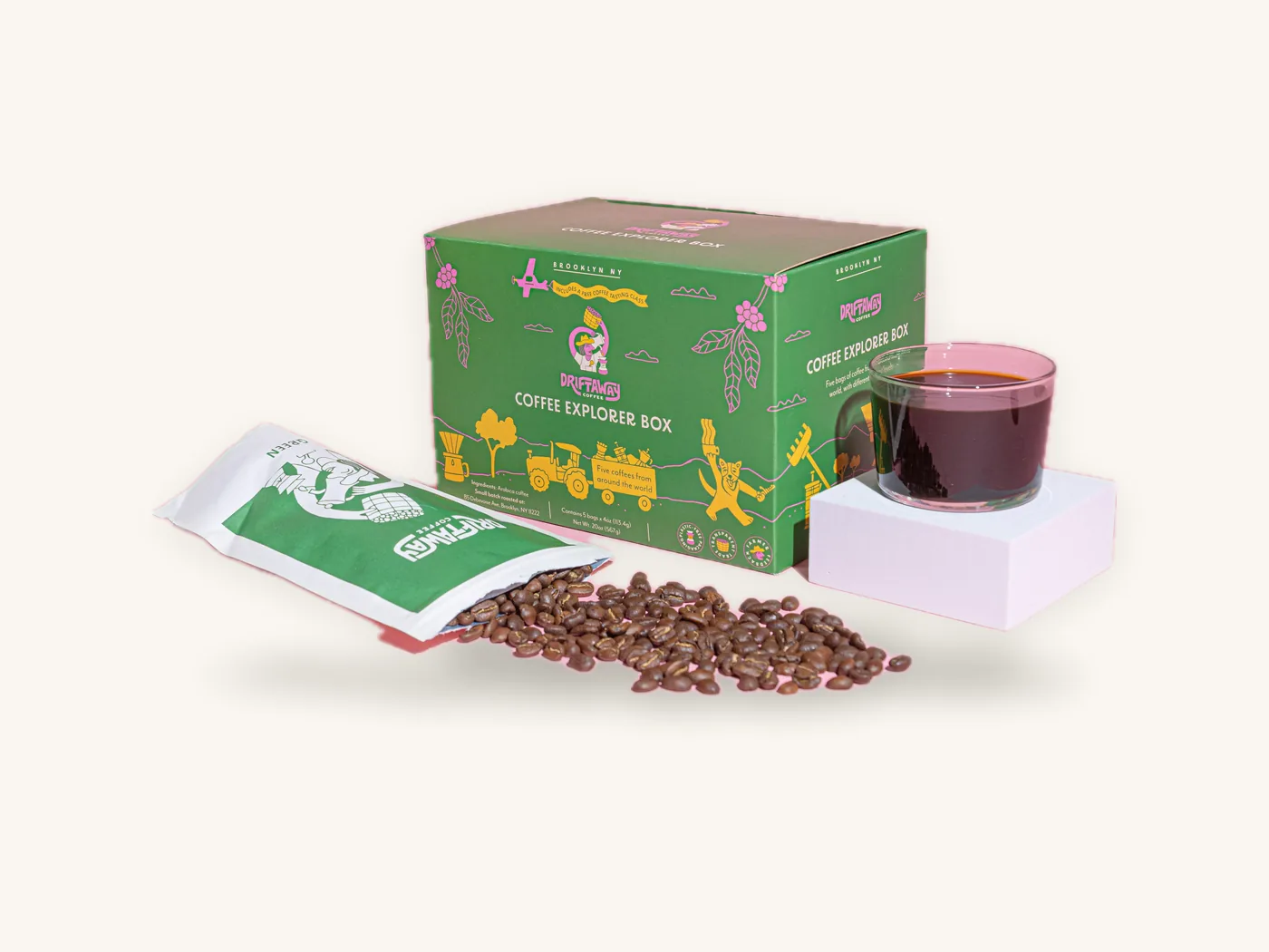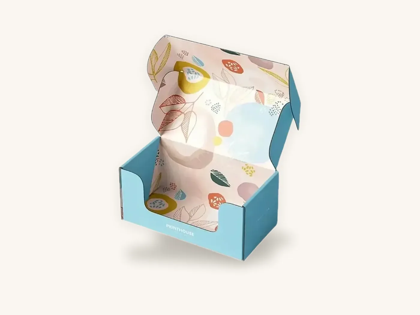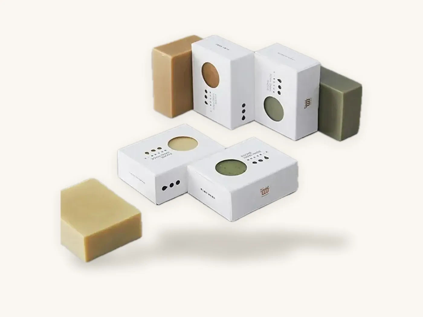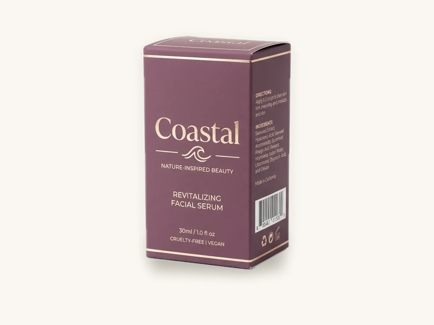
The packaging design trends 2026 is shaping up around are less about a single look and more about a shift in priorities: boxes that feel honest about their materials, finishes chosen for touch rather than shine, paper replacing plastic inside the box, and graphics bold enough to read on a phone screen. Those directions are visible across beauty, food, gifting and direct-to-consumer brands in the US, and each one has a practical reason behind it.
This guide does not rank trends by popularity or quote survey numbers, because honest data on "what shoppers want" is thin and usually commissioned. Instead, it explains the directions you can see on shelves and in unboxing videos, why brands adopt them, what each one changes in production and cost, and how to decide whether a trend fits your product or will date it within a year.
Key takeaways
- The strongest box design trends right now trace back to three pressures: sustainability expectations, e-commerce thumbnails, and short digital print runs that make experimentation cheap.
- Material-forward design (visible kraft, textured papers, uncoated stocks) signals restraint, but it changes how color prints, so design for the substrate from the start.
- Tactile finishes such as soft-touch, blind embossing and small foil accents are replacing all-over gloss and heavy metallics on premium packaging.
- Paper-based inserts, molded pulp and PLA windows are replacing foam and plastic trays wherever protection allows.
- Treat any trend as a hypothesis: a 10 to 100 box digital run lets you test a new look with real customers before a large order.
- A trend that fights your category's visual codes or your product's price point costs more in confusion than it earns in novelty.
How to judge a packaging trend before you spend money on it
Trend roundups tend to show beautiful renders with no context about price, channel or product. Before borrowing any idea, run it through four filters. If it fails two or more, it is probably a mood board image rather than a strategy.
Filter 1: Does it survive your sales channel?
A shelf box is judged at arm's length next to competitors, under store lighting. A shipped mailer is judged in someone's hands after a trip through the parcel network, and on a small product thumbnail before that. A delicate uncoated paper that looks beautiful in a boutique may scuff badly in transit. A minimalist carton that reads well in person may disappear as a 200-pixel image.
Filter 2: Does it match your price point?
Shoppers read cues quickly. A heavy rigid box with foil tells them to expect a premium price. If your product retails near the bottom of its category, that same box creates a mismatch, and a very spare kraft carton on an expensive product can look underpriced. The trend has to agree with what you charge.
Filter 3: Can you afford it at your real quantities?
Some looks are almost free (a new layout, a different typeface). Others add board, finishing steps or one-time tooling. Price the trend at the quantity you will actually order, not at a hypothetical 10,000 units.
Filter 4: How fast will it date?
Trends tied to materials and function tend to last. Trends tied to a specific color of the year, a meme or a type style that is everywhere at once tend to fade. If you only reprint every two years, favor the slower-moving directions.
Trend 1: Material-forward packaging that shows the board
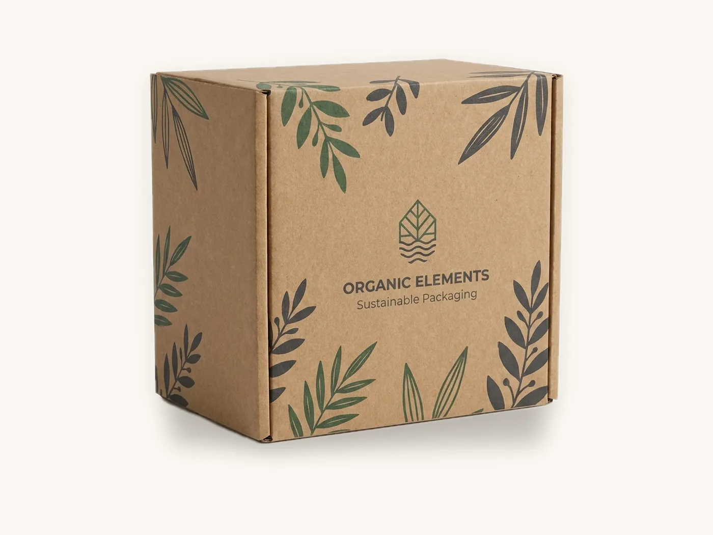
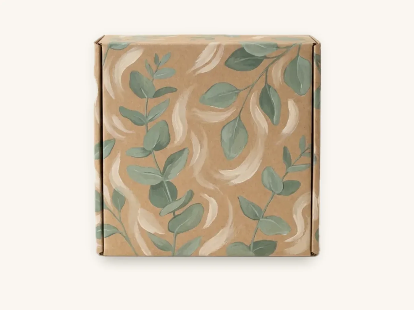
One of the clearest packaging trends is letting the substrate carry the design. Natural kraft, uncoated white stocks and textured or fiber-flecked papers are used as the visual base, with graphics printed in one or two colors instead of full-bleed photography.
Why brands adopt it
It signals that the brand is not hiding anything, which aligns with sustainability positioning without needing a printed claim. It also reduces ink coverage, and on digital short runs it looks just as intentional at 50 boxes as at 5,000. For small brands, it is a way to look considered without a large design budget.
What it changes in production
Printing on kraft is not like printing on white. The brown base shows through process inks, so colors look darker and more muted. Light colors and fine text need an opaque white ink underlayer to stay visible. Textured papers can break up very fine type and thin lines. Our kraft paperboard and textured and specialty papers pages explain how each stock takes ink.
Who it suits
Soap, candles, tea, coffee, apparel basics and personal care brands with a natural or minimal identity. It suits brands selling on values rather than on bright, color-coded product ranges. It is harder to pull off for products that rely on precise color to communicate flavor or variant.
Watch out: a kraft box does not make a sustainability claim for you, and printing "eco-friendly" on it invites scrutiny. The FTC's Green Guides describe how environmental claims should be qualified. Our guide to green claims on packaging covers the wording to avoid.
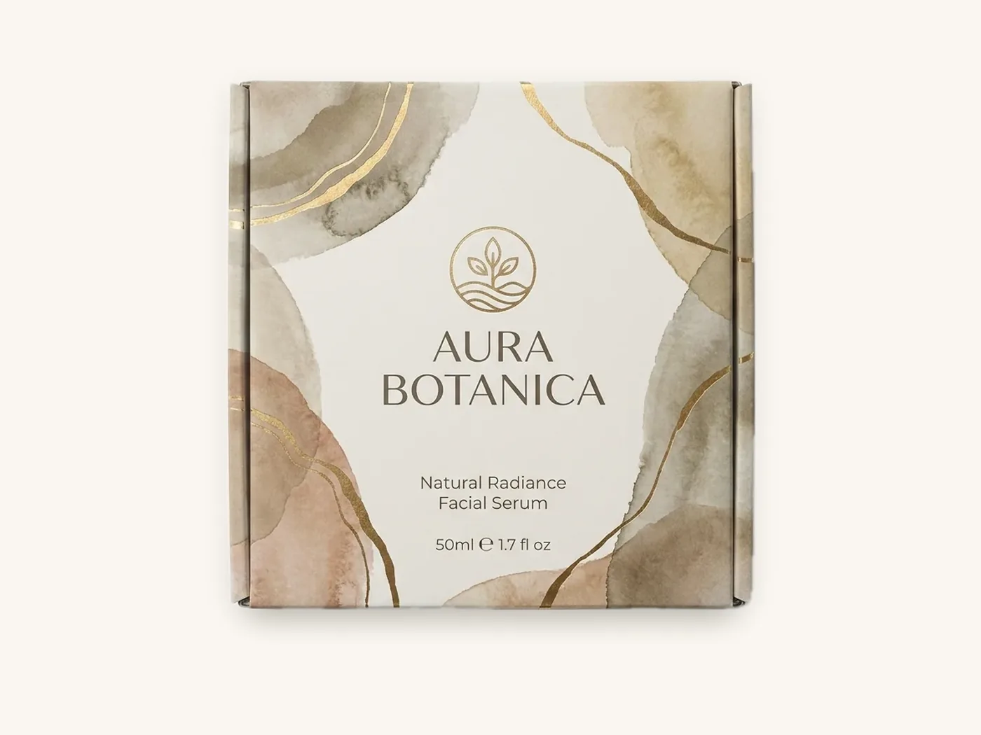
Trend 2: Quiet luxury and tactile finishes over shine
Premium packaging has been moving away from all-over gloss lamination and large metallic areas toward finishes you notice when you touch the box: soft-touch lamination, blind embossing or debossing (a raised or recessed logo with no ink), small foil accents and spot UV used sparingly on a single element.
Why brands adopt it
A tactile finish communicates quality in the hand and on camera without shouting. It also ages better. A matte, soft-touch box with one debossed mark looks as current in three years as it does today, while heavy holographic effects tend to anchor a design to a moment.
What it costs
Tactile finishes add process steps, and foil, embossing and spot UV each carry a one-time tooling charge (foil about $60, embossing about $60, spot UV about $40 on our current rates). To show the scale of the difference on a small carton: a straight tuck end carton in 18 pt SBS at 3x2x5 in with full color and aqueous coating runs about $1.15 each at 100 units, while a 2.5x2.5x6 in cosmetic carton in the same board with soft-touch and foil runs about $1.93 at 100 units. The sizes differ, so treat it as a rough sense of what finishing adds, then price your own spec on the instant estimator.
Who it suits
Skincare, fragrance, jewelry, spirits and gift sets. Our cosmetic boxes and luxury gift boxes are where most of these finish combinations are specified. The printing and finishes page shows each option side by side.
How to use it well
Pick one hero finish and let everything else stay quiet. Soft-touch plus a single foil logo reads as confident. Soft-touch plus foil plus spot UV plus embossing on the same panel reads as indecisive and costs more in tooling.
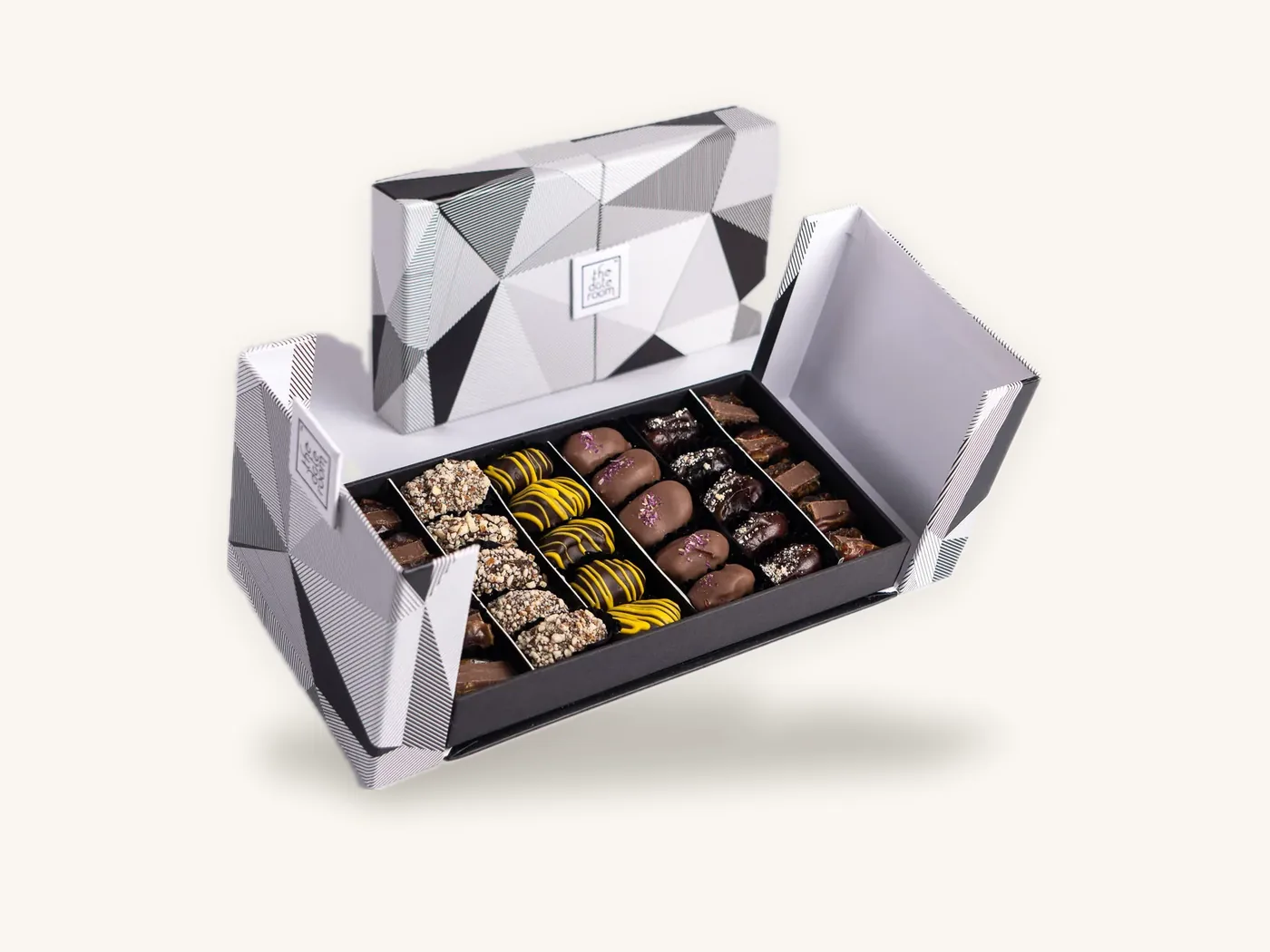
Trend 3: Paper-first structures and plastic-free interiors
Inside the box, the direction is clear: paperboard inserts, molded pulp trays, paper void fill and paper tape are replacing foam, plastic clamshells and air pillows where the product allows. Window cartons increasingly specify compostable PLA film instead of PET.
Why brands adopt it
Customers notice when a recyclable box is full of plastic, and a mixed-material package is harder for them to dispose of correctly. There is also growing regulatory attention: several US states have passed extended producer responsibility (EPR) laws for packaging, which are pushing brands to simplify materials. Our EPR packaging laws guide summarizes the direction, and you should confirm current requirements with each state program.
What it changes
Paper inserts protect differently from foam. A die-cut paperboard insert holds position well but cushions less, so fragile glass may need a corrugated insert or molded pulp instead. The insert must be designed together with the box, not added after the dieline is final. The eco-friendly boxes and box inserts pages list the combinations we run.
Who it suits
Nearly everyone shipping direct to consumer, and especially brands already using kraft or recycled-content boxes, where a plastic interior would contradict the exterior.
Trend 4: Bold color blocks and oversized type for the thumbnail
Look at how products appear in marketplace listings and social feeds and you will see packaging built to be read tiny: large flat fields of color, one oversized word or product name, simple icons for variants, and very little small decoration on the front panel.
Why brands adopt it
Many shoppers now see a box first as a small image on a phone before they ever see it in person. Fine detail and elegant thin serif type that work on a shelf can blur into noise at that size. Big, simple shapes are also easier to recognize when a customer comes back to reorder.
What it changes
Large solid areas demand careful color management. A big flood of a brand color shows every variation between print runs, so specify a PMS spot color on offset runs and approve a printed sample when color is critical. On corrugated E-flute, a very dark solid panel can show faint flute lines under raking light; a white liner or lamination helps.
Who it suits
Snacks, supplements, candy, pet treats and any brand with multiple flavors or variants that need a clear system. It is less natural for luxury brands, which tend to rely on restraint rather than volume.
A simple test
Export your front panel at the size of a marketplace thumbnail and put it next to three competitor images. If you cannot tell what the product is and which variant it is in under two seconds, the design is too detailed for this channel, whatever it looks like at full size.
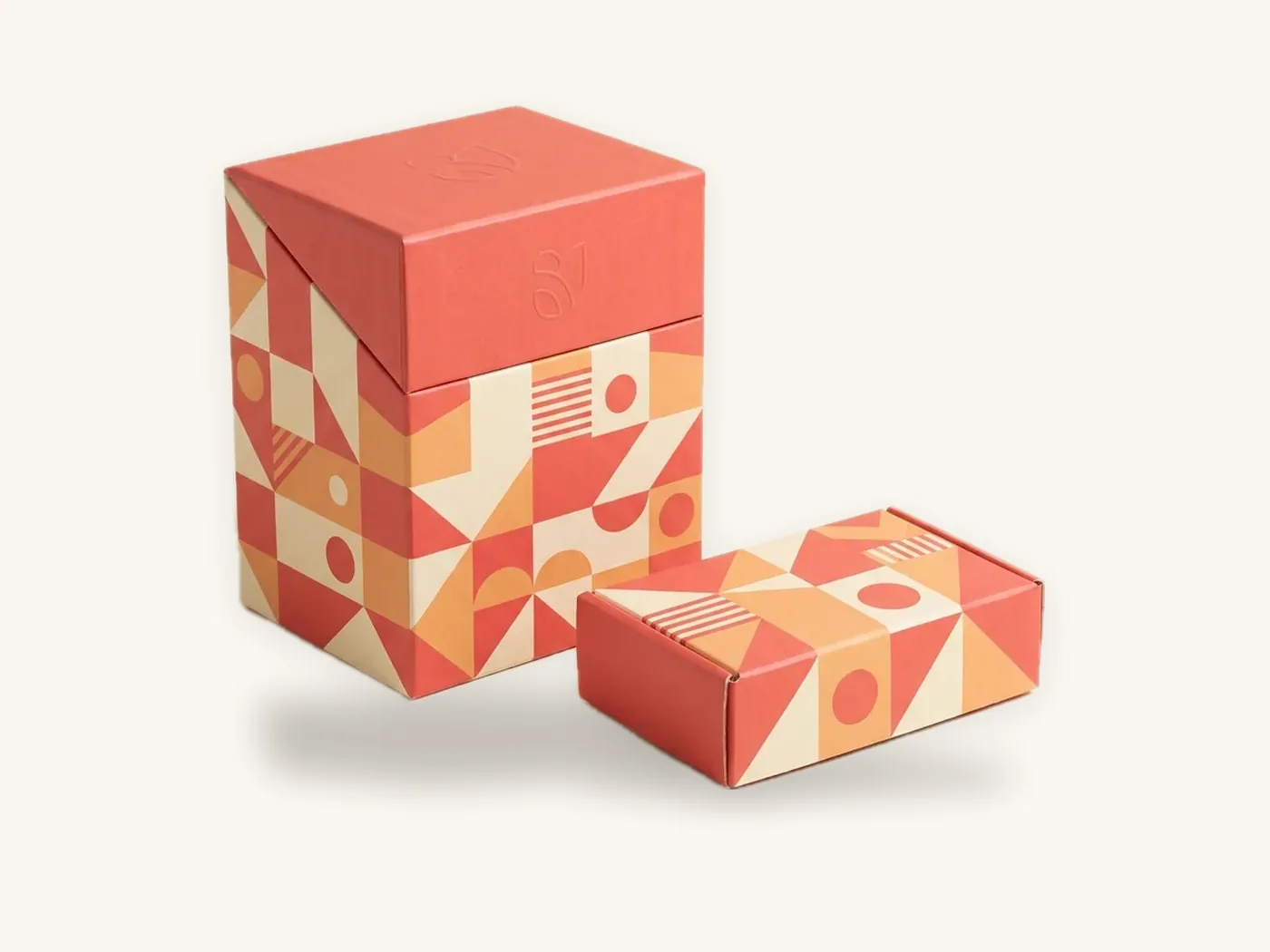
Trend 5: Limited editions and design systems built for short runs
Digital printing has made it practical to change artwork more often. Instead of one design printed for years, brands are building a fixed structure and layout system, then rotating colors, illustrations or messages for seasons, collaborations, local markets or subscription months.
Why brands adopt it
A new edition gives existing customers a reason to look at the box again and gives the brand something new to post. When the dieline, logo placement, type hierarchy and regulatory panels stay fixed, each new edition is mostly an artwork swap, which keeps design time and proofing risk down.
What it changes
You need a disciplined template. Lock the dieline, the barcode area, the ingredient or information panel and any required text, and define exactly which zones change. Our explainer on what a dieline is covers why that template matters, and the artwork preparation guide covers bleed and safe zones.
Who it suits
Subscription boxes, coffee roasters, candle makers with seasonal scents, confectionery for holidays, and any brand that already sells limited drops.
Box design trends compared: cost, lifespan and fit
The table below compares the directions above on the factors that actually affect a purchasing decision. "Lifespan" is a judgment about how quickly a look tends to feel dated, not a measured figure.
| Direction | Cost impact | Tends to date | Best-fit categories | Main production risk |
|---|---|---|---|---|
| Material-forward kraft and textured stocks | Neutral to lower (less ink) | Slowly | Soap, candles, tea, apparel basics | Muted color; fine type breaking up on texture |
| Tactile finishes (soft-touch, deboss, small foil) | Higher; one-time tooling for foil, emboss, spot UV | Slowly | Skincare, fragrance, jewelry, gifts | Too many finishes on one panel |
| Paper-first inserts and PLA windows | Neutral to moderate | Slowly | All DTC, especially eco-positioned brands | Less cushioning than foam for fragile goods |
| Bold color blocks and oversized type | Neutral | Moderately | Snacks, supplements, candy, pet | Color variation across large solid areas |
| Rotating limited editions | Design time per edition; no tooling if structure is fixed | Varies by artwork | Subscription, seasonal, collaborations | Regulatory text errors when artwork changes |
Directions to use with care in 2026
Not every visible style is a good bet. These are not "wrong," but they carry more risk of dating quickly or backfiring.
Heavy holographic and iridescent effects everywhere
Metallic and holographic board still has a place, for example in lash, cosmetics and party categories where sparkle is part of the product. As a full-box effect for a general brand, it tends to pin the design to a specific moment. If you like the look, consider it on an inner tray or a limited edition. Our metallic and holographic board page shows the options.
Vague sustainability language
Words like "green," "natural" or "planet-friendly" printed large on a box are attracting more skepticism, and unqualified environmental claims can create regulatory exposure. Specific, verifiable statements, such as naming the material and how to dispose of it, age better than slogans.
Copying a category leader too closely
When one brand's look becomes shorthand for a category, followers who copy it end up looking interchangeable. Borrow the underlying principle (for example, restraint, or one strong color), not the layout.
Over-packaging for the unboxing video
Layers of tissue, stickers, cards and fill can feel generous. They can also feel wasteful, especially when a box is much larger than its contents. Right-sizing the box and making each layer do a job is the more current direction.
A checklist for adopting a trend without a costly redesign
Use this sequence to move from inspiration to a printed box with the least risk. Each step is cheap compared with reprinting a run that did not work.
- Write down the reason. Name the problem the trend solves (for example, "our front panel is unreadable as a thumbnail"). If you cannot name one, stop here.
- Audit your category shelf. Collect ten competitor boxes or listing images. Note the shared color, type and structure codes you should respect.
- Pick one direction, not three. Combining material-forward kraft, tactile finishes and bold color blocks at once usually dilutes all of them.
- Keep the structure fixed if possible. Changing artwork on an existing dieline avoids new sizing risk. Our branding guide covers how to keep brand assets consistent while the look evolves.
- Price it at real quantities. Run the spec through the estimator, including any finishes that add tooling.
- Review a 3D proof. Check the design on the folded box, not just the flat artwork. The mockups and 3D proofs guide walks through what to look for.
- Print a short run. Order 10 to 100 digitally printed boxes and put them in front of real customers, retail buyers or your own team in real lighting.
- Decide with evidence you collected. Look at reorders, returns comments, retailer feedback and how the box photographs. Then commit to a larger run or adjust.
Tip: photograph the test boxes on your phone in daylight, under warm indoor light and next to a competitor product. A design that only looks good in a studio render will show its weaknesses immediately.
How to test a new packaging design with Box Sense
Trying a new direction does not require a large commitment. Here is how the process works if you want to test a trend on real boxes.
What to send us
- Your product dimensions and weight, packed as it will ship or sit on a shelf
- The box style you use today, or the one you are considering (tuck end carton, mailer, rigid box)
- The direction you want to test: new stock, new finish, new artwork system or a limited edition
- Current artwork files, or a brief for our design services team
- Quantities to price, for example 10, 100 and 500
What you get
- A quote confirmed within 24 hours
- Free design support: dieline, artwork setup, a 3D digital proof and two revision rounds
- Unprinted structural samples free; a printed sample of approved artwork free on orders of 100 or more (see samples)
- A minimum order of 10 boxes, with digital printing for short runs of roughly 10 to 500 and offset for larger runs
- No die or plate charges; one-time tooling only for foil, embossing, spot UV and custom inserts
Timeline
Standard production is 8–12 business days after proof approval, and rush production in 5 business days is available on most paperboard and corrugated styles. Shipping is free on every US order, and international shipping is quoted at cost. If a box arrives defective and you report it within 14 days, we reprint it free.
FSC-certified boards, soy or water-based inks, aqueous coatings and PLA windows are all available if the direction you are testing is sustainability-led; the sustainability page has the details.
Frequently asked questions
What are the biggest packaging design trends for 2026?
The most visible directions are material-forward design using kraft and textured papers, tactile premium finishes such as soft-touch and debossing, paper-based inserts replacing plastic, bold simple graphics that read as small online images, and rotating limited-edition artwork made practical by digital printing. Each responds to a real pressure, such as sustainability expectations or e-commerce browsing, rather than fashion alone.
Should a small brand follow packaging trends?
Only when a trend solves a specific problem for your product, channel or price point. Small brands benefit from trends that cost little, such as simpler layouts or kraft stocks, and from short digital runs that let them test before committing. Avoid adopting several trends at once, and keep your logo, colors and structure consistent so customers still recognize you.
Is minimalist packaging still in style?
Restraint remains common, especially in skincare, fragrance and premium goods, but it has shifted toward texture and finish rather than plain white boxes. Many brands pair a spare layout with one bold element, such as an oversized product name or a strong single color, so the box still reads clearly as a small image online and on a crowded shelf.
Are kraft boxes still a good choice in 2026?
Yes, for brands whose identity fits a natural or minimal look. Kraft hides scuffs, reduces ink coverage and suits eco-positioned products. Plan artwork for the brown base: colors print darker, and light colors or fine text need opaque white ink. Kraft is less suitable when precise, bright color is essential for communicating flavors, shades or variants.
How do I know if a packaging trend will look dated quickly?
Trends tied to materials, function and sustainability tend to last longer than those tied to a particular color, visual effect or type style that suddenly appears everywhere. If you reprint infrequently, favor slow-moving directions and keep trend-driven elements to areas that are easy to change, such as a sleeve, sticker or limited-edition panel.
Do premium finishes make packaging more expensive?
Usually yes. Soft-touch lamination adds a process step, and foil stamping, embossing and spot UV each add one-time tooling charges plus some per-unit cost. Using a single hero finish instead of several keeps costs in check while still giving the box a premium feel. The pricing estimator shows the effect on your exact size and quantity.
How can I test a new box design before a large order?
Order a short digital run, as few as 10 boxes, after reviewing a 3D digital proof. Put the printed boxes in real lighting, photograph them next to competitors, and show them to customers or retail buyers. That feedback is far more reliable than judging a flat artwork file or a studio render on a screen.
Next steps
Pick the one direction that solves a real problem for your packaging, then see what it costs at your quantities with the instant price estimator. When you are ready to try it on real boxes, request a quote and we will confirm pricing within 24 hours and prepare a dieline and 3D proof for your test run.
Boxes in this guide
Order the packaging we covered
Written by the Box Sense Packaging Team
Our structural designers, prepress technicians and production staff print and convert custom boxes every day for brands in the United States, United Kingdom and UAE. Questions about this guide? Talk to us.