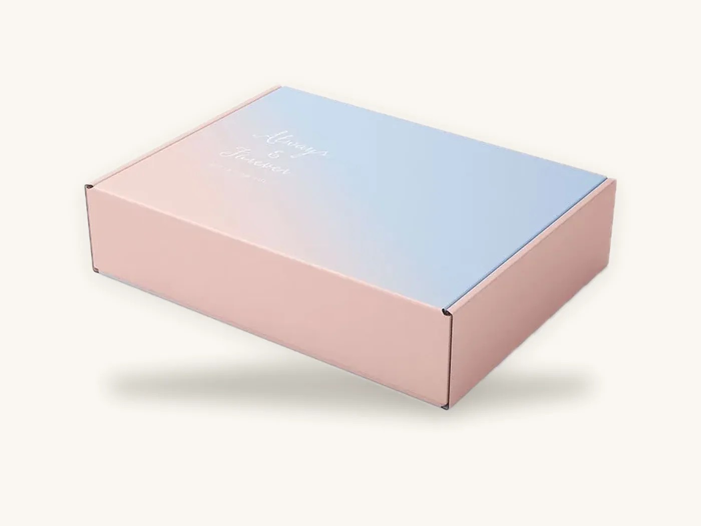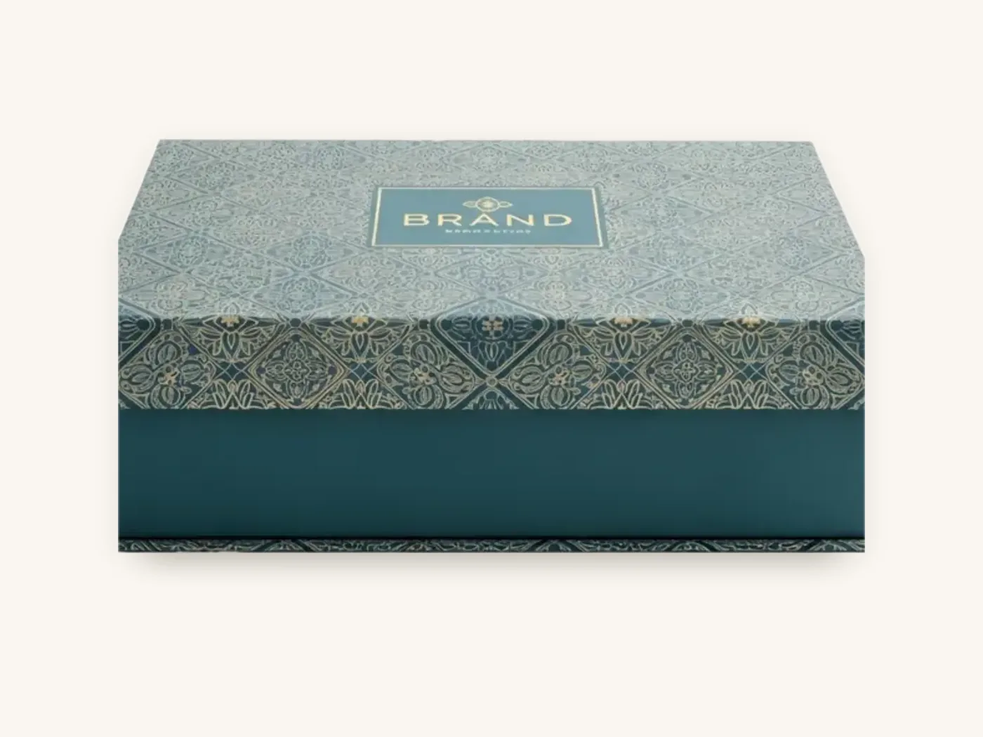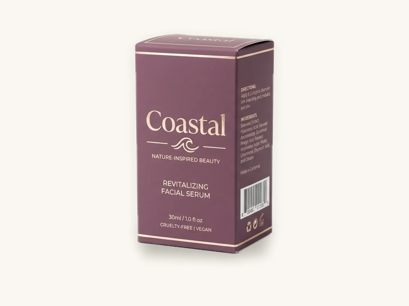
CMYK builds every color from tiny dots of four process inks, cyan, magenta, yellow and black, while Pantone (PMS) prints a single premixed ink formulated to hit one exact color. CMYK is the efficient choice for photographs, gradients and multi-color artwork. Pantone is the precise choice when one brand color has to look the same on every box, every reorder and every material.
Most of the CMYK vs Pantone packaging decision comes down to three questions: how strict your brand color is, how many different boards you print on, and whether your artwork is photographic or built on flat color. Many brands end up using both: CMYK for the imagery, plus one Pantone for the logo or background.
This guide explains how each system behaves on real packaging, why the same color looks different on SBS, kraft and corrugated, and how to proof so the finished boxes match what you approved.
Key takeaways
- CMYK mixes colors optically from four inks; it handles photos and gradients well but cannot reach some bright, saturated or very clean colors.
- Pantone spot colors are premixed inks that give the most consistent match for flat brand colors, including oranges, bright blues, greens and purples that CMYK struggles with.
- The board changes the color more than most people expect. Kraft darkens and mutes ink, corrugated liners absorb differently from SBS, and laminations shift saturation.
- Specify the Pantone coated (C) or uncoated (U) reference that matches your actual surface, and expect a small, normal tolerance between runs.
- On short digital runs, Pantone colors are simulated from the press's inks. Most are close; a few vivid shades need a printed test.
- Approve brand-critical colors on a printed sample on the final board and finish, not on a screen.
How CMYK printing builds color
CMYK is called process color. The press prints four separate layers of tiny dots, and your eye blends them into a single color. A dark green, for example, might be built from heavy cyan and yellow dots with a little black. Lighter tints use smaller dots with more paper showing through.
Why CMYK is the default
- One ink set prints everything. Photos, illustrations, gradients and hundreds of colors come from the same four inks.
- Efficient for complex artwork. A box with product photography, a pattern and several accent colors costs no more to print in CMYK than a box with two flat colors.
- Standard for digital printing. Short runs of roughly 10 to 500 boxes print digitally, and digital presses work from process inks.
Where CMYK falls short
CMYK has a limited gamut, the range of colors it can reproduce. Bright oranges, electric blues, vivid greens, clean purples and some rich reds sit partly outside it. When artwork contains a color CMYK cannot reach, the file is converted to the nearest achievable color, which usually looks duller than the screen version.
CMYK colors also move slightly with press conditions. Small variations in ink density, dot gain (dots spreading as ink absorbs into the board) and registration between the four layers can shift a built color from one run to the next. On photographs nobody notices. On a large flat brand color, people do.
How Pantone spot colors work
The Pantone Matching System is a standardized library of numbered colors, each with a published ink formula. Instead of building a color from dots, the printer mixes that specific ink and prints it as a solid layer.
Why brands specify PMS colors
- Consistency. The same formula prints the same color across runs, far more tightly than a CMYK build.
- Reach. Many Pantone colors lie outside the CMYK gamut, so they look brighter and cleaner.
- Clean solids. A spot ink prints as a smooth, even layer with no dot pattern, which is especially visible in large backgrounds and fine type.
- Specials. Metallic and fluorescent Pantone inks give effects CMYK cannot, though foil stamping is often the better route to metallics on boxes.
Coated and uncoated references
Pantone publishes the same color numbers in coated (C) and uncoated (U) guides. The ink formula is the same, but the result looks different: ink sits on top of coated paper and looks crisp and saturated, while on uncoated paper it absorbs and looks softer and darker.
Always specify the reference that matches your surface. A laminated SBS carton behaves like coated stock. Uncoated kraft and uncoated specialty papers behave like uncoated. Asking a printer to match a "C" swatch on uncoated kraft sets up a disappointment before the job starts.
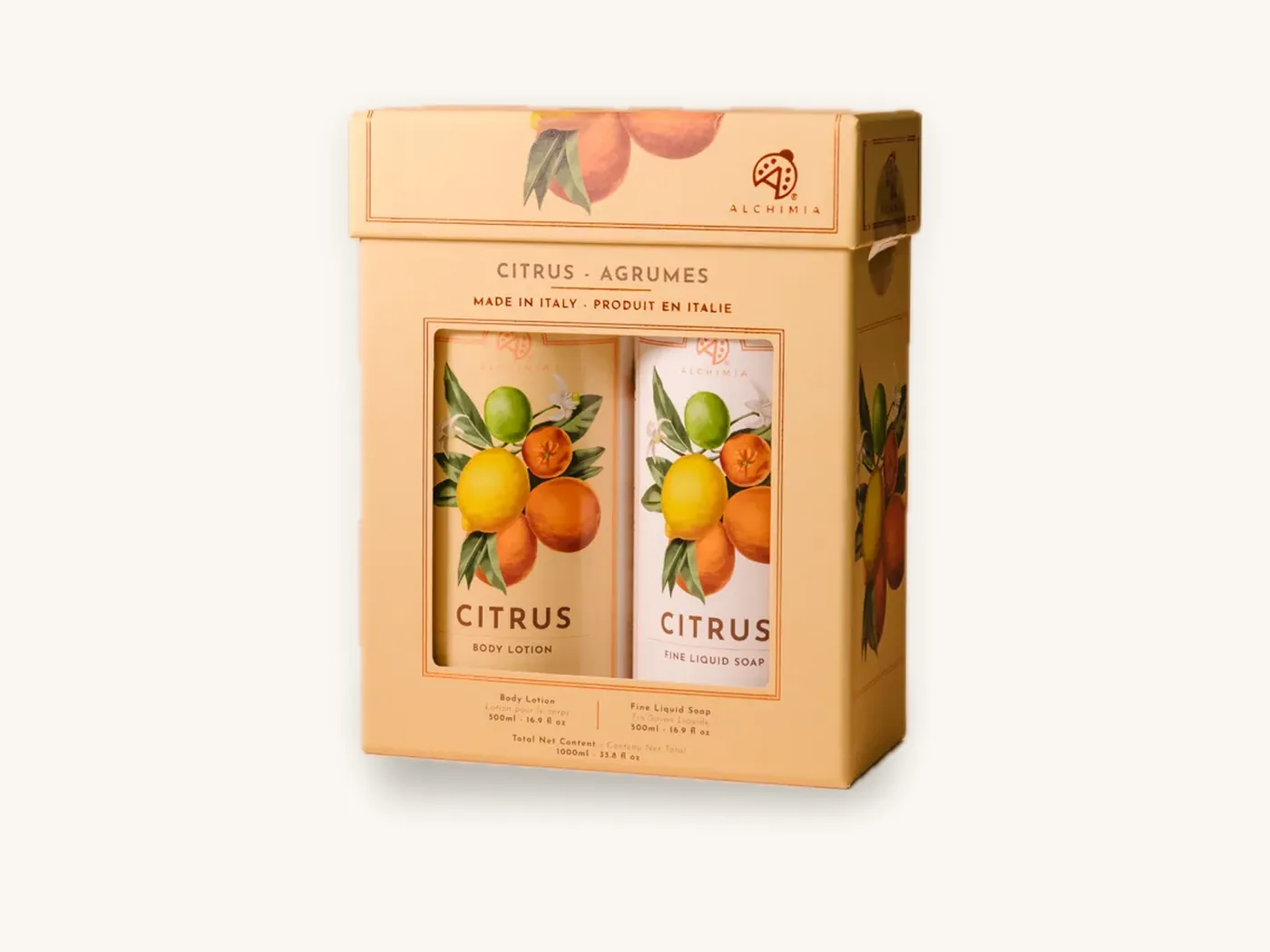
CMYK vs Pantone side by side
| Factor | CMYK (process) | Pantone (spot / PMS) |
|---|---|---|
| How color is made | Four inks in dot patterns, blended by the eye | One premixed ink per color, printed solid |
| Best for | Photos, gradients, multi-color illustrations | Logos, flat brand colors, large solid backgrounds |
| Color range | Limited gamut; misses some bright and clean shades | Wide library, including colors outside CMYK |
| Run-to-run consistency | Good, but built colors drift slightly | Very consistent |
| Fine type in color | Can show slight fringing if layers shift | Crisp, single layer |
| Digital short runs | Native | Simulated from process inks |
| Offset long runs | Standard | Adds an ink unit per spot color |
| Typical use on boxes | Full-color retail cartons, mailers with imagery | Brand-color backgrounds, one- and two-color kraft boxes |
The hybrid approach
Many packaging jobs print CMYK plus one or two Pantone colors. The imagery and secondary colors run in process, and the brand color that must never drift runs as a spot ink. On offset, that means five or six ink units instead of four. For brands with a signature color, it is often the best balance of flexibility and control.
Why brand colors shift on packaging
Even with a perfect file, the same color can look different from box to box. Understanding the causes helps you decide where precision matters and where it does not.
The substrate
The board under the ink is the biggest variable. Ink reflects the color of whatever is beneath it, and absorbent surfaces soak up ink and dull it. The next section covers each common board.
Dot gain and absorption
On absorbent stock, CMYK dots spread as ink soaks in, which darkens tints and muddies built colors. Spot colors also darken on absorbent stock, but they do so predictably, which is why printers can compensate with the ink formula.
The finish on top
Gloss lamination deepens saturation. Matte and soft-touch films scatter light, so colors look softer and darks look slightly lighter. Aqueous coating changes color the least. Our packaging finishes guide and matte vs gloss lamination comparison cover those shifts in more detail.
Lighting and viewing
Colors look different under warm retail spotlights, daylight and cool LEDs. Two samples that match under one light can separate under another, an effect called metamerism. Decide where the box will actually be seen and judge color there.
Screens
Monitors emit light in RGB; boxes reflect light through ink. A bright on-screen color may simply not exist in print. Screens also vary widely in calibration, so two people reviewing the same PDF may see different colors.
Matching colors across different boards
This is where brand color printing gets hard. If your packaging line includes a folding carton, a corrugated mailer and a kraft sleeve, the same color specification will produce three different-looking results unless you plan for it.
| Board | How it affects color | Matching advice |
|---|---|---|
| SBS paperboard, coated | Bright white, smooth; closest to proof | Use coated (C) Pantone references; the benchmark surface |
| White corrugated liner, direct printed | Slightly more absorbent and less smooth than SBS | Expect softer solids; laminated printed liners match SBS more closely |
| Kraft paperboard or kraft corrugated | Brown base darkens and mutes every color; light colors nearly vanish | Use uncoated (U) references, bold dark colors or a white ink underlay |
| Rigid box wrap paper, laminated | Very smooth; behaves like coated stock | Match to coated references with the lamination applied |
| Textured specialty papers | Texture and absorbency soften and darken ink | Test print on the actual paper; choose uncoated references |
| Metallic board | Ink over metallic base shifts toward metallic tones | Use a white underlay where a true color is needed |
SBS: your reference surface
SBS paperboard is bright, smooth and coated, which makes it the easiest surface for accurate color. If you have one hero box, match it on SBS first and treat that as the brand reference for everything else.
Corrugated mailers
Direct-printed corrugated takes ink on the outer liner. It is less smooth and more absorbent than SBS, so solids look slightly softer. A laminated printed liner, where the artwork is printed on a separate sheet and mounted to the board, matches SBS far more closely. The corrugated board page and our guide to corrugated flutes explain the constructions. For a brand color on custom mailer boxes, ask which method your quantity and budget allow.
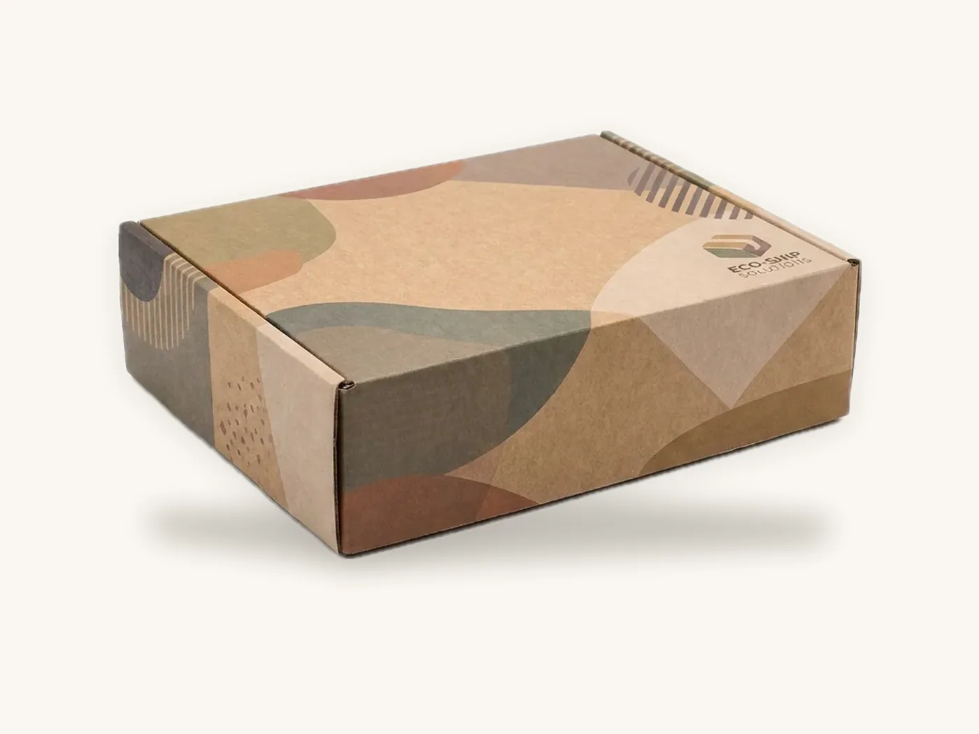
Kraft: plan for the brown
Ink on kraft paperboard is partly transparent, so the brown shows through. Yellows turn olive, pale blues turn gray-green and light pinks nearly disappear. The strongest kraft designs use black, dark navy, deep green or burgundy, or print an opaque white underlay first so lighter colors stay true. The white ink on kraft guide covers the technique.
Watch out: approving a brand color on a white SBS sample does not tell you how it will look on kraft. If your line includes kraft boxes, request a printed sample on kraft before committing the design, and consider a kraft-specific version of the color.
Specialty and textured papers
Linen, felt and cotton papers change color through texture and absorbency. Some designers love the softer result; others find the brand color drifts too far. The specialty papers guide explains which textures are most color-stable, and our overview of packaging materials types compares all the main board families.
Pantone matching on digital vs offset presses
The print method affects how Pantone colors are delivered, and it depends on your quantity.
Digital printing (roughly 10 to 500 boxes)
Digital presses print from process inks, sometimes with extended color sets. Pantone colors are simulated by converting each spot color into the closest achievable ink combination. For most PMS colors the simulation is very close. For vivid oranges, bright greens, clean violets and some reds, the simulation may fall short of the swatch. Metallic and fluorescent Pantones cannot be simulated at all.
If your brand color is one of the hard ones, ask for a printed test before approving a digital run, or consider foil or a slightly adjusted color for short runs.
Offset printing (larger runs)
Offset can print true spot inks mixed to the Pantone formula, so matching is tighter. Each spot color uses its own ink unit, so a CMYK-plus-one-Pantone job runs as five colors. Spot inks are also where offset shines on large flat backgrounds, where a CMYK build could show slight mottling.
Our guide to digital vs offset printing for boxes covers the quantity crossover in more depth.
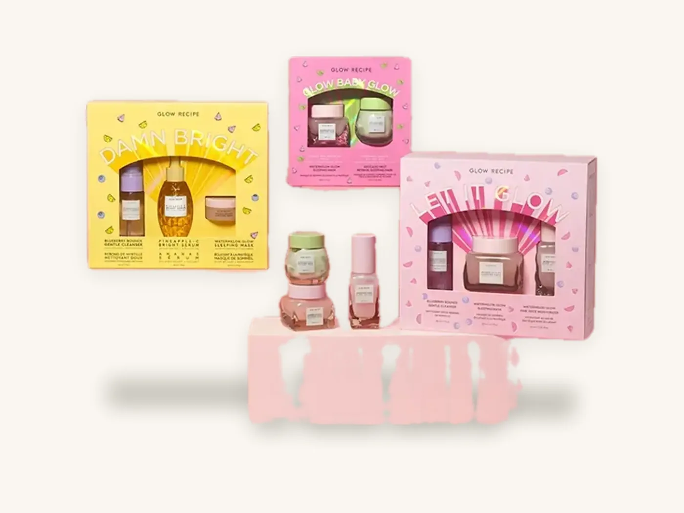
Choosing between CMYK and Pantone: a decision process
Use these steps to decide what your packaging needs.
- List every color in the artwork. Mark which ones are brand-defining (logo, signature background) and which are supporting.
- Check whether the brand color is inside the CMYK gamut. Your design software shows the CMYK conversion. If the converted color looks noticeably duller, a spot color is worth considering.
- Count the materials in your packaging line. One board type makes CMYK matching easier; several boards make a defined Pantone reference more valuable.
- Consider how much of the box the color covers. A small logo in a near-match CMYK build is rarely noticed; a full-panel background that varies between reorders is.
- Check your quantity. On short digital runs, Pantone is simulated anyway. On offset runs, adding a spot ink is practical.
- Decide the finish. Matte, gloss and soft-touch each shift the result, so match against the final finish.
- Pick the reference. Coated or uncoated Pantone to match the surface, or a CMYK build recorded as the brand standard.
- Proof on the real board. Approve a printed sample, then keep it as the physical color standard for reorders.
A worked example
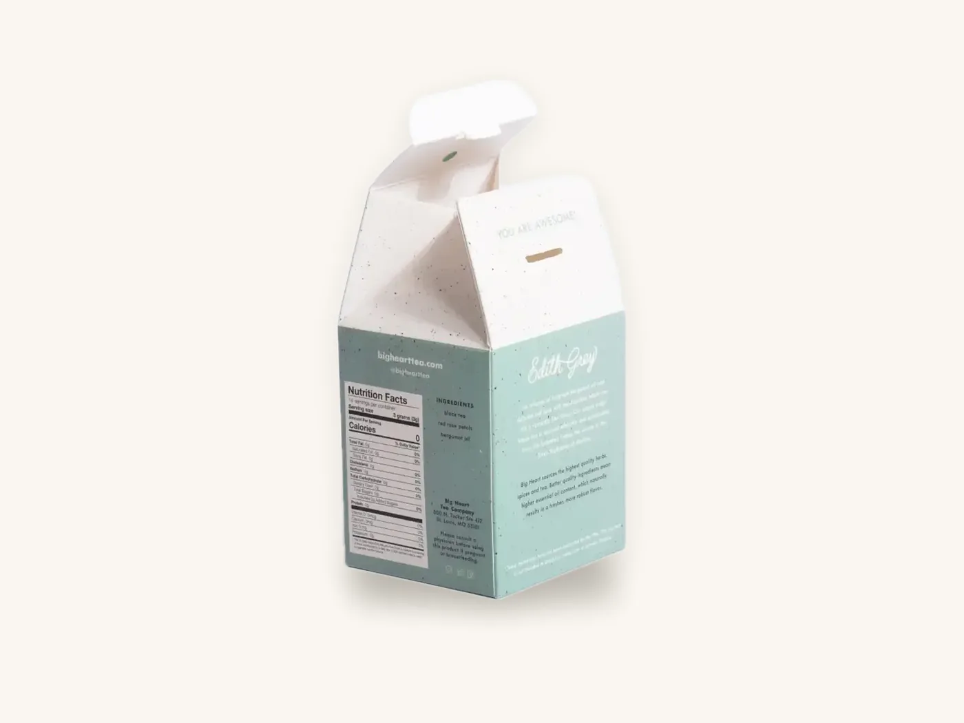
Say you sell a tea range in an SBS carton with product photography and a signature teal band, plus a kraft outer shipper with a one-color logo. The carton runs CMYK for the photos and a coated Pantone for the teal band. The kraft shipper prints the logo in a dark uncoated Pantone chosen to read clearly on brown, rather than trying to force the bright teal onto kraft. Both are clearly the same brand; neither fights its material.
Proofing brand colors: from screen to press
Every proofing stage answers a different question. Knowing which one confirms color saves you from approving the wrong thing.
| Proof stage | What it confirms | What it cannot confirm |
|---|---|---|
| On-screen PDF | Layout, text, dieline position, which elements are spot vs process | Accurate color, sheen, texture |
| 3D digital proof | How panels wrap the structure, orientation, overall look | Printed color on your board |
| Printed sample on final board and finish | Real color, finish shift, texture, fold behavior | Minor run-to-run variation on a large production run |
| Retained color standard | A physical reference for reorders | Nothing new; it is the benchmark |
Tolerance: what "match" really means
No printing process reproduces a color identically every time. Printers measure color difference with an instrument and express it as Delta E (ΔE), where lower numbers mean a closer match. Brand owners and printers agree an acceptable tolerance for critical colors, and small differences within it are normal and usually invisible at arm's length. Your printer can explain how they measure and what tolerance applies to your job.
Color checklist before you approve
- Spot colors are named with the exact Pantone reference, including the C or U suffix
- Only the colors you intend as spot colors are set as spot swatches; everything else is converted to CMYK
- Images are in CMYK at 300 dpi at final size, with no RGB elements left in the file
- Large black areas use a rich black build agreed with your printer, while small black text stays single-ink black
- Fine type in color is either a single spot color or a strong CMYK build, never a four-color tint below readable size
- The printed sample was reviewed on the final board, with the final finish, under the lighting where the box will be seen
- The approved sample is labeled and kept as the reference for future reorders
Tip: keep one approved, dated box from every production run. When you reorder, that physical box is a far better color target than any file, swatch book or screen, and it lets you compare runs side by side.
How Box Sense handles color matching
We print, finish and convert in-house, so color decisions and proofs sit in one place from artwork setup to delivery.
What to send for an accurate color quote
- Box style, dimensions and board, for example an 18 pt SBS carton for cosmetic boxes or E-flute for a mailer
- Artwork with spot colors named by Pantone reference, or a note of which colors are brand-critical
- The finish you want, since it affects the color target
- Any existing packaging or printed pieces your new boxes must match
- Quantities to price, which tells us whether the job runs digitally or on offset
- A request for help from our design services team if your files need color setup
Proofing and samples
Free design support includes the dieline, artwork setup and a 3D digital proof with two revision rounds. For brand-critical color, a physical sample is the right check: unprinted structural samples are free, and a printed sample of approved artwork is free on orders of 100 or more. See samples for details and the printing and finishes page for print options.
Pricing and timeline
There are no die or plate charges, and one-time tooling applies only to foil, embossing, spot UV and custom inserts. As a reference, a kraft tuck carton, 18 pt kraft, 4x3x2 in, with 1-color print is about $0.81 each at 100 units, and an 8x6x3 in E-flute mailer printed full color outside is about $2.64 each at 100, both with free US shipping. Check your spec in the price estimator.
Quotes are confirmed within 24 hours. Standard production is 8–12 business days after proof approval, with rush production in 5 business days on most paperboard and corrugated styles. Orders start at 10 boxes, and defective boxes reported within 14 days are reprinted free. Custom product boxes in every style are available with CMYK, Pantone or both.
Frequently asked questions
Should I use CMYK or Pantone for my packaging?
Use CMYK when your artwork is photographic, full of gradients or uses many colors, and when small color variation is acceptable. Use Pantone when one flat brand color must match exactly across runs and materials, or when the color is too bright for CMYK. Many boxes combine both: CMYK imagery plus one Pantone for the logo or background.
Why does my brand color look different on kraft boxes?
Kraft board is brown and absorbent, so ink is partly transparent against it and soaks in. Colors darken and mute, yellows shift toward olive and pale colors almost disappear. Use dark, bold colors on kraft, specify uncoated Pantone references, or print an opaque white underlay first to keep lighter colors closer to their intended shade.
Can digital printing match Pantone colors?
Digital presses simulate Pantone colors from their process inks. Most colors come very close, but some vivid oranges, greens, violets and reds fall slightly short, and metallic or fluorescent Pantones cannot be simulated. If your brand color is in one of those ranges, request a printed test before approving a short digital run, or consider offset for larger quantities.
What is the difference between Pantone C and U?
Pantone C (coated) and U (uncoated) use the same color numbers and ink formulas but show how the ink looks on different paper surfaces. Ink on coated stock sits on top and looks bright and crisp; on uncoated stock it absorbs and looks softer and darker. Choose the reference that matches your box surface: coated for laminated SBS, uncoated for kraft.
Does Pantone printing cost more than CMYK?
It can on offset runs, because each spot color needs its own ink unit and ink mixing, so CMYK plus one Pantone runs as five colors. On short digital runs, Pantone colors are simulated from process inks, so there is usually no separate spot color cost. Box Sense has no plate charges; check your spec in the pricing estimator.
How close will my printed boxes match the Pantone swatch?
Very close, but not mathematically identical. Printers measure color difference with an instrument using Delta E, and critical colors are held within an agreed tolerance. The board, finish and lighting also affect how the color appears. Approving a printed sample on your actual board and finish is the most reliable way to confirm the match.
Should I convert my Pantone colors to CMYK?
Convert them only if the CMYK version still looks right and the color is not brand-critical. Converting simplifies the file and suits digital runs. If the CMYK conversion looks noticeably duller, or the color covers large areas and must match across reorders, keep it as a spot color and name the exact Pantone reference in your artwork.
Next steps
Mark the colors that define your brand, check how they convert to CMYK, and decide which boards and finishes they need to survive. Then price your spec in the custom box price estimator and request a quote with your color requirements. We will confirm pricing within 24 hours, set up your spot and process colors correctly and prepare a proof before anything goes to press.
Boxes in this guide
Order the packaging we covered
Written by the Box Sense Packaging Team
Our structural designers, prepress technicians and production staff print and convert custom boxes every day for brands in the United States, United Kingdom and UAE. Questions about this guide? Talk to us.