Printing on kraft boxes works best when the design treats the brown board as part of the palette. Standard printing inks are transparent, so every color mixes with the brown underneath: black and deep colors print well, bright and pale colors turn muddy, and white disappears entirely unless you use an opaque white ink. Designs built from one or two dark colors, or from white ink and one accent, look sharp and intentional on kraft.
If your artwork depends on pastels, photography or exact brand colors, either print a white base under those areas or choose a white board instead. This guide explains why colors shift on kraft, how white ink on kraft actually performs, the design approaches that work, how to set up files, and what kraft box printing costs, so the boxes you receive look like the proof you approved.
Key takeaways
- Process inks are transparent, so on kraft they combine with the brown board; colors print darker, warmer and less saturated than on white.
- Black, dark brown, navy, deep green and deep red print reliably on kraft; yellows, pinks, light blues and pastels shift the most.
- White ink on kraft is opaque enough for logos, type and patterns, but it reads as a soft off-white rather than bright paper white; a double hit increases opacity.
- Natural kraft varies slightly in shade and texture from lot to lot, so treat the brown as a range, not a fixed color.
- A kraft tuck carton printed in one color runs about $0.81 each at 100 units and $0.36 at 1,000; for full-color artwork on kraft, compare against a white board in the price estimator.
Why colors look different when printing on kraft
Print on white board starts with a bright, neutral surface that reflects almost all light. Printing on kraft starts with a brown, absorbent surface that reflects much less. Everything else follows from that.
Transparent inks act like tinted glass
CMYK and most PMS inks are designed to be transparent, so light passes through the ink, bounces off the board and back through the ink to your eye. On white board, the board contributes nothing, and you see the ink color. On kraft, the light picks up the brown on its way back, so a yellow reads as mustard, a cyan as teal-green, and a pink as dusty rose.
Unbleached fibers absorb ink
Kraft board is made from unbleached fibers, often with recycled content, and its surface is usually uncoated. Ink soaks into the fibers instead of sitting on a smooth clay coating. That softens edges, reduces saturation and makes very fine detail less crisp. Heavy ink coverage can also look blotchy, because absorption varies across the sheet.
Natural variation in the board
The brown of kraft is a natural result of the pulp, not a printed color. Shade and fiber flecks vary between production lots. That variation is part of the appeal, but it means a design that sits right on the edge of legibility may look different from one order to the next.
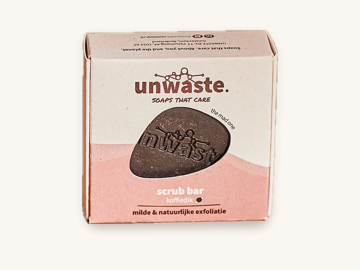
What happens to each color on kraft board
Use this table as a planning guide. It describes typical shifts for transparent inks printed directly on natural kraft, with and without a white base underneath. Your exact result depends on the board lot, ink and press, and is confirmed on a printed sample.
| Color printed | Directly on kraft | With white ink underneath |
|---|---|---|
| Black | Strong, crisp, slightly warm | No white needed |
| Dark brown, navy, forest green, burgundy | Rich and readable; a natural fit | Rarely needed |
| Mid red and orange | Darker and warmer, still punchy | Brighter, closer to brand color |
| Mid blue and teal | Shifts toward green, loses brightness | Much closer to the intended hue |
| Yellow | Turns mustard or khaki; weak contrast | Reads as yellow, still slightly warm |
| Pink, lilac, pastels | Muddy and low contrast; often illegible | Closer to intended, softer than on white board |
| Metallic look via ink | Flat and dull | Better, but foil is more convincing |
| Photographs and gradients | Dark, brownish and low contrast | Improved, but white board is usually better |
| White | Does not print with standard inks | Use opaque white ink as the color itself |
The practical rule
If a color is darker than the kraft, print it directly. If it is lighter than the kraft, it needs white underneath or it will struggle. That single test sorts most artwork decisions in seconds.
White ink on kraft: how it works and how opaque it gets
White ink is formulated with high-opacity white pigment, usually titanium dioxide, so it hides the surface beneath instead of letting it show through. It can be used on its own as a design color, or as an underbase that other colors print on top of.
Digital white versus conventional white
On digital presses, white ink or white toner is laid down as a separate layer in register with the color. It suits short runs, roughly 10 to 500 units, and allows white underbase and color in the same job without plates. On conventional presses, white is printed as a spot ink, often with a heavier ink film to build opacity.
Single hit, double hit and realistic opacity
A single layer of white on kraft looks like a soft, slightly warm off-white, because some brown still shows through the pigment. Printing a second layer, called a double hit, builds a brighter, more solid white. Even so, white ink on uncoated kraft will not look as bright as bare white SBS board or a white corrugated liner. Expect a creamy, chalky white with a little texture from the fibers.
| White ink approach | How it looks on kraft | Best use |
|---|---|---|
| Single hit white as a design color | Soft off-white, some brown show-through | Bold logos, patterns, large type |
| Double hit white as a design color | Brighter, more solid white | Hero logos, text that must pop |
| White underbase under color | Colors appear brighter and truer | Brand colors that are lighter than kraft |
| Selective underbase (only under some elements) | Mix of natural kraft tones and bright accents | Artwork that combines dark and light colors |
Where white ink struggles
Very small white type and hairline strokes can close up or look broken on textured kraft. Large solid white floods can look uneven, because absorption varies across the sheet. And a white underbase must be slightly smaller than the color printed on top, or a thin white halo can peek out along the edges.
Watch out: a PDF proof or a mockup on screen shows white ink as clean white on a smooth brown texture. The real result is softer and warmer. Judge white ink on kraft from a printed sample, never from a screen.
Design approaches that work on kraft
Kraft box printing looks best when the design leans into the material. These approaches are ordered from simplest and cheapest to most involved.
- One dark color. A black or deep brand color logo and text on natural kraft. Crisp, economical and the most reliable result.
- Two dark colors. Black plus a deep accent such as burgundy or forest green. Adds hierarchy without fighting the board.
- White ink as the only color. A white logo and pattern on kraft gives a modern, natural look, especially on mailers and gift boxes.
- White plus one dark color. White for the logo or highlights, black or a deep color for text. A strong, balanced combination that stays readable.
- Selective white underbase under brand colors. Bright brand colors printed on white only where they appear, with the rest of the board left natural.
- Reverse-out designs. Print a dark flood and leave the logo as unprinted kraft. The brown becomes the "second color" at no ink cost, though large dark floods use more ink and show scuffs.
- Line illustration and texture. Engraving-style drawings, stamps and hand-drawn marks suit the fiber texture and hide small variations.
Designs to avoid on natural kraft
- Full-bleed photography or detailed gradients
- Pastel palettes without a white base
- Tiny type below roughly 6 pt, or thin serif fonts
- Designs that rely on matching an exact brand color across kraft and white packaging
If exact color is non-negotiable, white mailer boxes or a white SBS carton is the honest answer. Our CMYK vs Pantone guide explains color matching in more depth.
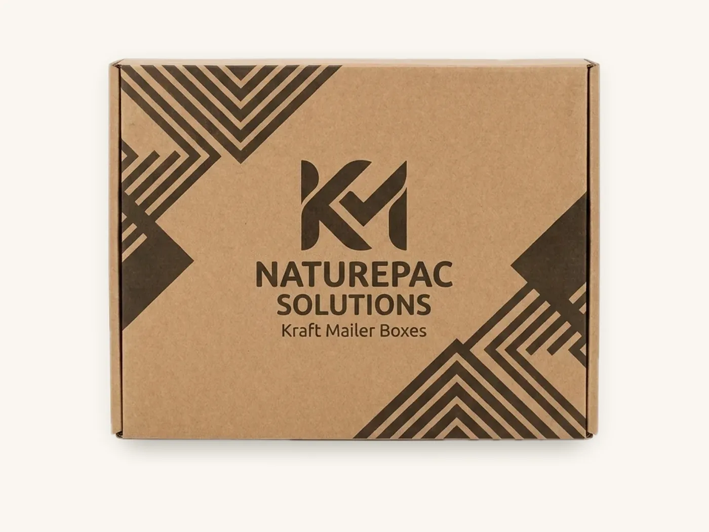
Kraft paperboard vs kraft corrugated: printing differences
"Kraft box" can mean a folding carton made from kraft paperboard or a mailer or shipper made from corrugated board with a kraft liner. They print differently.
| Factor | Kraft paperboard (for example 18 pt) | Kraft corrugated (E-flute or B-flute) |
|---|---|---|
| Typical boxes | Tuck cartons, soap boxes, sleeves, small retail boxes | Mailers, shipping boxes, subscription boxes |
| Print surface | Smoother, more uniform | Rougher; flutes can show as faint lines in solids |
| Fine detail | Good with bold type and simple art | Best with bold shapes and larger type |
| White ink performance | More even coverage | Less even on large floods; best for logos and patterns |
| Common print approach | One or two colors, white accents | One color or white logo, sometimes full color |
Choosing between them
For small retail items like soap, candles, tea or spice, kraft paperboard gives the crisper print surface. For anything shipped, corrugated board with a kraft liner adds protection, and designs should be bolder to suit the texture. The corrugated flutes guide explains why E-flute gives a better print face than B-flute.
Some brands want a kraft look outside and a bright interior. A corrugated box can combine a kraft outer liner with a white inner liner, which our inside printing guide covers.
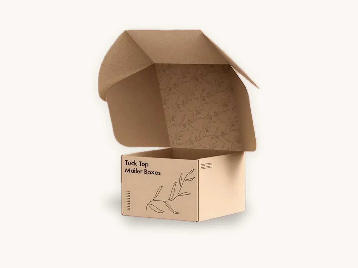
File setup for white ink and kraft printing
Kraft printing needs a few file conventions that white-board jobs do not. The figures below are typical industry ranges for printing on uncoated kraft; exact limits are confirmed at proofing.
Artwork checklist for kraft boxes
- Design on a kraft background in your file, so you see approximately how transparent colors will behave. Never design on white and hope.
- Build white ink as a spot color on its own layer, named clearly (for example "WHITE_INK"), set to 100% and overprint where it sits under color.
- Choke the underbase. Make the white underbase slightly smaller than the color on top, typically about 0.1–0.25 mm per edge, so no white halo shows if layers shift.
- Keep white text bold. Aim for about 8 pt or larger for white type, and heavier weights; reversed or white hairlines under roughly 0.5 pt tend to break up.
- Keep dark text at a readable size. Around 6 pt is a typical floor for dark ink on kraft paperboard; go larger on corrugated.
- Avoid tints and fine halftones. Screens below roughly 20% can disappear into the brown; use solid colors wherever possible.
- Mark areas left unprinted. If kraft is meant to show through as a design element, make those areas explicitly empty on every layer.
- Use vector logos and outlined fonts, with any images at 300 dpi at final size.
- Keep bleed and safe zones. Extend backgrounds 1/8 in (3 mm) past cut lines and keep text 1/8 in inside cuts and creases.
Our design services team sets up white ink layers and underbase chokes as part of free artwork setup, so you do not need prepress experience to get it right.
Tip: if you are unsure whether a color needs a white base, print it both ways on a short run of 10 boxes. Side by side in your real lighting, the choice becomes obvious, and the cost of the test is small.
Coatings, foil and finishes on kraft
Finishes behave differently on absorbent brown board, and a few of them change the color of the kraft itself.
Aqueous coating
A clear aqueous coating protects print from scuffing and keeps the box paper-based. On kraft it can slightly darken and enrich the brown, much as water darkens wood. Matte aqueous keeps the natural look closest to uncoated. The aqueous coating guide covers sheens and recyclability.
Lamination
Matte or gloss film can be applied to kraft paperboard, but it darkens the board more noticeably and removes the natural texture that makes kraft appealing. It also adds a plastic layer, which works against the eco message many kraft brands want.
Foil and pigment foils
Gold and copper foils look warm and natural against kraft. Opaque white or black pigment foils give a crisper, brighter mark than ink when you want a small, very clean logo. Keep foil designs bold, since fiber texture breaks up fine lines.
Embossing and debossing
Kraft's long fibers take a deboss well, and a blind debossed logo can look excellent on kraft paperboard with no ink at all.
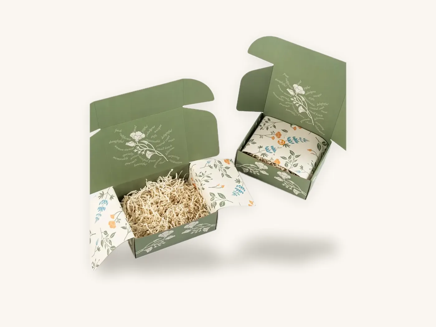
What printing on kraft boxes costs
Kraft board and simple one-color printing are among the most economical box specs. White ink, a white underbase and full color add cost, because they add layers and ink. These prices are indicative per unit with free US shipping.
| Spec | 100 units | 500 units | 1,000 units | 5,000 units |
|---|---|---|---|---|
| Kraft tuck carton, 18 pt kraft, 4x3x2 in, 1-color print | $0.81 | $0.43 | $0.36 | $0.25 |
| Soap sleeve or box, 18 pt kraft, 3.5x2.5x1.25 in, 1-color | $0.66 | $0.35 | $0.29 | $0.21 |
For white ink, multiple colors or kraft corrugated mailers, run your spec in the instant price estimator, and compare it against the same box in white board. Sometimes a white box printed to look natural costs about the same as a kraft box with a full white underbase, and reproduces color better. For a broader look at kraft structures, see the kraft boxes guide.
How to order printed kraft boxes from Box Sense
We print on kraft paperboard and kraft corrugated, with one color, multiple colors, white ink or full color. The details below get you an accurate quote and a proof that reflects the real result.
What to include
- Box style and internal dimensions, for example soap boxes, tuck cartons or kraft mailer boxes
- Board: kraft paperboard or kraft corrugated, and flute if known
- Print: number of colors, whether you need white ink, and where a white underbase is required
- PMS references for brand colors, noting they will shift on kraft unless underbased
- Coating preference: none, matte aqueous or gloss aqueous
- Quantities and target delivery date
- Artwork, or a request for design help
What to expect
We confirm quotes within 24 hours. Free design support covers the dieline, artwork setup including white ink layers, and a 3D digital proof with two revision rounds. Because screens cannot show white ink on kraft accurately, we strongly suggest a printed sample: unprinted structural samples are free, and a printed sample of approved artwork is free on orders of 100 or more.
Standard production takes 8–12 business days after proof approval, with rush in 5 business days on most paperboard and corrugated styles. Shipping is free on every US order, and international shipping is quoted at cost. The minimum order is 10 boxes, and defective boxes reported within 14 days are reprinted free. Brands in soap and bath and other natural categories often start with a short run to confirm the look.
Frequently asked questions
Can you print full color on kraft boxes?
Yes, but expect colors to print darker, warmer and less saturated than on white board, because standard inks are transparent and the brown shows through. Dark colors hold up well, while yellows, pinks and pastels shift the most. A white ink underbase brightens colors, but for photography or exact brand colors, a white board is usually the better choice.
Does white ink show up on kraft paper?
Yes. Opaque white ink is designed to cover the brown surface and shows clearly on kraft. It looks like a soft, slightly warm off-white rather than bright paper white, and some texture from the fibers remains. A double hit of white builds more opacity. Bold logos, patterns and larger type work best; very fine white lines can break up.
What colors look best on kraft boxes?
Black, dark brown, navy, forest green, burgundy and deep reds print reliably on kraft and look natural against the board. White ink is also very effective. Colors lighter than the kraft itself, such as yellow, pink, light blue and pastels, look muddy unless printed over a white underbase. A simple test is whether the color is darker than the board.
Why does my kraft box print not match my proof?
Screen proofs show colors on an idealized brown background and cannot reproduce how transparent ink mixes with real kraft, how fibers absorb ink, or how white ink looks. Natural kraft also varies slightly between production lots. Approve layout and text from the digital proof, then judge color from a printed sample on the actual board.
What is a white underbase?
A white underbase is a layer of opaque white ink printed beneath colored ink, only in the areas where those colors appear. It hides the brown board so the colors on top look brighter and closer to their intended shade. The underbase is made slightly smaller than the color layer, so no white edge shows if the layers shift slightly on press.
Is printing on kraft cheaper than printing on white boxes?
One- or two-color printing on kraft is among the most economical specs, and a small kraft tuck carton in one color is about $0.81 each at 100 units. Adding white ink, a white underbase or full color increases cost. For color-heavy artwork, a printed white box can cost about the same and reproduce colors better, so compare both in the pricing estimator.
Can you print on the inside of kraft boxes?
Yes. Kraft boxes can be printed inside as well as outside, using the same approaches: dark colors or white ink directly on kraft, or a white underbase for lighter colors. On corrugated mailers, you can also specify a white inner liner with a kraft outer liner, which gives a natural exterior and a bright interior for full-color artwork.
Next steps
Look at your artwork against a real piece of kraft, decide which colors can print directly and which need white underneath, and check the numbers in the kraft box price estimator. Then request a quote for printed kraft boxes, and we will confirm pricing within 24 hours and set up your white ink layers before the proof.
Boxes in this guide
Order the packaging we covered
Written by the Box Sense Packaging Team
Our structural designers, prepress technicians and production staff print and convert custom boxes every day for brands in the United States, United Kingdom and UAE. Questions about this guide? Talk to us.