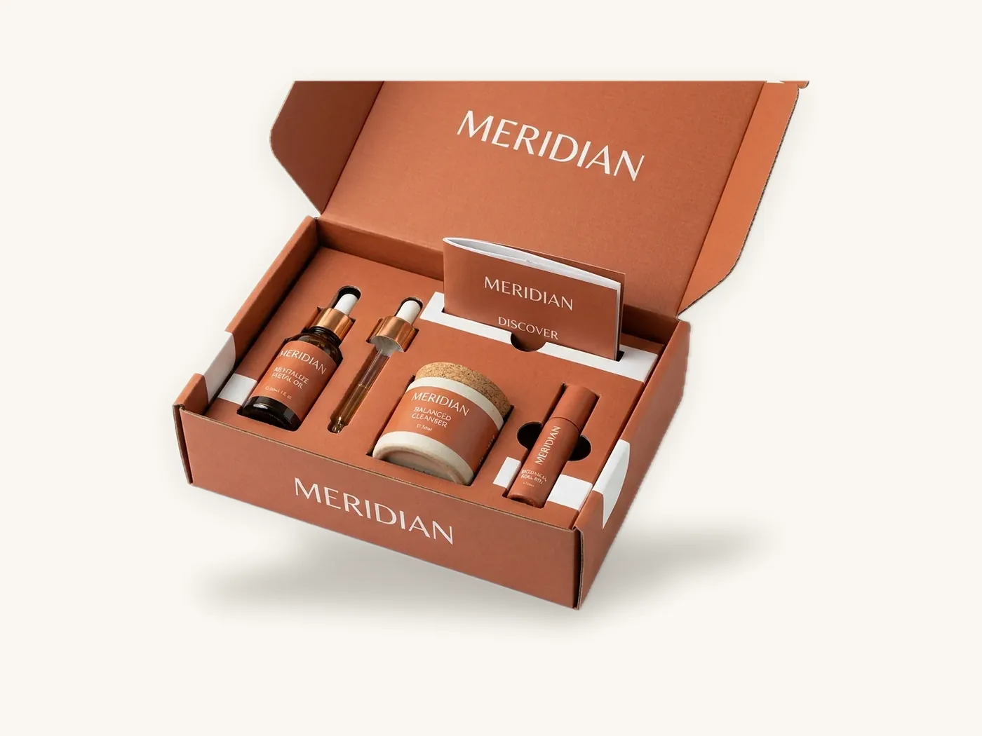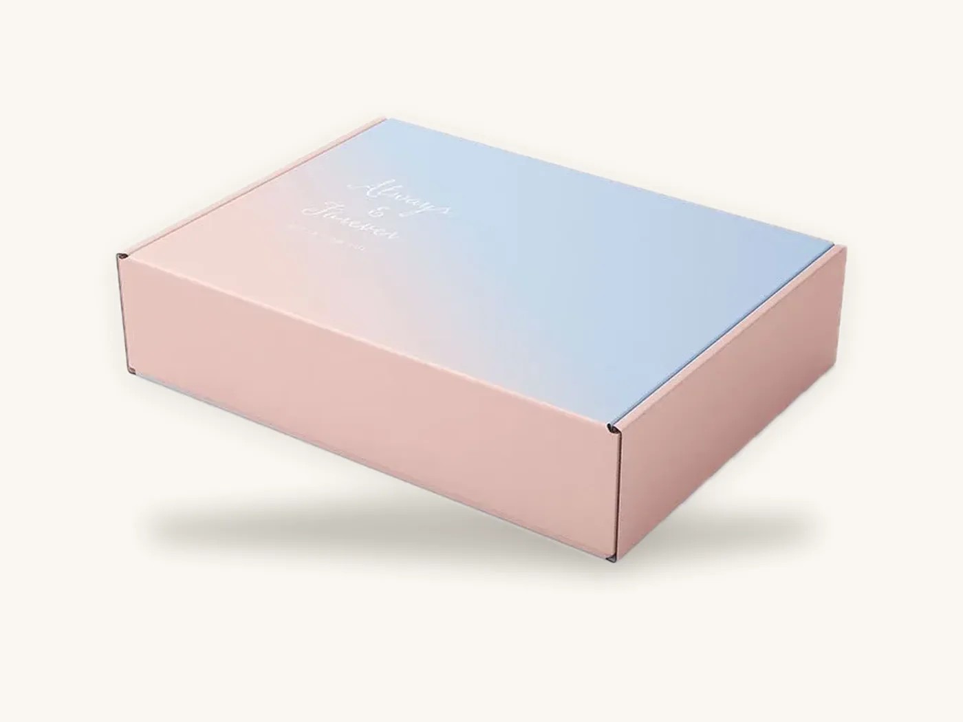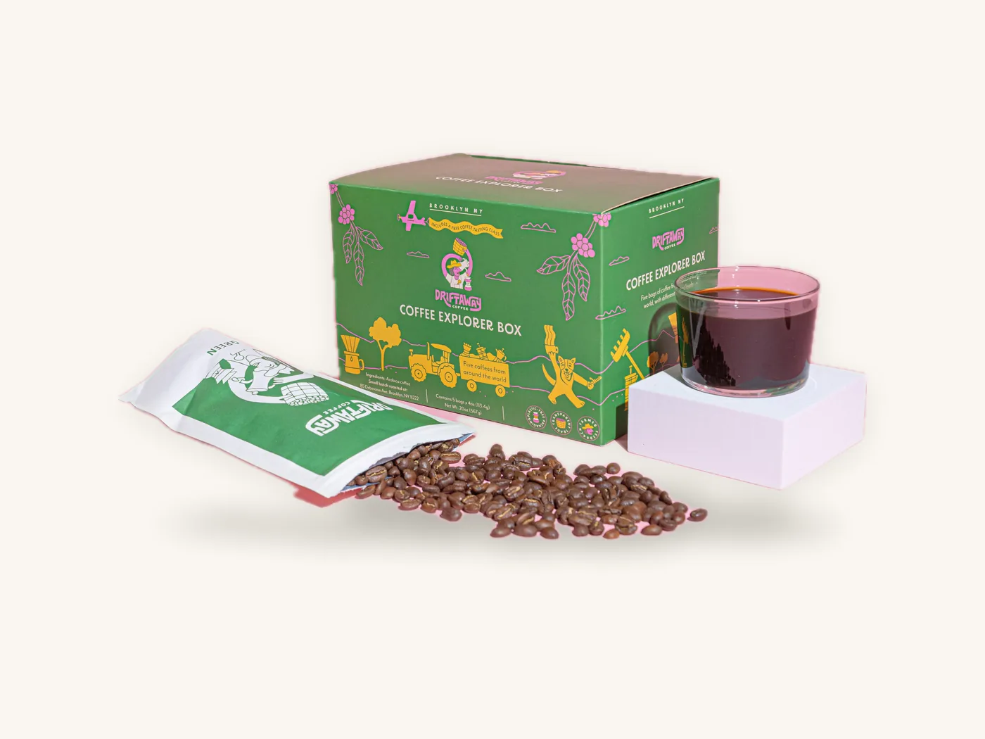
The short answer to matte vs gloss lamination: gloss makes colors look brighter and more saturated and reads well from a distance, while matte gives a calmer, low-glare, modern look that feels more premium in the hand. Both are thin polypropylene films bonded over the print, both protect the box far better than bare ink, and the price difference between them is small.
So the decision is mostly about look, lighting and handling. Gloss laminated boxes suit bright, busy retail shelves and color-driven artwork. Matte finish boxes suit minimal designs, beauty and lifestyle brands, and anything customers will photograph under household light. The rest of this guide explains the differences that are easy to miss until the samples arrive: color shift, which marks each film shows, glare on barcodes and product shots, and how each behaves at the folds.
Key takeaways
- Gloss boosts saturation and contrast and hides fine scratches under its own reflections; it shows fingerprints and creates glare.
- Matte reduces glare, softens color slightly and feels smoother and more upscale; dark matte panels can show scuffs and rub marks.
- The cost gap between the two films is small on a typical carton. Your choice of board, size and quantity moves the price far more.
- Matte is the better base for spot UV, because gloss highlights need a dull surface to stand out.
- Choose the finish before final color approval, because both films shift how printed color looks.
- A reverse tuck end carton, 14 pt SBS, 2x2x6 in, full color with gloss lamination is about $1.17 each at 100 units and about $0.52 at 1,000.
Matte vs gloss lamination: the quick verdict
If you only have a minute, this table covers most decisions.
| Factor | Gloss lamination | Matte lamination |
|---|---|---|
| Overall look | Bright, shiny, energetic | Soft, flat, understated |
| Color saturation | Higher; colors pop | Slightly lower; colors calm down |
| Deep blacks | Very deep, glossy black | Rich but can look a touch lighter |
| Glare under lights | Noticeable | Minimal |
| Fingerprints | Visible, especially on darks | Less visible |
| Fine scratches | Often masked by reflection | More visible on dark solids |
| Feel | Slick, cool | Smooth, slightly velvety-dry |
| Readability of small text | Can glare at some angles | Consistent from most angles |
| Works under spot UV | Poorly | Very well |
| Perceived positioning | Mass retail, playful, bold | Premium, minimal, lifestyle |
Neither film is more protective in any meaningful structural sense. Both add rub resistance and some moisture resistance compared with an aqueous coating. For the wider set of options, including coatings and soft-touch film, see the packaging finishes guide.
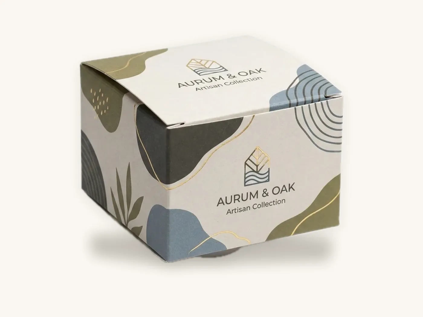
How the two films handle light
Every difference between matte and gloss comes back to one thing: what the surface does with light.
A gloss film is optically smooth. Light hitting it reflects in a single direction, like a mirror. From most angles you see the printed ink clearly, with colors made deeper because less stray light scatters off the surface. From one angle, you see a bright highlight: the glare.
A matte film has a microscopically rough surface. Light hitting it scatters in many directions. You never get a sharp highlight, so the box looks consistent from every angle. The tradeoff is that a little of that scattered white light mixes with the color you see, which makes colors slightly less saturated and darks slightly lighter.
That single mechanism explains why gloss looks punchier, why matte looks calmer, why gloss has glare and why spot UV only shows up against matte.
Color shift: what happens to your artwork
Designers are sometimes surprised when a carefully approved color looks different on the laminated sample. The shift is predictable, and planning for it is easier than fixing it after the run.
On gloss
- Saturated colors look more vivid. Reds, blues, greens and purples gain intensity.
- Blacks look deeper and more solid.
- Gradients and photographs gain contrast, which helps food and product imagery look appetizing and crisp.
- Very bright designs can tip into looking loud or cheap if the palette was already intense.
On matte
- Saturated colors lose a little punch and look more sophisticated.
- Blacks can read as very dark charcoal, especially with plain 100% black ink rather than a rich black build.
- Pastels and muted tones look elegant, but already pale colors can appear chalky.
- Photography looks softer, which suits lifestyle imagery but can make food look slightly flat.
Planning for the shift
- Decide the film first. Ask for your digital proof to note the finish, and approve key colors on a printed sample with that film applied.
- Build blacks for the finish. On matte, a rich black holds depth better than single-ink black.
- Check brand colors on your actual board. A color that shifts slightly on SBS will shift differently on a laminated corrugated liner. Our guide to CMYK vs Pantone for packaging explains how to specify brand colors across boards.
- Look under realistic light. Store lighting and household lighting produce very different results, especially for gloss glare.
Tip: if your brand color is a bright, saturated hue and your competitors on shelf are all matte, a gloss carton can be the simplest way to stand out. If your competitors are all gloss, matte does the same job in reverse.
Durability: scuffs, fingerprints, scratches and cracking
Both films protect the print. They fail in different ways, and which failure matters depends on how your box travels and who handles it.
Scuffs and rub marks
Matte laminated boxes can pick up visible rub marks on dark solids, because rubbing polishes the matte texture into small shiny patches. On a black matte mailer, those marks can show clearly after parcel shipping. On light and mid-tone designs they are rarely noticeable.
Gloss laminated boxes also scuff, but the marks are partly hidden by the surface's own reflections. Under direct light at the right angle, fine scratches become visible as hazy lines.
Fingerprints
Gloss shows fingerprints and skin oils plainly, especially on black and dark blue panels. Retail boxes handled by many shoppers can look smudged. Matte hides light fingerprints better, though oily residue can still darken a matte surface.
Cracking and whitening at folds
Film adds a little stiffness to the sheet. If the scoring is not set correctly for laminated stock, either film can lift or whiten along a tight fold, and the effect is most visible on dark colors. It is a production setup issue rather than a finish choice, and it should be caught on the sample. Our guide to packaging print tolerances explains acceptable variation at creases and cuts.
Durability comparison by situation
| Situation | Better film | Why |
|---|---|---|
| Dark design, shipped bare in parcels | Gloss, or matte inside an outer box | Matte shows rub marks on dark solids |
| Dark design, handled in a boutique | Matte | Fingerprints show more on gloss |
| Light or white design, any channel | Either | Marks are hard to see on light colors |
| Bright food or toy carton under store lights | Gloss | Color reads from a distance; smudges less visible on busy art |
| Minimal logo on a solid color | Matte | Clean look, no glare distracting from the mark |
| Box stored and handled repeatedly, like a game or kit | Matte | Consistent look over time; fewer visible prints |
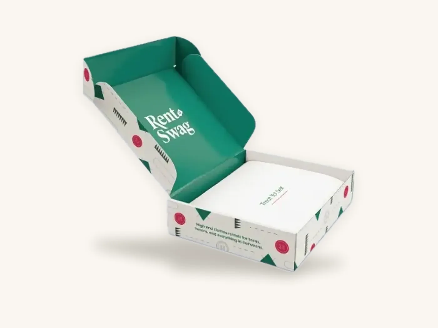
Glare, barcodes and legibility
Glare is more than an aesthetic issue. It affects whether people can read your box and whether scanners can read your barcode.
Small text and regulatory copy
Supplement facts panels, ingredient lists and warnings are often set in small type. Under bright store lighting, gloss can wash out part of a panel at certain angles, making the text harder to read. Matte stays readable from nearly any angle, which is one reason it is common on supplement boxes and pharmaceutical cartons.
Barcodes
Most modern scanners read barcodes through gloss film without trouble, but strong specular reflection can occasionally interfere, especially with handheld scanners at a steep angle. If you use gloss, keep the barcode on a panel that is likely to face a scanner squarely, maintain good contrast between bars and background, and test scan a sample. Follow GS1 guidance for barcode size and quiet zones.
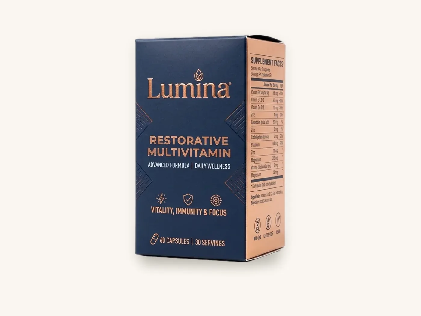
How each finish looks in photos and on screen
For e-commerce brands, the box will be seen in product photos, unboxing videos and customer posts far more often than on a shelf.
Gloss creates hot spots under studio lights and phone flashes. Photographers can manage reflections with diffused lighting and careful angles, but customers filming an unboxing at a kitchen table will not. Matte photographs predictably under almost any light, and dark matte boxes look rich on camera.
On the other hand, gloss can make a box look more vivid in bright daylight product shots, and some brands use the reflections as part of a glossy, high-energy aesthetic. If your brand's visual identity is saturated and bold, gloss can be the more honest translation of your screen artwork.
Matte vs gloss by product and channel
These are practical starting points, not rules. Put your brand positioning first, then check the channel.
| Product or channel | Common choice | Reasoning |
|---|---|---|
| Skincare and cosmetics | Matte | Premium, low glare, pairs with foil and spot UV |
| Supplements and sports nutrition | Matte or gloss | Matte for legibility and premium; gloss for bold, energetic brands |
| Toys and games | Gloss | Bright artwork, character graphics, shelf visibility |
| Snacks, cereal and confectionery | Gloss | Food imagery looks crisp and appetizing |
| Candles and home fragrance | Matte | Calm, warm look that suits the category |
| Electronics accessories | Matte | Modern, minimal, fewer visible fingerprints |
| DTC mailers | Matte for light designs; gloss or aqueous for dark designs shipped bare | Balances rub marks against glare |
| Rigid gift boxes | Matte, or soft-touch for a step up | Handled and kept, often decorated with foil |
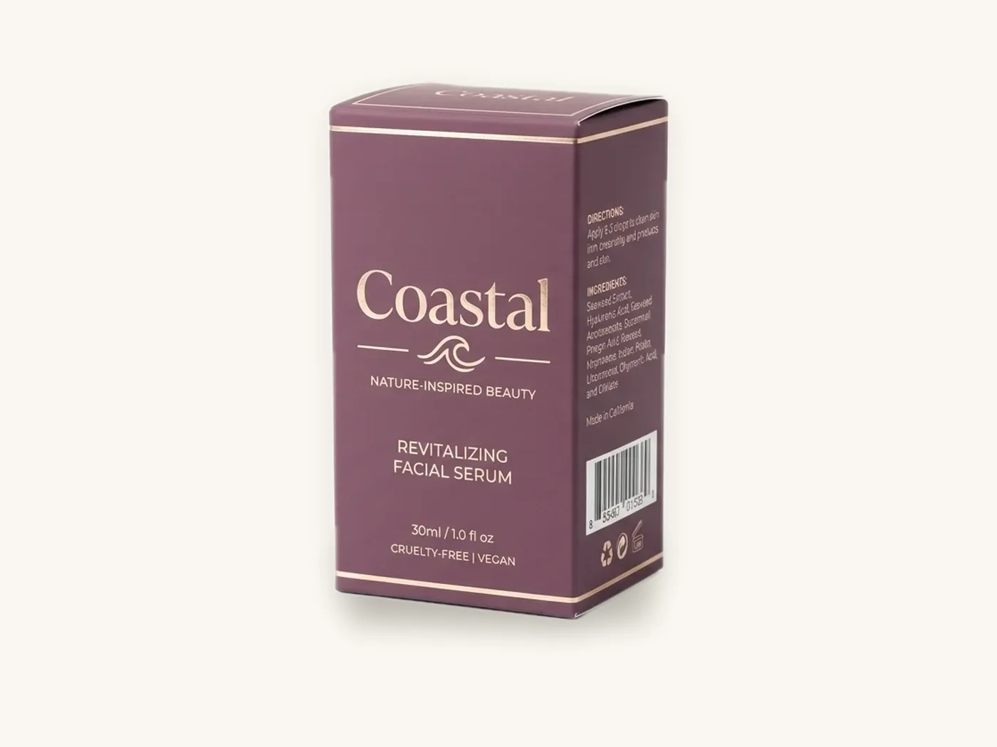
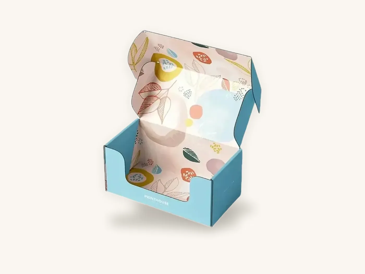
For a closer look at retail cartons, custom product boxes and cosmetic boxes show the most common laminated specs. The folding cartons style page covers structures that take lamination well.
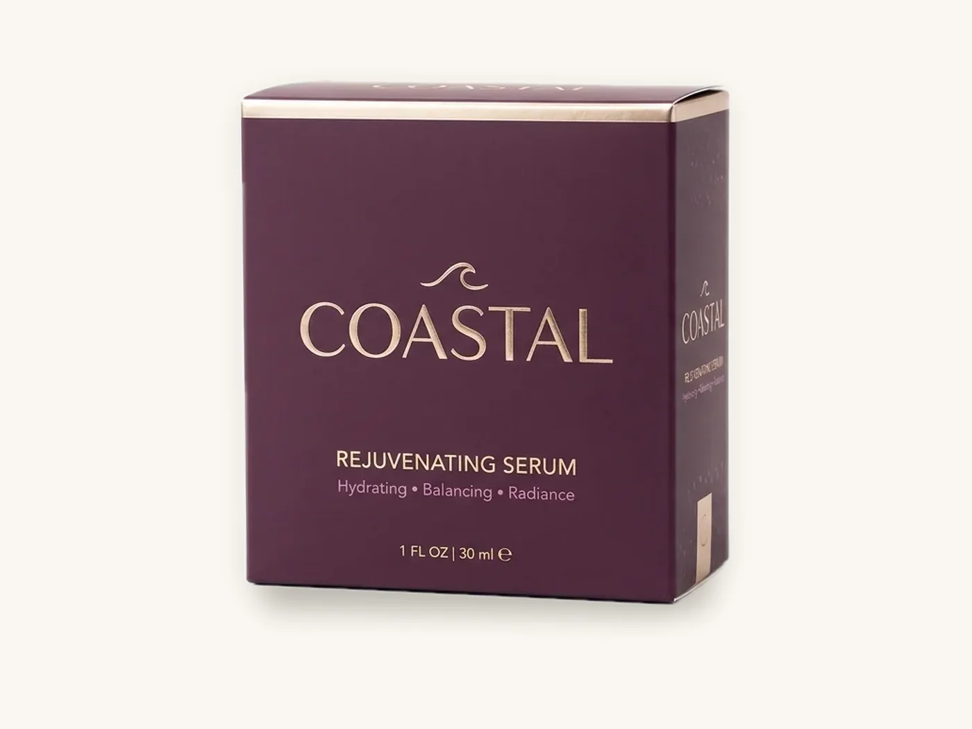
Cost: what the finish really adds
Matte and gloss films are both standard lamination options, and on a typical carton the difference between them is small relative to board, size, print coverage and quantity. Neither film carries tooling. Lamination as a whole costs more than an aqueous coating because it adds film, adhesive and a machine pass.
Reference prices
These indicative per-unit prices include free US shipping. The two laminated specs are different box types and sizes, so compare them for scale rather than as a matte-versus-gloss price test.
| Spec | 10 | 100 | 500 | 1,000 | 5,000 |
|---|---|---|---|---|---|
| Reverse tuck end carton, 14 pt SBS, 2x2x6 in, full color, gloss lamination | $1.77 | $1.17 | $0.63 | $0.52 | $0.37 |
| Straight tuck end carton, 18 pt SBS, 3x2x5 in, full color, aqueous | $1.73 | $1.15 | $0.61 | $0.51 | $0.36 |
| Rigid box, 2 mm greyboard wrapped, 8x6x3 in, full color, matte | $13.76 | $9.10 | $4.85 | $4.05 | $2.87 |
For your exact dimensions with each finish, the instant price estimator lets you switch between matte, gloss, soft-touch and aqueous and see the change.
When to skip lamination altogether
If the box is a kraft carton, a food box that should stay simple to recycle, or a shipper that will be overboxed, an aqueous coating is usually the better value. The aqueous coating guide explains where a coating provides enough protection.
Middle paths: satin, spot gloss and mixed finishes
You do not always have to choose one extreme.
Matte with spot UV
The most popular hybrid is matte lamination over the whole box with spot UV on the logo, a pattern or product imagery. You get matte's calm, premium base with gloss highlights exactly where you want attention. The spot UV design guide covers file setup and registration.
Gloss aqueous or UV coating
If you like the shine of gloss but want less plastic, a gloss aqueous coating gives a moderate sheen with a paper-first profile. It will not match the depth or rub resistance of gloss film.
Soft-touch as a matte upgrade
If you like matte but want more tactile impact, soft-touch film is the next step. It adds a velvety feel and a deeper look at a higher cost, with its own scuffing considerations. Soft-touch lamination explained covers the details.
Different finishes on different components
On a two-piece or sleeve-and-tray box, some brands laminate the outer sleeve in gloss for shelf impact and keep the inner tray matte or coated. Because each component is printed separately, mixing finishes adds little complexity.

How to choose: a 6-point checklist
Run through this list with your designer before you finalize artwork.
- Palette: Is the design saturated and bold (lean gloss) or minimal, muted or dark (lean matte)?
- Lighting: Will the box be seen under bright retail lights where glare matters?
- Handling: Will many hands touch it (matte hides prints) or will it ride bare through parcel networks with a dark design (gloss hides rub marks)?
- Decoration: Do you plan spot UV (matte) or foil (either)?
- Photography: Will customers photograph and film it at home (matte is more forgiving)?
- Text: Does the box carry dense regulatory copy or a barcode that must scan easily (matte is safer)?
If the answers split evenly, order printed samples of both. Seeing the same artwork side by side under your own lighting settles the question faster than any spec sheet.
Ordering matte or gloss laminated boxes from Box Sense
We print and laminate in-house, so you can compare finishes on the same artwork without coordinating separate suppliers.
What to send
- Box style and internal dimensions, for example a reverse tuck end carton or an E-flute mailer
- Board choice, such as 14 pt or 18 pt SBS
- Finish: matte lamination, gloss lamination, or "please advise"
- Any spot UV, foil or embossing and where it goes
- How the box ships: bare in parcels, inside a mailer, or on retail shelves
- Quantities to price, such as 250, 1,000 and 2,500
- Artwork, or a request for help from design services
Proofing and samples
You receive a 3D digital proof with two revision rounds included. Because sheen and color shift cannot be judged on screen, a physical sample is the best check. Unprinted structural samples are free, and a printed sample of approved artwork is free on orders of 100 or more; see samples.
Timeline
Quotes are confirmed within 24 hours. Standard production is 8–12 business days after proof approval, with rush production in 5 business days on most paperboard and corrugated styles. Orders start at 10 boxes, with digital printing for short runs and offset for larger ones. Shipping is free on every US order, and defective boxes reported within 14 days are reprinted free.
Frequently asked questions
Which is better, matte or gloss lamination?
Neither is better overall. Gloss lamination makes colors brighter and suits bold retail artwork, food and toys. Matte lamination reduces glare, softens color and suits premium, minimal and beauty brands. Choose gloss for shelf impact and saturated designs, and matte for a calm, upscale look, dense text, spot UV accents or boxes customers will photograph.
Does matte or gloss lamination scratch more?
They show damage differently. Matte can develop shiny rub marks on dark solid colors, especially when shipped bare. Gloss scratches too, but its reflections hide fine marks until light hits at the right angle, and it shows fingerprints more. On light or busy designs, both hold up well. Dark boxes that ship unprotected need extra thought.
Is gloss lamination cheaper than matte lamination?
The difference is small. Both are standard films with no tooling, and board, size, print coverage and quantity affect the unit price far more than the choice between them. As a reference, a 14 pt SBS reverse tuck end carton, 2x2x6 in, with gloss lamination is about $1.17 each at 100 units. Check your spec in the pricing estimator.
Does matte lamination make colors look dull?
It makes colors look slightly softer, not dull. The matte surface scatters a little white light, which reduces saturation and can make blacks read as very dark charcoal. Many brands prefer that calmer look. Designers compensate by using rich black builds and approving brand colors on a sample with the matte film applied.
Can you use spot UV on gloss laminated boxes?
Technically yes, but it is barely visible, because spot UV depends on contrast between glossy highlights and a duller surface. For a clear effect, use matte or soft-touch lamination as the base. If you want a glossy box with an accent, foil stamping gives visible contrast on gloss.
Are matte or gloss laminated boxes recyclable?
Both films add a thin plastic layer to the paperboard. Many recycling programs accept laminated paperboard, but acceptance varies by location. If recyclability is a priority, consider an aqueous coating instead of film. Before printing any recyclable claim on the box, check the FTC Green Guides and confirm acceptance with programs in your market.
Which finish is better for mailer boxes?
For light and mid-tone designs, matte lamination looks premium and resists rubbing well. For dark designs that ship bare, gloss lamination or an aqueous coating with a pattern that breaks up large solid areas usually arrives looking better, because dark matte panels can pick up rub marks in parcel networks. A test shipment of a sample settles it.
Next steps
Shortlist a finish with the checklist, then see the cost of each on your spec in the custom box price estimator. If you are still torn, request a quote with both finishes and we will confirm pricing within 24 hours and help you compare them on a sample of your actual artwork.
Boxes in this guide
Order the packaging we covered
Written by the Box Sense Packaging Team
Our structural designers, prepress technicians and production staff print and convert custom boxes every day for brands in the United States, United Kingdom and UAE. Questions about this guide? Talk to us.